


Short description:
CAPTCHAs require alternatives. An audio CAPTCHA must have an image CAPTCHA as an option, and vice versa. Image-based CAPTCHAs should also include text in the alt attribute that explains the purpose of the CAPTCHA.
An easy-to-understand overview of the Web Content Accessibility Guidelines (WCAG Version 2.2 Level A & AA). Learn quickly and easily what’s important for creating accessible websites and apps.
CAPTCHAs require alternatives. An audio CAPTCHA must have an image CAPTCHA as an option, and vice versa. Image-based CAPTCHAs should also include text in the alt attribute that explains the purpose of the CAPTCHA.

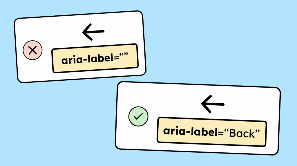
Graphical controls, such as clickable icons or images, need a name so that screen reader users can understand their function. This can be provided, for example, via the alt attribute or the aria-label attribute.
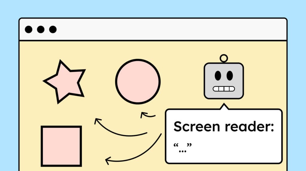
Decorative images that don’t convey information should be hidden from assistive technologies. For <img> elements, use an empty alt attribute (alt=””), and for <svg> elements, add aria-hidden=”true” so screen readers skip them.
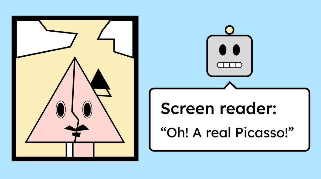
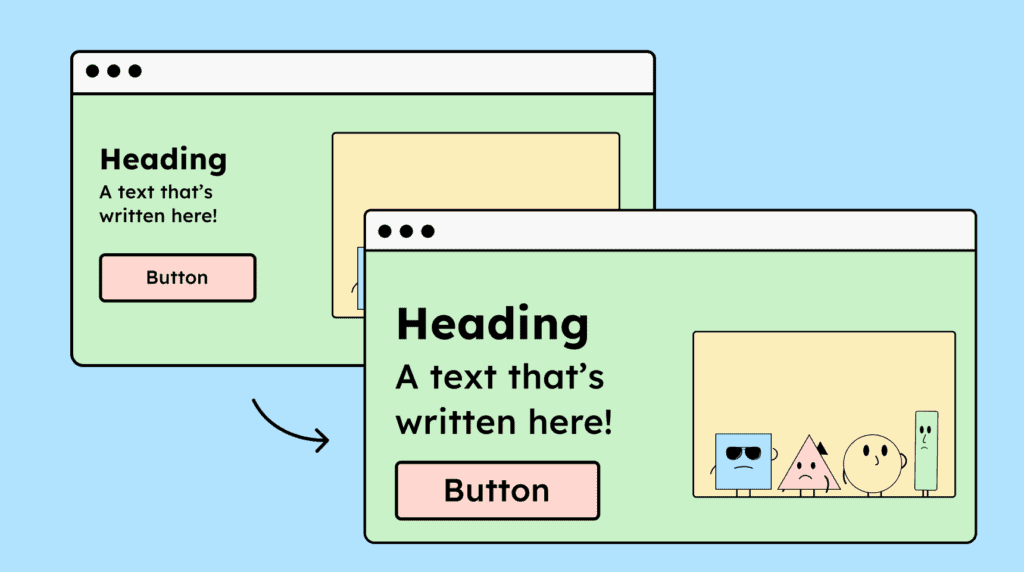
Images or graphics that share important information should have a text alternative — in the alt attribute or nearby text. Even pictures that express feelings or set a tone deserve meaningful descriptions.
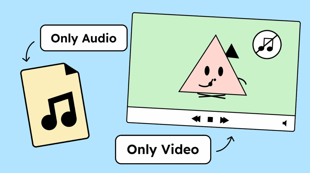
Audio files require a transcript as an alternative format. For silent videos, either a video description or an audio file should be provided as an alternative.
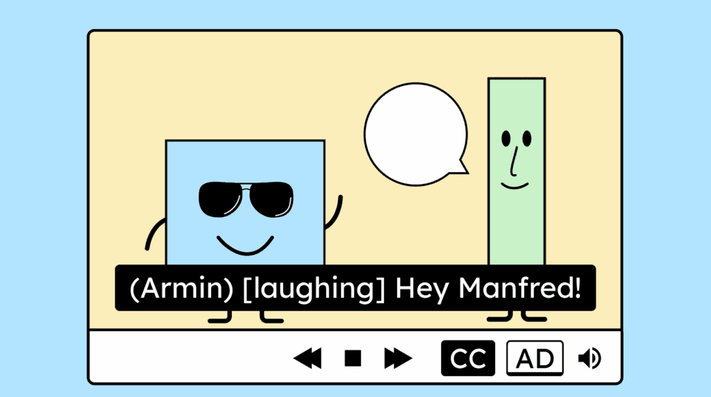
Recorded videos require synchronized captions. For the captions to be complete, they should include not only the spoken words, but also the names of speakers, human sounds, and important noises such as music.
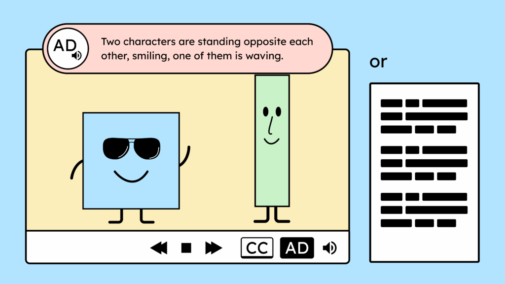
Your videos need an audio description or a full-text alternative if they contain important information that is not conveyed in the audio track.
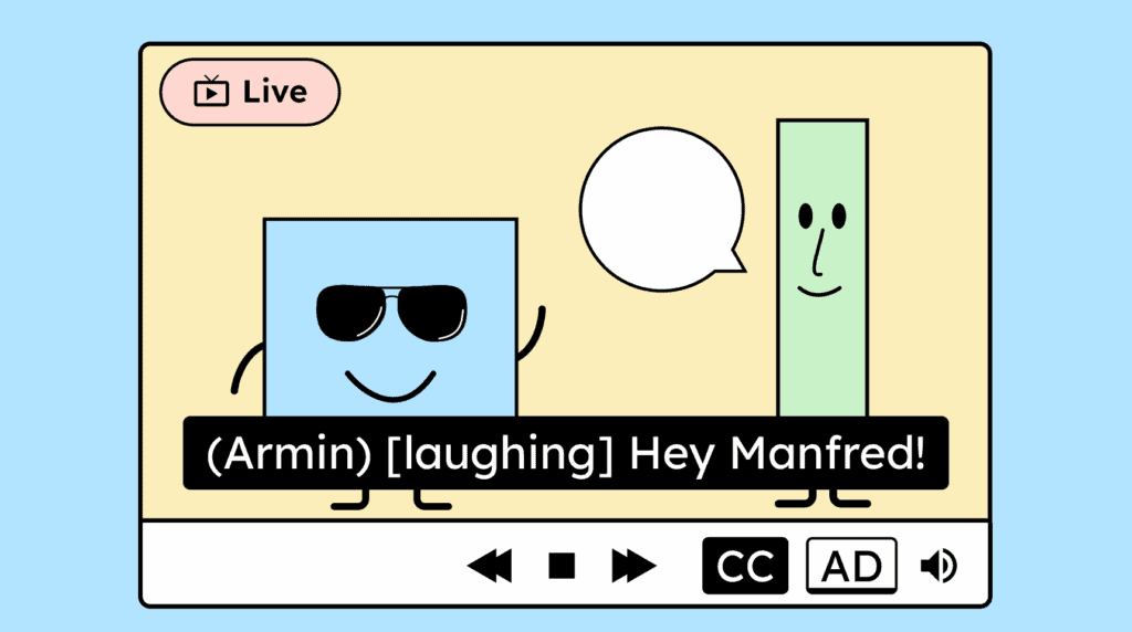
Live broadcasts also require captions. These captions should convey the content and indicate who is speaking as well as any important sounds.
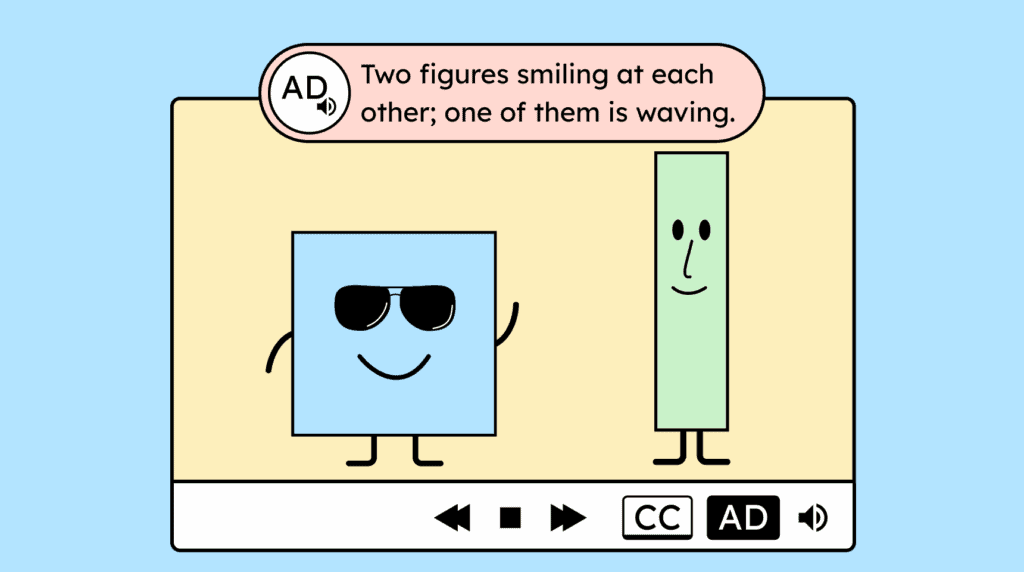
If a video conveys important information only visually and not through sound, it requires an audio description. This can include details such as the speaker’s name when it appears on screen but is not spoken aloud.
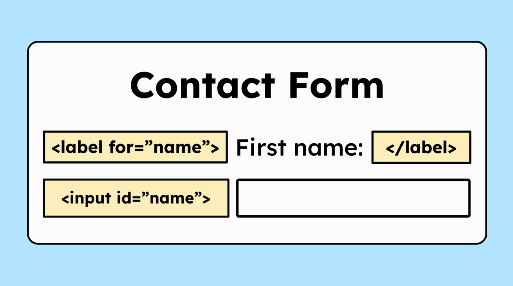
The label (<label>) for form fields (<input>) should include a »for« attribute to link the label to the input. This gives the field an accessible name. It’s not the only way to do this, but the best one!
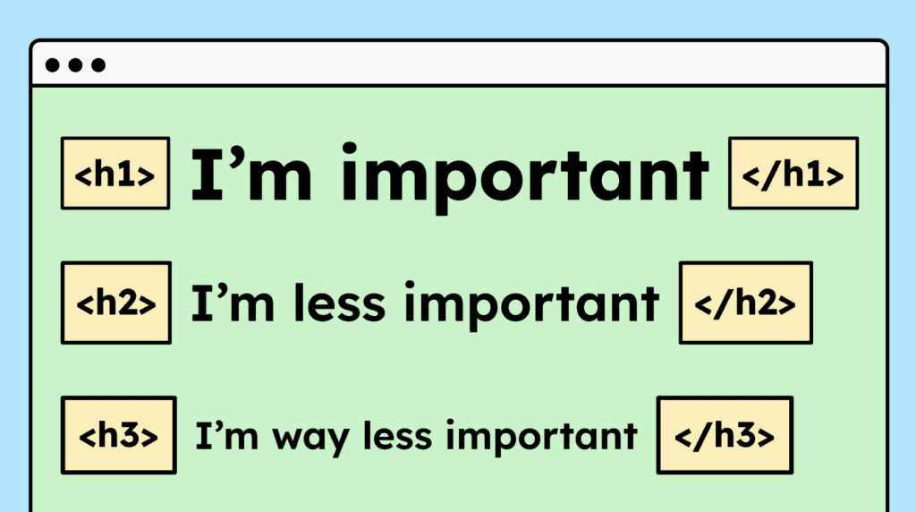
Headings must be properly marked up in HTML using <h1> to <h6>. They should also follow a logical order, for example, an <h3> should appear above an <h1>.
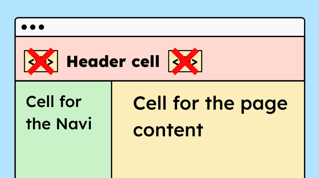
If a website uses HTML tables purely for layout purposes, semantic elements like <table>, <th>, and <td> shouldn’t be used, so that screen readers don’t interpret them as data tables.
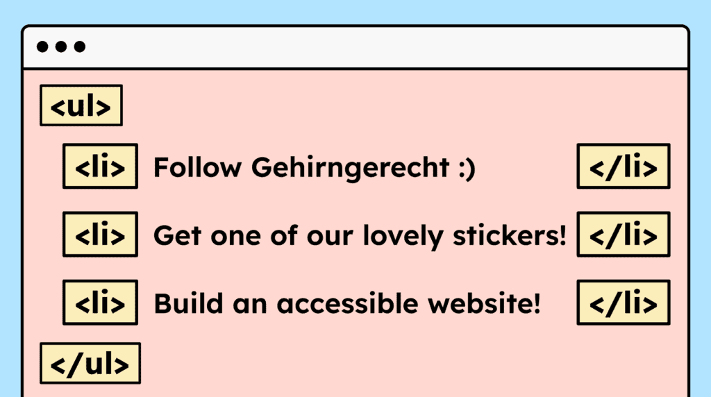
Content that visually appears as a list must also be marked up as a list in HTML. Use <ul>, <ol>, or <dl> depending on the type of list.
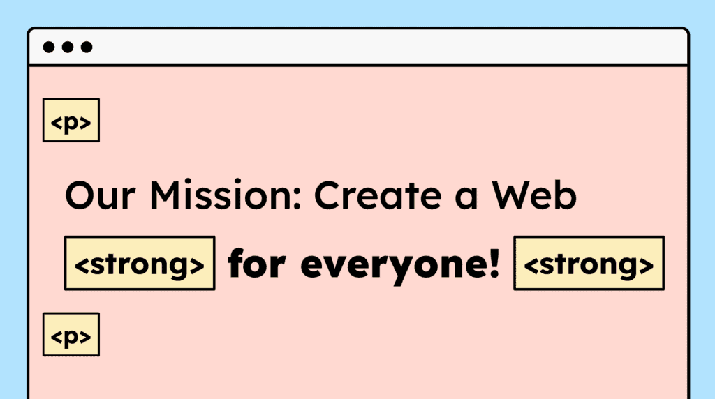
For paragraphs and formatted text, such as bold or italic, the correct HTML tags must be used. Line breaks in continuous text should not be created using double <br> tags.
Standalone quotes must be marked up using <blockquote>. These can include, for example, individual customer feedback on a website. Quotes within paragraphs don’t necessarily require special markup.
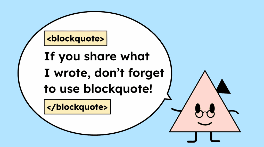
Table headers must be marked up with <th> and the content with <td>. For complex tables with multiple headers, the scope attribute should also be used to clarify the relationships.
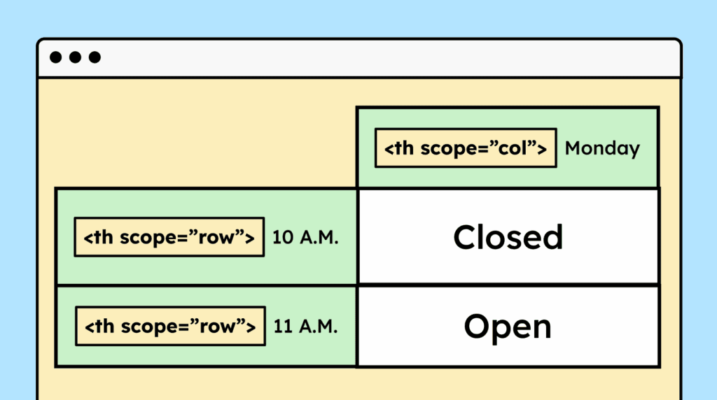
Information presented visually in a table must also be marked up as a table in HTML. This enables assistive technologies to interpret the content correctly.

The visual layout of a website using CSS must not affect the logical order of content. Related elements, such as a heading and its accompanying text, must be read in the correct order by screen readers.

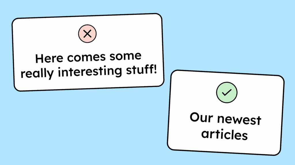
Avoid relying on sensory cues in your text. Phrases like »bottom left« are often unhelpful for screen reader users. Instead, focus on descriptive text, for example: “Click the ‘Order Now’ button!”

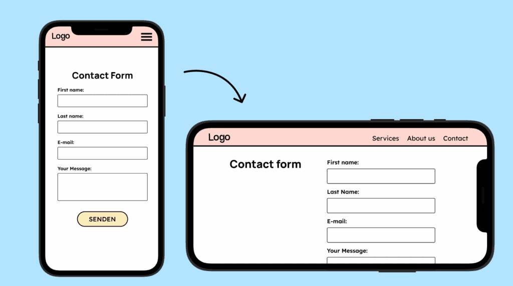
A website must be usable in both portrait and landscape orientations. Users should be able to switch between orientations without any restrictions.
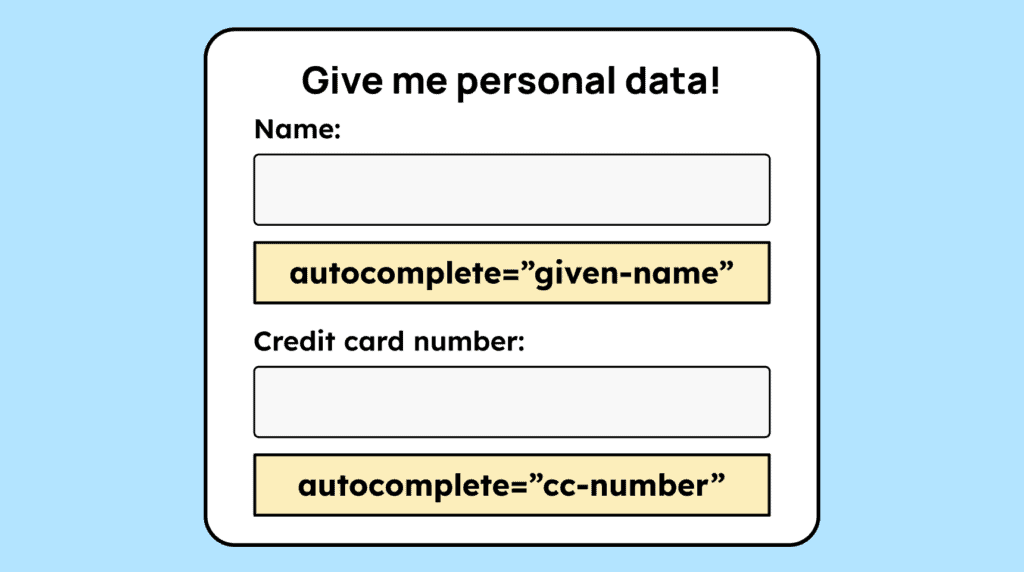
When users need to enter personal data, such as name, address, or password, form fields must have the correct autocomplete attribute. For example, for the »first name« field you should use: autocomplete=”given-name”.
A website must also be accessible for people with color vision deficiencies. If information is conveyed only through color (for example, a green dot = active, red = inactive), additional graphical elements or text must be provided.

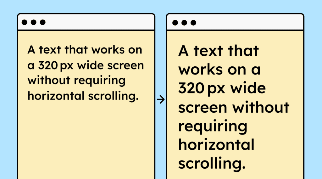
A website must function correctly at a width of 320 px (or 400% zoom at 1280 px), ensuring that all content and functionality are preserved and text doesn’t require horizontal or vertical scrolling.
All graphical elements that are interactive (e.g., icon buttons) or important for understanding must have a minimum contrast of 3:1 with the background.

If users increase line height, paragraph spacing, letter spacing, or word spacing, the text must remain fully visible and legible, without being cut off or obscured.
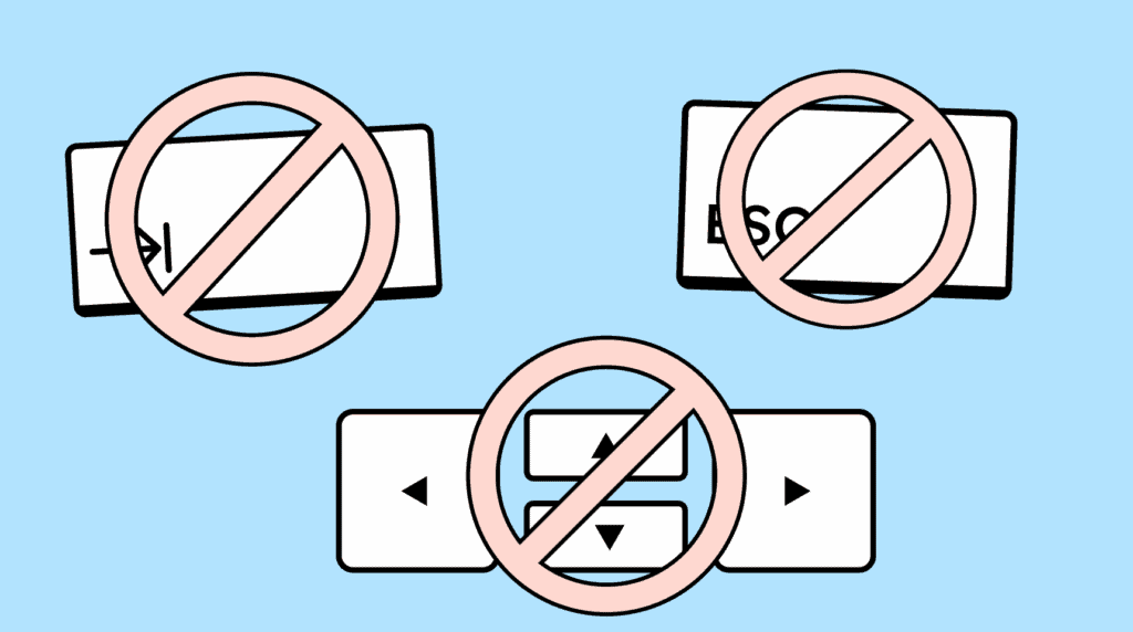
Elements that appear on focus or hover, such as submenus, should be closable using the ESC key. They must not close automatically after a set time or while the mouse is hovering over them.

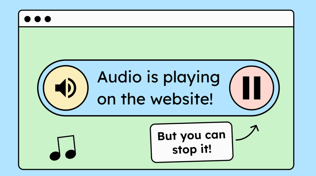
If your website automatically plays audio for more than three seconds, a way to stop or mute the sound must be provided.
All text, including body text, labels, and placeholders, must have sufficient contrast with the background. The minimum contrast ratio is 4.5:1 for text smaller than 24px and 3:1 for text 24px or larger.

Users must be able to zoom in up to 200% without text or other content being hidden, and all essential website functions must remain fully operable.
Important information shouldn’t be presented solely as text within images. Users can’t adjust this text to their needs, and assistive technologies cannot read it.

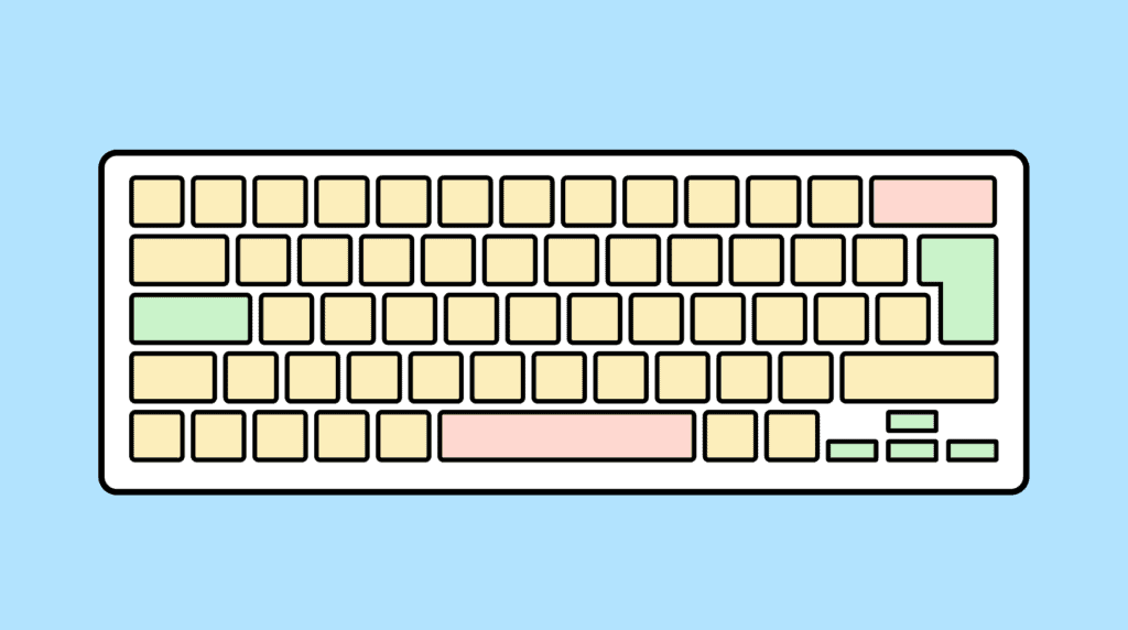
A website must be fully operable with a keyboard. All content should be accessible, and all essential functions must be usable without a mouse.
If an element can receive keyboard focus, it must also be possible to move the focus away using the keyboard. Users should be able to exit the element with Tab, arrow keys, ESC, or Enter.
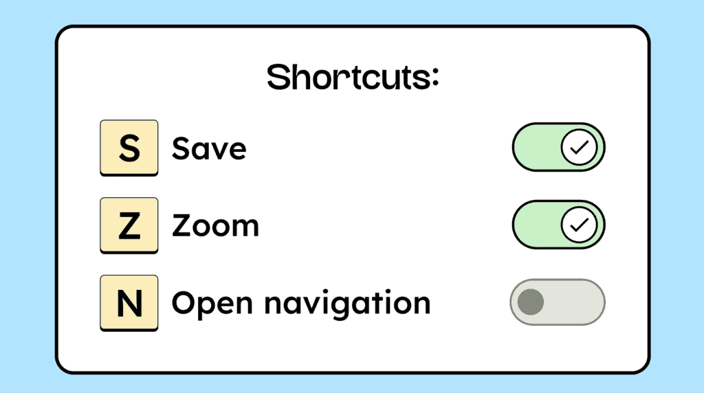
If your website uses single-character keyboard shortcuts (letters, numbers, or special characters), they should be customizable or able to be disabled.
Time limits on a page must be adjustable or turnable off. Users shouldn’t be logged out automatically without a warning or the option to extend the time.

Automatically starting animations lasting longer than 5 seconds must be pausable, stoppable, or able to be hidden.

A website should not include elements that flash more than three times per second, such as rapidly blinking GIFs or flickering videos. Flashing elements that are small enough (around 148×148 px) are considered acceptable.

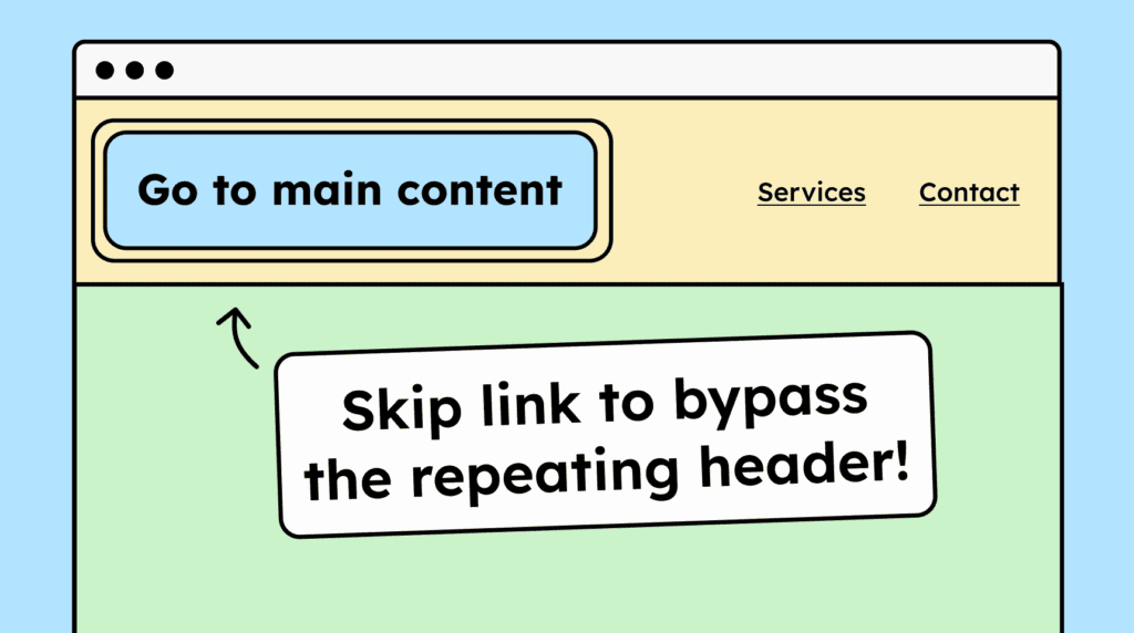
A website must allow users to skip repetitive sections, such as headers and footers. This can be achieved using hidden skip links or HTML landmarks.
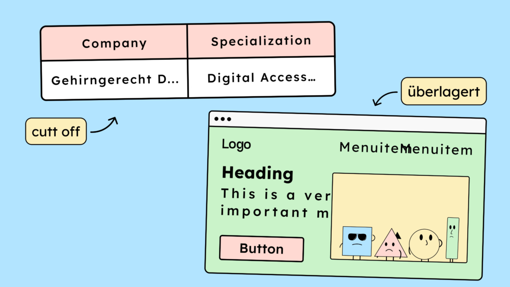
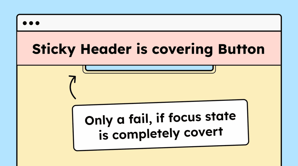
Interactive elements must not be fully covered by other content when focused via the keyboard. For example, sticky headers, dropdown menus, or dialogs shouldn’t entirely obscure the focused element.
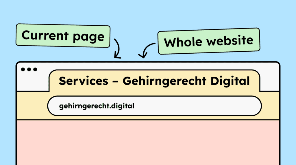
Each subpage must have a meaningful HTML title that can be easily identified in the browser. The title should include both the page name and the website name.
Users must be able to navigate a website’s content using the keyboard (Tab key) in a logical order. The tab order should generally follow the visual layout.

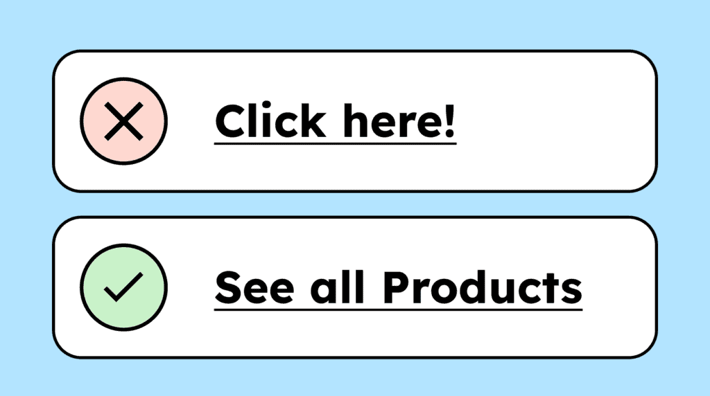
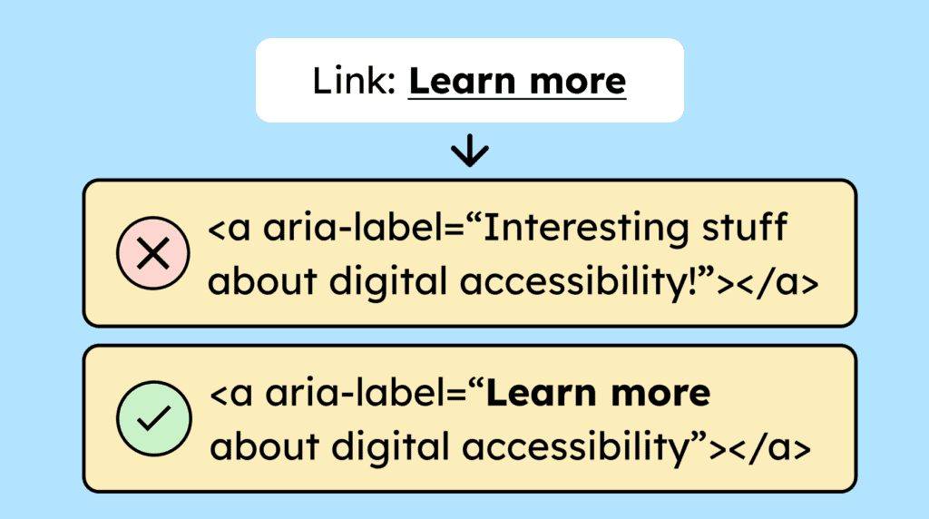
Link text should be meaningful on its own. Vague links like “Learn more” are acceptable only if the surrounding context, such as a preceding heading or a <p> tag, provides enough information about the link’s destination.
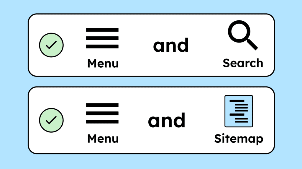
Subpages of your website must be accessible in multiple ways. In addition to navigation menus, provide options such as a search function or a sitemap.
Headings must clearly describe the content or purpose of the sections that follow. Similarly, form field labels must clearly indicate what information should be entered.
Interactive elements, such as buttons and links, must have a visible focus state. A recommended approach is a two-colored focus outline, with white and black lines, ensuring it is clearly visible on all backgrounds.

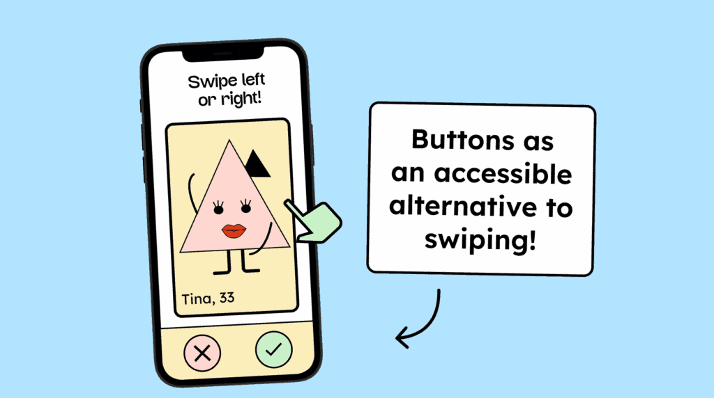
Every function on a website must be operable with a simple input. More complex gestures, like swiping or multi-finger actions, must have an alternative that can be activated with a single-pointer action, such as a clickable button.
Pressing and holding a button or link, with a mouse or finger, must not trigger an action immediately. The action should only occur on release, allowing it to be canceled if needed.

If hidden text is used to provide more detailed descriptions for links, buttons, or form fields, the visible text must be included in the hidden text, ideally starting in the same way.
Functions triggered by device motion must also be operable with a simple input, such as a click, touch, or Enter key. Additionally, users must be able to disable motion-based activation.
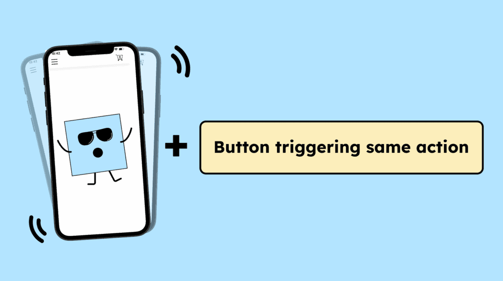
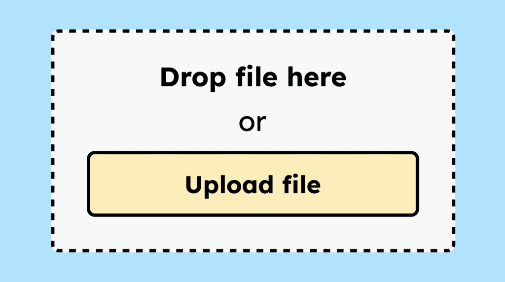
If functions on a website can only be triggered via drag-and-drop gestures, they must have an alternative that can be activated with a single-pointer action, such as a clickable button.
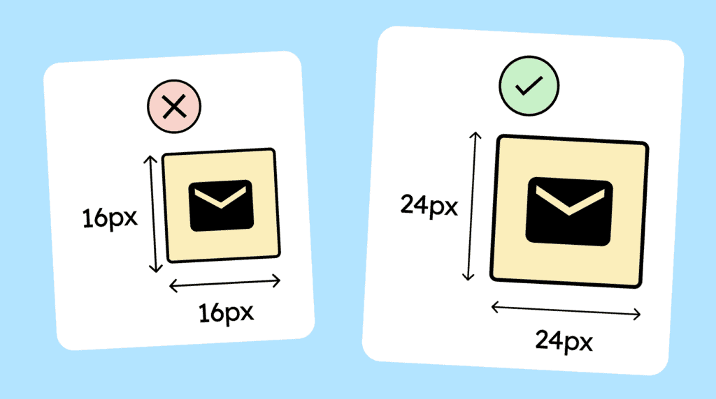
Interactive elements, such as buttons or links, must have a clickable area of at least 24 × 24 px that does not overlap with the clickable area of other elements.
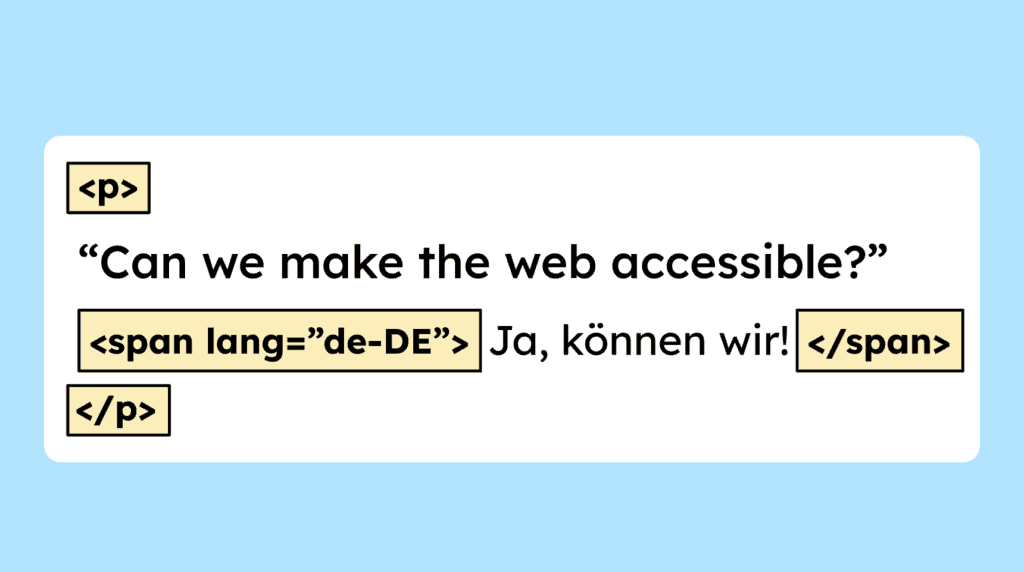
The <html> tag must include a »lang« attribute specifying the page’s language. This helps assistive technologies render the page correctly and supports automatic browser translation.

If a website includes sentences, phrases, quotes, or similar content in a different language, that text must be marked with the »lang« attribute and the appropriate language code.
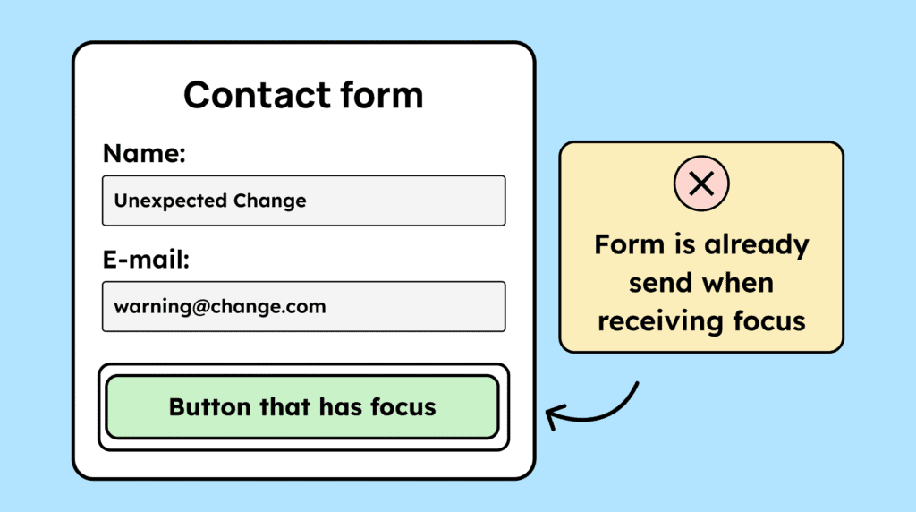
Setting keyboard focus on an element must not trigger any unexpected action. Functions should only be executed through an explicit action, such as pressing Enter or clicking with a mouse.
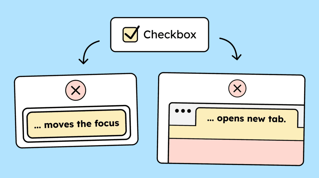
Interacting with a form element, such as a checkbox, must not cause an unexpected change in context, like a shift in keyboard focus. Context changes are allowed only if the user has been warned in advance.
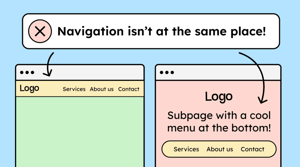
The navigation elements on your website, such as menus, breadcrumbs, and search, must consistently be located in the same place to make navigation between subpages easier.
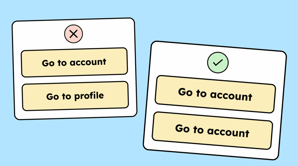
The labeling of interactive elements, such as links, buttons, and form fields, must be consistent across subpages when they perform the same function. Their appearance should also remain consistent.
If a website provides help, it should be easy to find and consistently located on all subpages. Help can include elements such as chatbot or simple contact information in the footer.

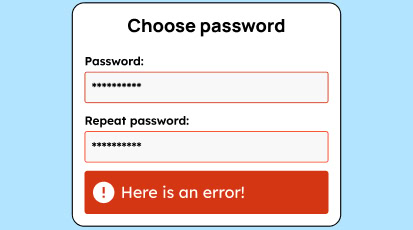
If errors occur on a website, they should be easy to identify and not indicated by color alone. Text describing the error must also be provided.
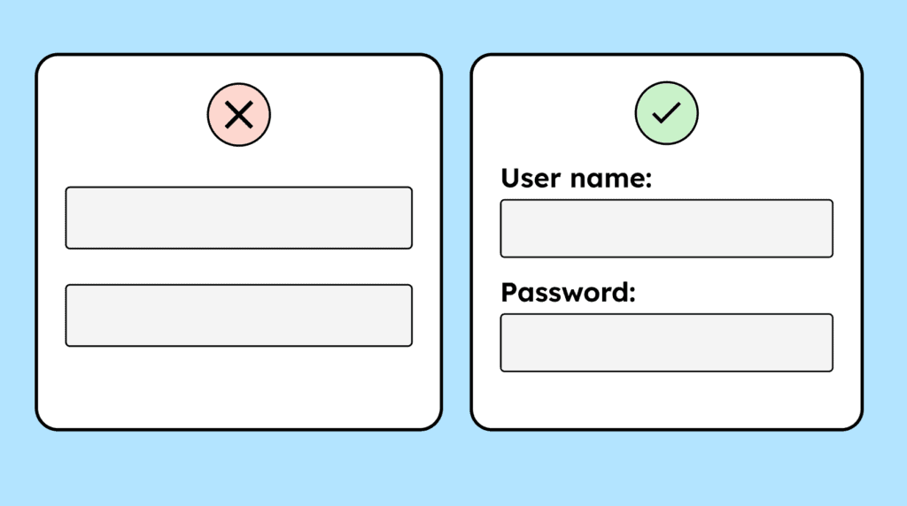
Form fields should include a clearly visible label, ideally using the <label> tag. This label should always remain visible and not disappear. Placeholder text by itself is not an adequate substitute for a proper label.
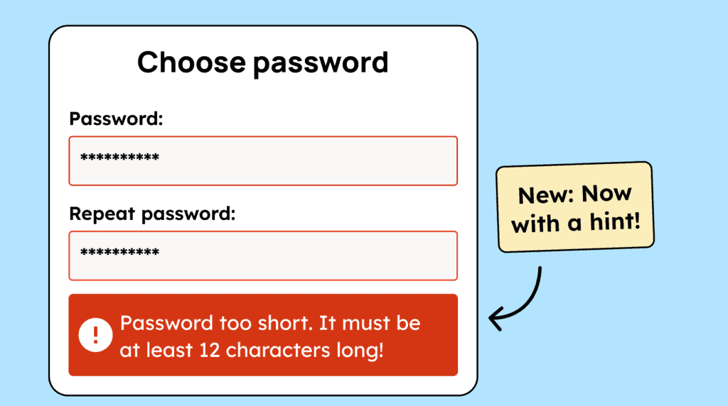
Error messages should be as specific as possible, providing clear guidance to help users understand and fix the issue.
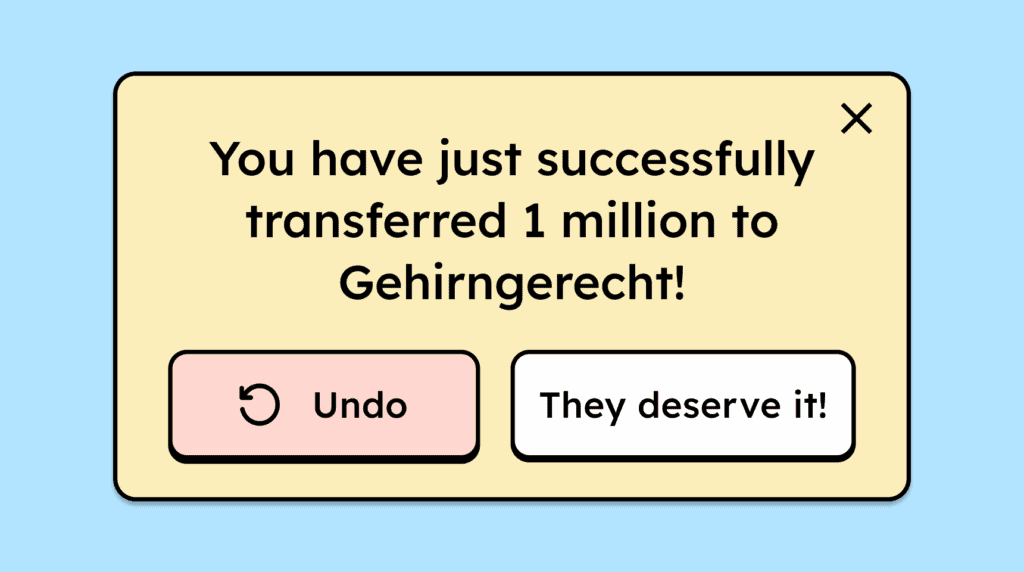
To prevent errors during important interactions or transactions, users should have the opportunity to review their data before sending. Alternatively, they should be able to confirm the action again or have the option to undo it.
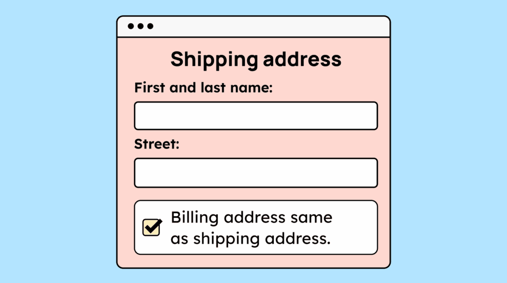
Users should only need to enter their data once. If the same information is required again, the website should automatically populate it or make it easy to reuse (for example, using the delivery address as the billing address).
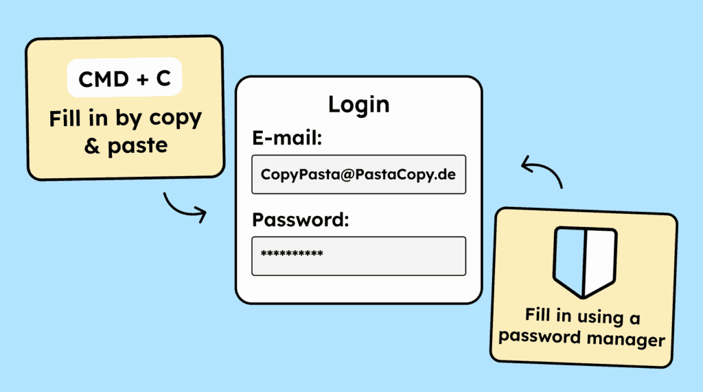
When users need to verify their identity, the process should be smooth and not feel like a test of their memory or mental effort. Copying and pasting information, as well as using password managers, should work seamlessly.
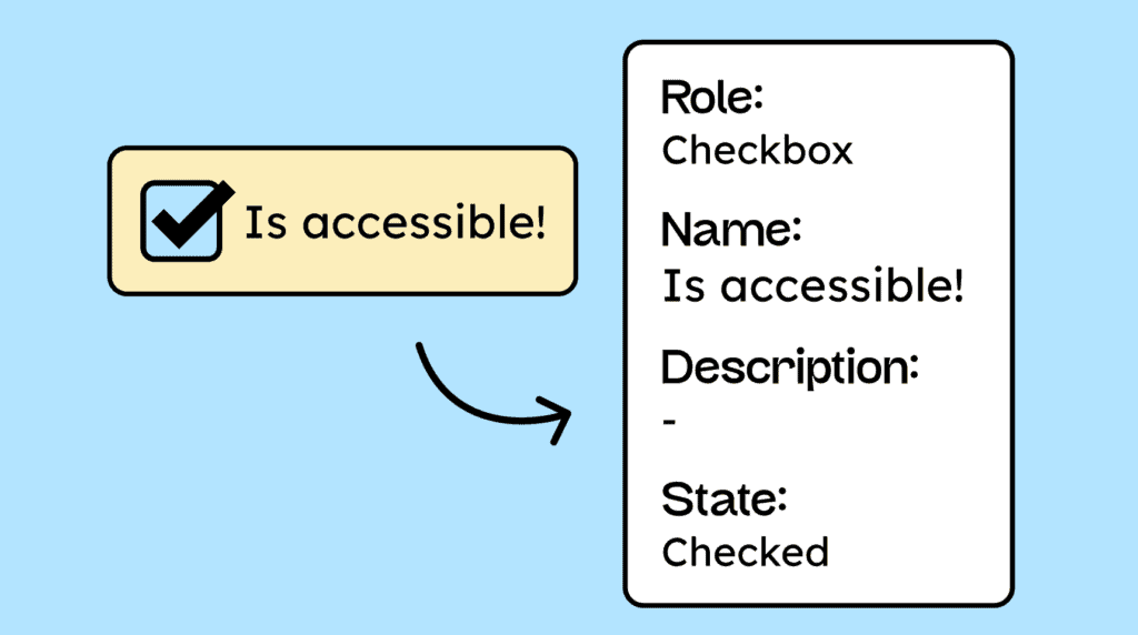
All interactive elements on a website must be coded in a way that allows assistive technologies to identify their name, role, and current value. Any changes to these attributes should also be communicated.
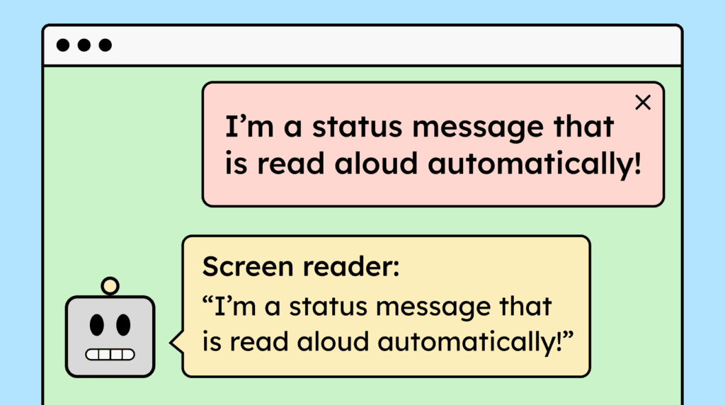
When websites display status messages or notifications, they should be automatically announced by screen readers without shifting the user’s focus. This can be achieved using ARIA live regions.
You are currently viewing a placeholder content from Google Maps. To access the actual content, click the button below. Please note that doing so will share data with third-party providers.
More InformationYou are currently viewing a placeholder content from Facebook. To access the actual content, click the button below. Please note that doing so will share data with third-party providers.
More InformationYou need to load content from reCAPTCHA to submit the form. Please note that doing so will share data with third-party providers.
More InformationYou need to load content from Turnstile to submit the form. Please note that doing so will share data with third-party providers.
More InformationYou are currently viewing a placeholder content from Facebook. To access the actual content, click the button below. Please note that doing so will share data with third-party providers.
More InformationYou are currently viewing a placeholder content from Instagram. To access the actual content, click the button below. Please note that doing so will share data with third-party providers.
More InformationYou are currently viewing a placeholder content from X. To access the actual content, click the button below. Please note that doing so will share data with third-party providers.
More Information