WCAG 1.4.10: Reflow
Back to all WCAG criteriaOVERVIEW
What's it about?
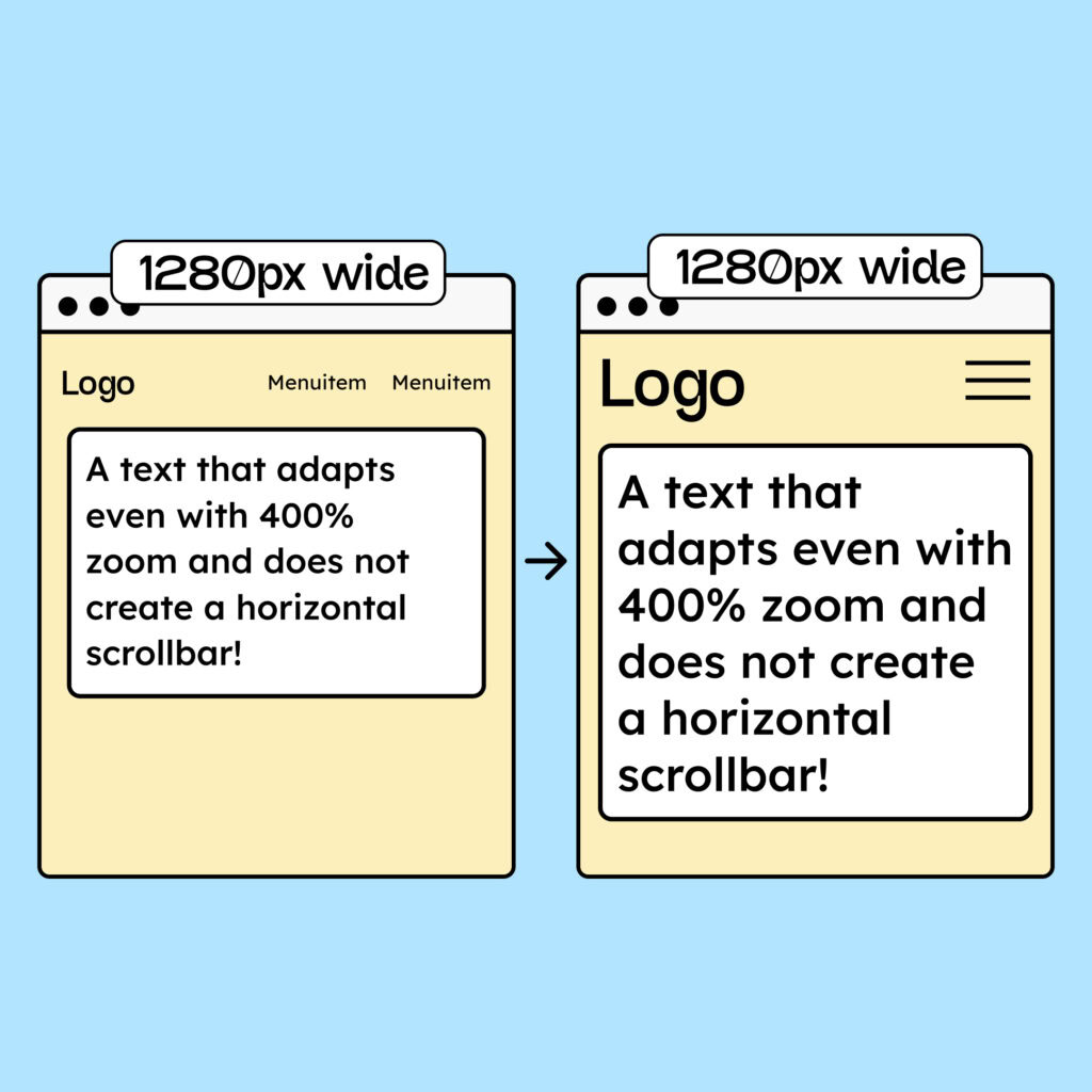
Content should be designed so that users only have to scroll in one direction to read it. On smartphones, this applies to the following widths:
-
320 pixels for content that scrolls vertically (up and down)
-
256 pixels for content that scrolls horizontally (left and right)
These two measurements were chosen because they are very common viewport widths.
On a desktop browser with a 1280-px-wide monitor, zoomed to 400%, the viewport width is approximately 320 px. This is why the criterion is often referred to as 400% zoom.
However, testers check both variants (desktop at 400% zoom and smartphone view at 320 px width without zoom), and only one of them needs to be met.

How to
Depending on your situation, you can implement one of the following options to meet the criterion. For a deeper dive, please refer to the linked WCAG techniques.
Make websites responsive
HTML and CSS provide all the tools needed to display content correctly on all screen sizes.
With Flexbox, Grid, and Media Queries, you can define how content breaks on different viewports.
A well-designed website normally has no issues with horizontal scrolling on smartphone views.

Make text wrap correctly
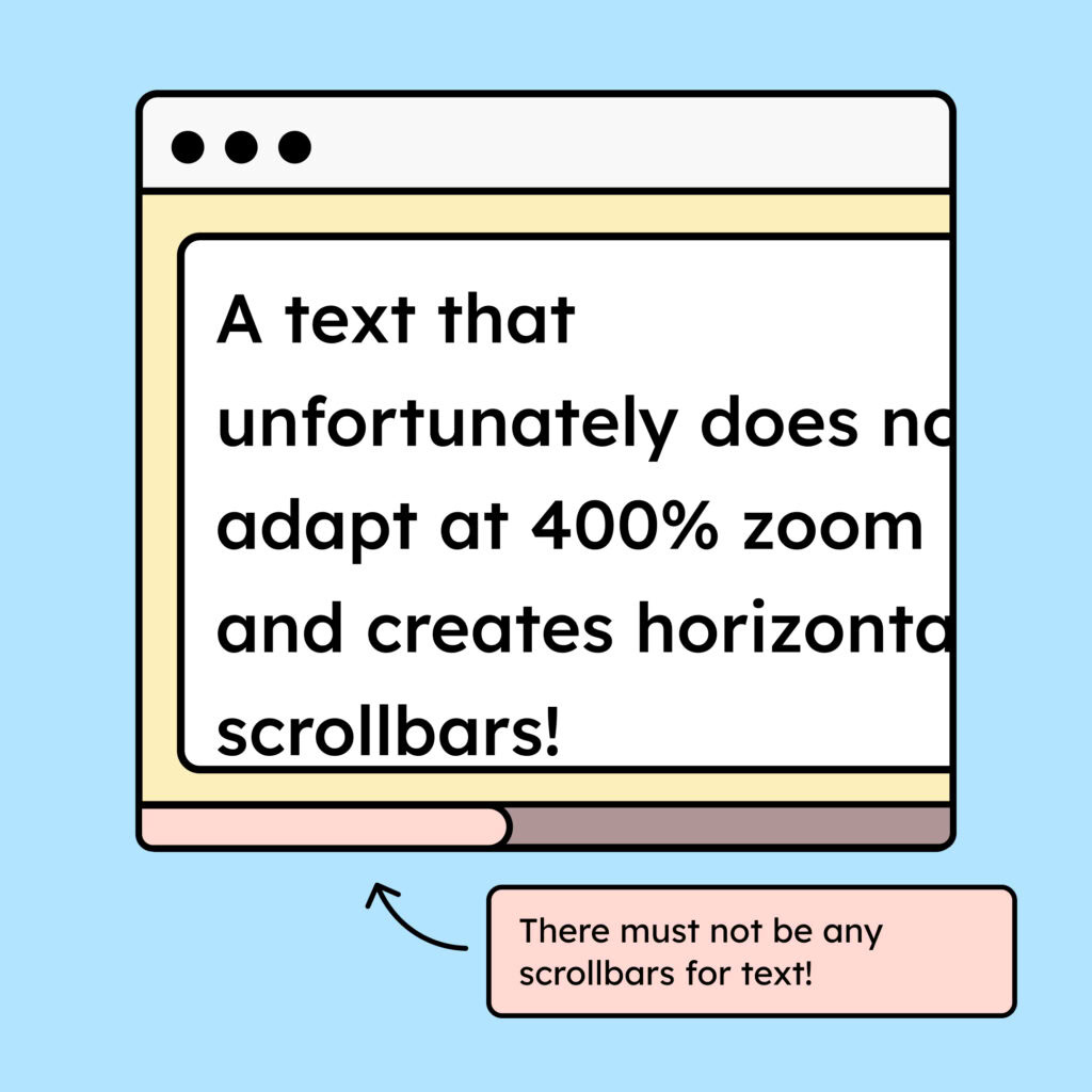
A common problem is long words that don’t wrap properly, causing a horizontal scrollbar on smaller views.
To avoid this, you can use the CSS property
word-wrap: break-word;.This may not always break a word at the perfect position, but it prevents the entire layout from breaking.
Notes
Exception: Content that cannot wrap
There is content that simply cannot wrap. This includes videos, photos, or tables. In these cases, it is acceptable if horizontal scrolling is needed to view the full content.
Sometimes a fixed layout is also important for understanding—for example, when comments need to be displayed directly next to a text (as in Google Docs).

Exception: Open select elements
It is okay if, when zoomed in, the contents of open dropdowns are cut off and you need to scroll in order to read them. You have very little control over how a native select-Element behaves, so in some cases it simply cannot be avoided.

Accessible development?
Our workshop for developers!
Learn everything you need to know in our workshop to build accessible websites!

Learn accessibility with us?
Looking to implement WCAG best practices in your design, development, or content workflow? Book a workshop for your team or contact us directly to learn more.