WCAG 1.4.3: Contrast (Minimum)
Back to all WCAG criteriaOVERVIEW
What's it about?
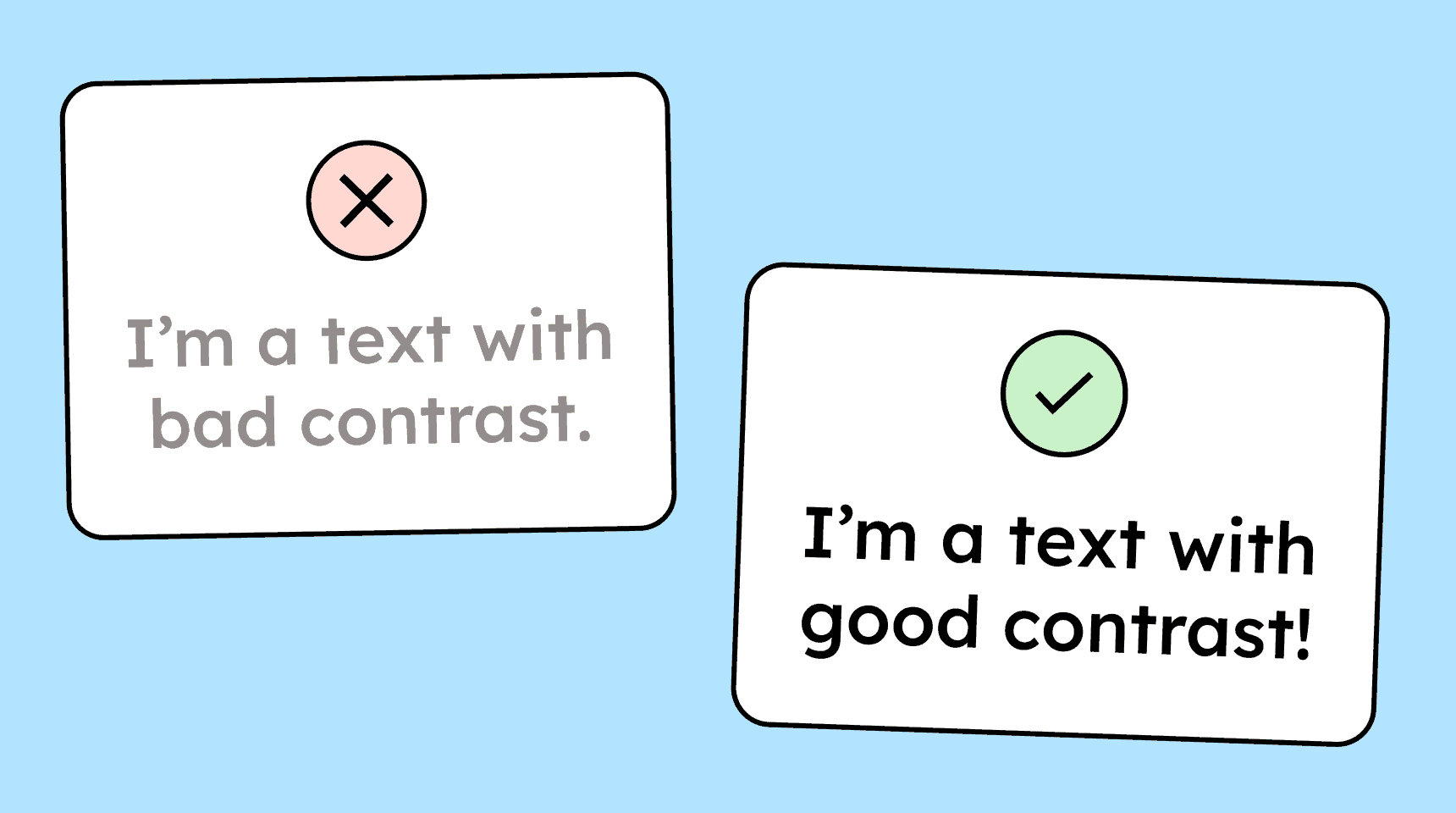
All text on a website must have sufficient contrast against the background. This applies to body text, button labels, and placeholder text in form fields.
How to
Depending on your situation, you can implement one of the following options to meet the criterion. For a deeper dive, please refer to the linked WCAG techniques.
Text follows the correct contrast requirements
The following applies to text contrast:
-
Text smaller than 24 pixels requires a contrast ratio of 4.5:1 against the background
-
For text larger than 24 pixels, a contrast ratio of 3:1 is sufficient
-
And for text larger than 18.5 pixels and bold, 3:1 is also sufficient
To determine contrast ratios, you can use contrast checkers. There are websites and browser plug-ins for this (install a contrast checker), and modern design tools like Figma also have contrast checkers built in.

-

Create accessible designs?
Our workshop for designers!
Learn everything you need to know as a designer to create accessible design systems for digital products and entire brands.

Learn accessibility with us?
Looking to implement WCAG best practices in your design, development, or content workflow? Book a workshop for your team or contact us directly to learn more.