What exactly is a link?
In HTML, links are <a>marked up with the `<link>` element. This element is intended to link resources together, for example, to redirect users to another page. To transform text into a clickable and keyboard-operated link, the ` <a><link>` element additionally needs the href`target` attribute. This attribute contains the link’s target, such as another web page.
A correct link might look like this, for example:
<a href=”https://Website.de/Product overview”>To the product overview</a>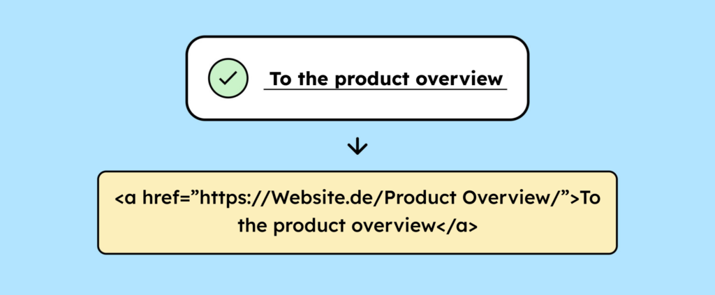
Make sure your links are implemented correctly from a technical standpoint. Mistakes often occur in practice, especially when distinguishing between links and buttons. Our article “Accessibility in Focus: Buttons and Links Compared” explains why this is problematic.
Links simply consist of link text.
First, let’s look at what you need to consider when choosing your link text.
Visibility & Contrast
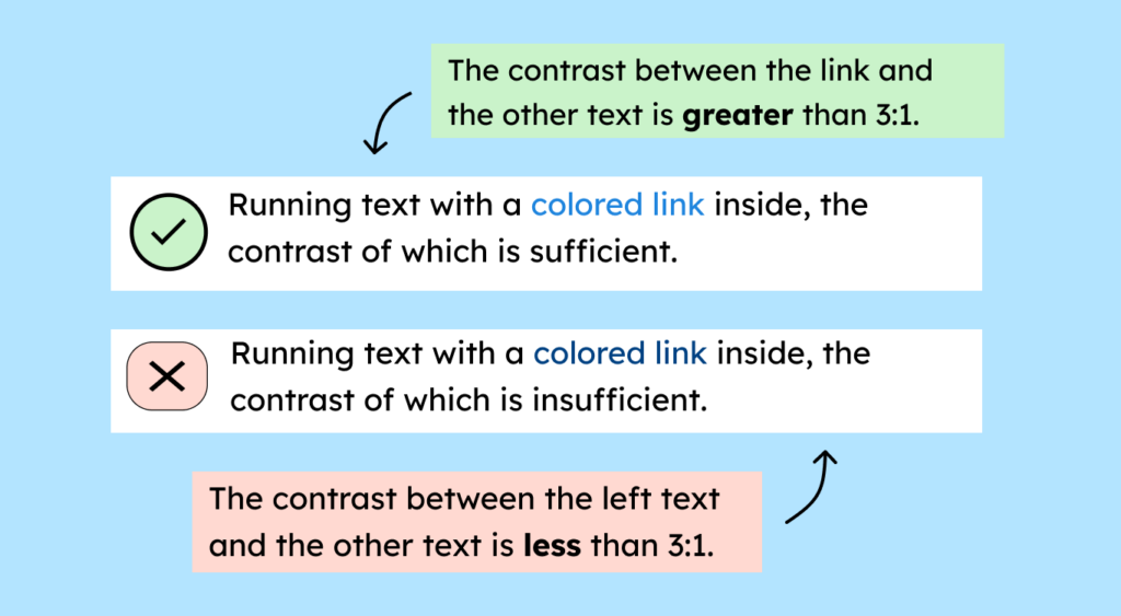
Link text is essentially just text and must adhere to the text contrast requirement. In most cases, this means a 4.5:1 ratio to the background.
You also want people to click your links. For this to work, the links need to stand out from the surrounding text. The most reliable way to do this is with an underline. If the underline is a different color than the link text, it must itself have a contrast of at least 3:1 with the background.
Less obvious, but also acceptable: Link text is distinguished from its surroundings by color. Color alone is never sufficient, so an additional feature is always necessary, such as contrast. This means the link should have a contrast ratio of at least 3:1 to the body text. You are free to choose this additional feature. The important thing is to ensure it is distinguishable: If you use bold text, make sure you use it only for links, not for regular text.
Label clearly
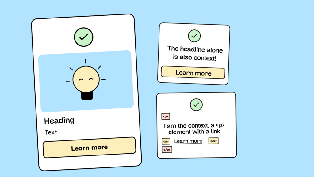
Links should be labeled so that it’s immediately clear where they lead. Link texts like “Home,” “Legal Notice,” or “Privacy Policy” are good choices. You know right away what to expect from these links. “Here,” “Learn More,” or “Details” are not good link texts because context is needed to understand the link’s destination or purpose.
It’s not the best user experience, but it’s permitted under WCAG if the link’s purpose is clear from the immediate context. The only important thing is that the context is correctly defined in the code so that screen readers can recognize it and users understand what they’ll learn more about when they click the link.
Context could include, for example:
- A heading before the link
- A text in the same paragraph
- The text of the list item (if the link is part of a list)
- The content of the table cell and associated column or row headings (e.g., in td and th)
- Additional text hidden via CSS
- The alternative text of an image that is contained in the same link element (<a>).
- An aria-label or aria-labelledby
You can find more information in criterion 2.2.4 Link texts in context (German).
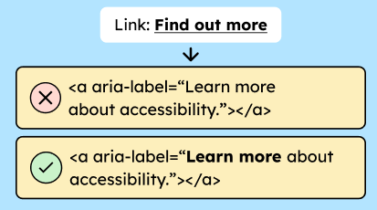
Sometimes, for space or design reasons, the visible link text needs to be short. In such cases, you can aria-labelextend the name with a hidden text that is only visible to screen readers.
Example extension via aria-label:
<a href=”https://...” aria-label=”Learn more about accessibility”>Learn more</a>Example of extending the text via hidden text:
<a href=”https://...” aria-labelledby=”visible-lbl hidden-lbl”> <span id=”visible-lbl”>Learn more/span> <span id=”hidden-lbl” hidden>über Accessibility</span> </a>This keeps the page visually uncluttered while ensuring everyone gets the necessary information. It’s important that the extension includes the visible text and also meaningfully complements it. There’s a specific WCAG criterion for this: 2.5.3 Label in the name.
PS: Best practice is to put the visible text at the beginning and append the extension at the end.
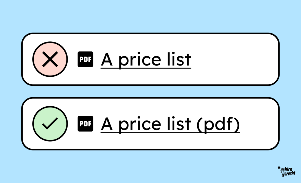
Icons that are part of a link and contain information not included in the link text must have an alternative.
For example, you have a link that includes a PDF icon and the text “A price list”. The format information “PDF” is not included in the link text. Therefore, the icon is the sole source of information, and you must specify the format in a way that everyone can understand. For example, by adding the following to the link text: “A price list (PDF)”.
Images are used as links.
A link is not always just text; often, images or icons are also used as links.
Visibility & Contrast
Images and icons used as links are often, for example, the logo linking to the homepage or an arrow symbol to navigate to the next page. Linked graphics must be clearly recognizable and sufficiently distinguishable from the background. The contrast should be at least 3:1.
While a visual change on hover is not mandatory, we still recommend it. This makes it easier for more users to recognize that the element is clickable – for example, through shading, a border, or a color change.
Everything you need to know about creating accessible content!
- What types of content actually need to be accessible: social media, websites, newsletters?
- What requirements apply to content, and how do you implement them—without missing anything?
- How do you integrate accessibility into your daily workflow without it becoming a major extra burden?
Through theory and practice, we’ll show you what we’ve taught participants—from Aktion Mensch to Deutsche Bahn—over the past three years!

Label clearly
Screen readers don’t see with their eyes, so images and icons need to be clearly labeled. Ideally, you should combine icons with visible text. You can learn more about icons in our article Accessible Icons: A Guide for Designers.
Images as <img>
When <img>displaying images using a `<img>` element, you can altuse the `alt` attribute. The content of the alt`alt` attribute should describe what is shown in the image and where the link leads. For example: “Product image: FlotterRoppelt sneakers, linked to the product details page.” You can learn more about alt text in our article: Alt Text: Your Images for Everyone.
Other formats such as <svg>
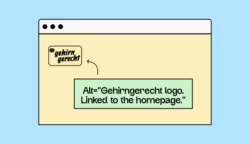
If you use other HTML tags, such as the `<div> ` element, to display, for example, a download arrow or a magnifying glass icon for a search function, you also need a text alternative. Here , ` <div>` or a textual description that is visually hidden via CSS <svg>is suitable .aria-labelaria-labelledby
A good example is our logo with the following alternative: “Brain-friendly logo. Links to the homepage. This makes it clear that it is a logo, which logo is being shown exactly, and that clicking on it leads to the homepage.
Complex or compound link elements (e.g., cards)
For more complex link elements like cards – clickable boxes with an image, heading, and text – it’s crucial to know exactly which element is linked. The contrast requirements for text and images that are links apply as previously described.
Ideally, you should only use the heading as a link and choose clear link text for it. However, you can still make the entire card clickable using CSS tricks. Our article “Creating Accessible Cards – A Step-by-Step Guide” shows you how.
That’s also okay, but it’s harder to understand if you <a>nest the entire map in a `<map>` element. The reason: Every link needs an accessible name , a label that screen readers can read aloud. For example, if you link an image with alt text, that text will be read aloud – the link then has a clear name.
However, if you link the entire card, this name will be automatically generated from all visible content: image, title, text, and everything else that appears in your cards. This can quickly become long, cluttered, or even confusing.
Support for assistive technologies
Now that we’ve clarified what a link can be, let’s briefly look at assistive technologies such as screen readers and keyboard accessibility.
For a link to function barrier-free, it must be correctly created in the code using the ` <a><link>` element and a valid href`–interactive` attribute. Only then does it become an interactive element that can be recognized by screen readers and operated with the keyboard. This means users can navigate the link using the Tab key and activate it with the Enter key.
If this is missing hrefor if a different HTML element is used instead (e.g. a styled <a> <div>), the screen reader and keyboard do not recognize the content as a link – and many users cannot use it.
It’s also important that the focus state of the link is clearly visible when navigating with the keyboard – for example, by a border. This way, keyboard users can also see where they are. More information can be found in WCAG criterion 2.4.7: Focus Visible.
Summary
- Links should always be marked with the `
<a><link>` element and a valid `<link>href` attribute – only then are they accessible. - For link text to be recognizable, it needs a clear visual identifier – e.g., underlining, color, or bolding.
- Colored link text needs sufficient contrast to the body text (3:1) and the background (4.5:1).
- Link texts should be formulated so that their purpose is clear – ideally without additional contextual information.
- Images and icons may also be used as links, but they must then have a meaningful text alternative.
- Complex link elements such as cards must be easily accessible both visually and technically – different requirements apply depending on the structure.
- Screen reader and keyboard users rely on correctly marked links – otherwise, they cannot recognize and use them.
