
What’s the problem with cards?
The problem with traditional overview cards and digital accessibility is that the cards are often not optimized for screen readers.
Users of screen readers, therefore, face several problems:
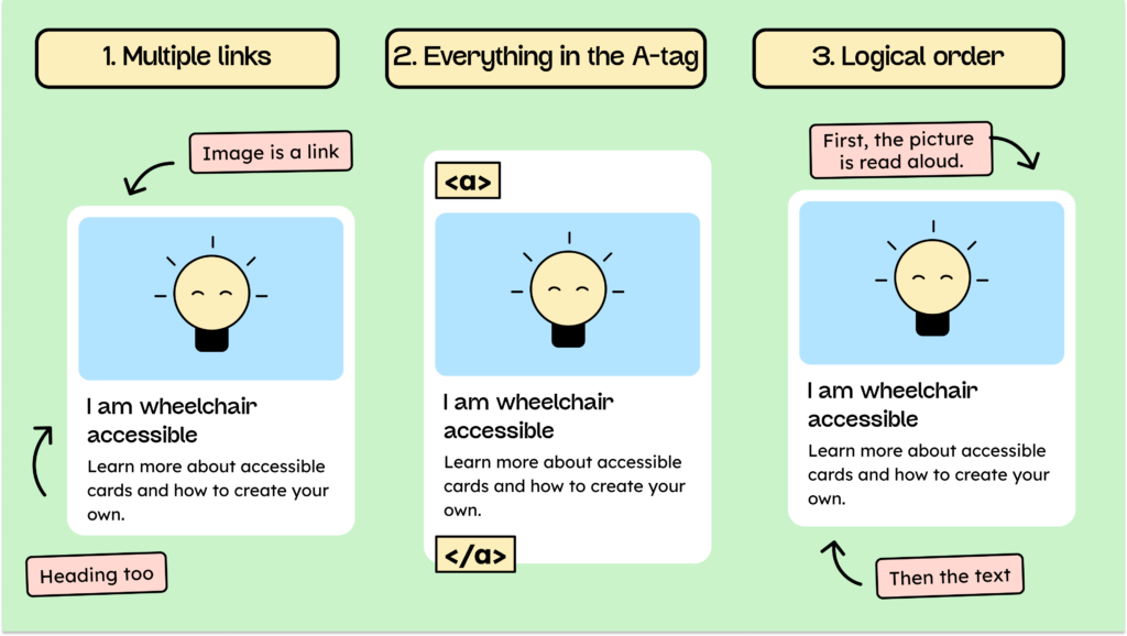
- The cards contain multiple links that point to the same destination.
- The cards are wrapped in a complete tag, so they read the content aloud all at once.
- The cards are not arranged in the correct logical order.
We will briefly discuss these points in detail.
The cards contain multiple links that point to the same destination.
Many cards are implemented in such a way that when you navigate to them using the tab navigation, often only parts of the card, not the entire card, are focused. Several parts of the card include links that point to the same URL (for example, the blog post). There might be a link to the image, then the headline, and then perhaps even a “Read more” link.
Screen reader users often request a list of links from a page when navigating it. This list enumerates all the links visible on the page. Having the same link three times, all pointing to the same destination, can be frustrating, especially if this applies to every card.
Cards are wrapped in a complete tag, so they read the entire content aloud at once.
To make an entire card clickable, a common method is to wrap the card’s entire content in a link. However, this is:
- not a very clean HTML structure and
- makes reading the cards a nightmare for screen reader users
If all the content is placed within an a tag, the screen reader will read it aloud as soon as you navigate to that card using the Tab key. This means it will read the image (if it has alt text), the heading, the description, and everything else contained within that a tag.
This is not a good user experience. The user has no way to navigate the card or have the content read aloud individually.
The cards are not arranged in the correct logical order.
The third problem is that cards require a slightly different logical order for screen readers. For sighted people who can perceive a card visually, it is familiar and helpful to see the image first, then the title, and then the description.
If we can’t perceive the card visually, what is the most important element? How do I immediately understand what it’s about? By having the image read to me? Probably not. It makes much more sense if I first hear the blog’s headline or the product title.
Therefore, cards for screen readers must be structured so that the title is read aloud first, followed by the description, then the image. (I’ll show you how we do this without changing the visual order below.)
Note: The correct order can be crucial and may result in failing the WCAG logical order criterion. Testers might argue that the visible order is confusing. If your card is structured like this—image, title, description—then the second card starts with another image. This can be confusing because a screen reader user might think that the image on card two belongs to the title and text of card one.
So how do I create accessible cards?
Now we’re getting down to business; we’re optimizing our card to solve all the problems just mentioned!
The Basic framework
First of all, we want to create the basic structure of our card for you:
<li>
   <article class="card">
      <div>
        <img alt="Image description">image</img>
      </div>
      <div>
        <h3>Heading</h3>
        <p>Brief description of the article</p>
      </div>
   </article>
</li>
Our card is surrounded by a li tag. Why? Because a blog overview is simply a list that links to various blog posts. A list is helpful for screen readers because, among other things, it lets them know how many items to expect.
Then our actual card begins with an article tag. We use an article tag for the correct semantics. A blog overview is a list of elements that could theoretically appear on any page, regardless of its context. That’s why an article tag is well-suited here.
The rest should look very familiar. This is followed by a div containing an image and another div with a heading and a description.
How do we make the card clickable?
Now that the basic structure is in place, the question arises: But where is the link? How can I click to get to the blog?
First, we need to consider:
- What is the link?
- What should be clickable?
Since we want to avoid having more than one link in the card, we need to decide which element should be the link. Normally, the most important element, and what a screen reader should read first, is the heading. Therefore, we will make the heading our link.
<h3>
   <a href="...">Heading</a>
</h3>
We now have a link, but we don’t want only the heading to be clickable. Ideally, we’d like users to be able to click on the entire map to reach their destination.
We achieve this with a small CSS trick: We make our clickable link so large that it fills the entire card. We do this by adding a pseudo-element (: before) to our a tag to create an absolute, invisible, and clickable area.
.card h3 a::before {
   content: '';
   position: absolute;
   inset: 0;
   z-index: 1;
}
Anyone who has used a pseudo-element before knows that we always need a content property. In our case, however, this property has no content. The “inset” property ensures that the clickable area also fills the entire surrounding container.
To make sure all of this works, we need to do one more thing: set our card to “position: relative”.
.card { position: relative }How do we indicate the correct focus?
Our card is now clickable! However, we still have one problem. Currently, our card doesn’t have a focus frame, but it does have our title. We don’t want that. We want the entire card to receive focus when we select it with the screen reader.
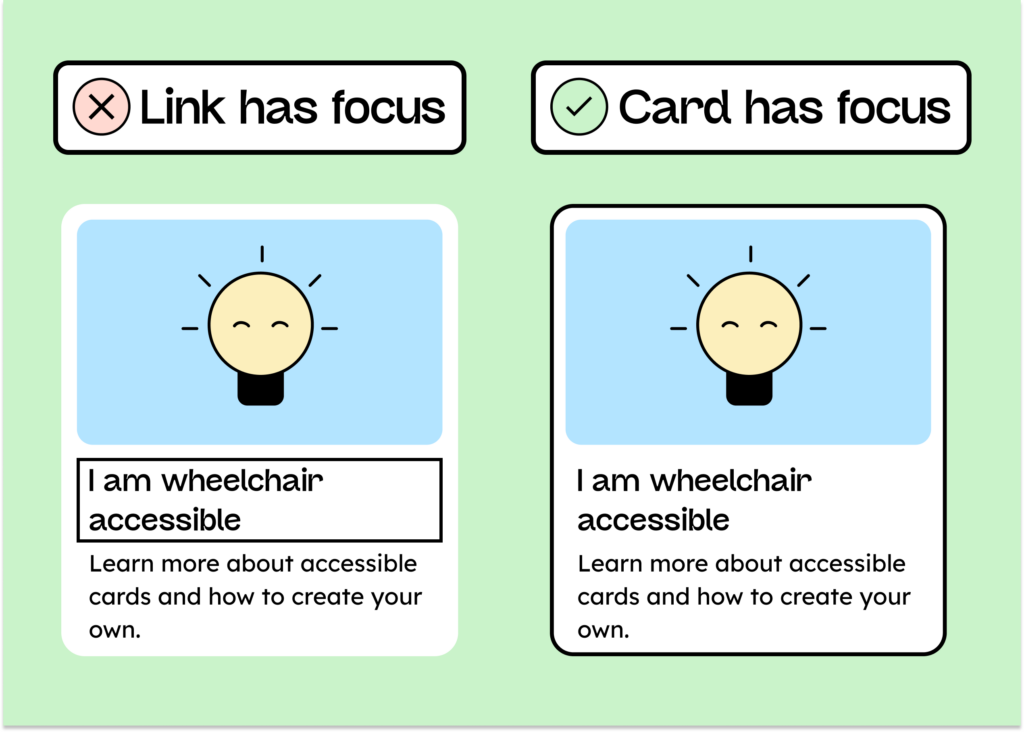
First, let’s focus on the card:
.card:focus-within {
box-shadow: 0 0 0 0 4px black;
}
The CSS pseudo-class :focus-within ensures that the element is focused when one of its child elements receives focus (the <a> tag in our case).
Finally, we want the focus around the heading to disappear when we focus on it, leaving only the card itself visible.
.card:focus-within :focus {
   box-shadow: none;
   outline: none;
   border: none;
}
Normally, we know how we implemented our focus frame. If we don’t know, or simply want to be on the safe side, we set all three properties (box-shadow and so on) to none.
How do we arrange the cards in a logical order?
Finally, you only need to do one more small thing: change the order of the elements in the card. We don’t want screen reader users to read the image first, then the headline, and the text. We want the headline to be read first when the focus is on it, followed by the text below, and finally the image.
You can actually achieve this quite easily by:
- Place the image at the end of the card.
- Turn our card into a Flexblox
- Reverse the order of the elements
<li>
  <article class="card">
    <div>
      <h3>Heading</h3>
      <p>Brief description of the article</p>
    </div>
    <div class="card__img-wrapper">
      <img alt="Image description">Image</img>
    </div>
   </article>
</li>
First, we moved the image to the bottom of the code. Now we’ll create a flexbox from the card:
.card {
  display: flex;
  flex-direction: column;
}
And finally, we reverse the order:
.card__img-wrapper {
order: -1;
}
That’s it! Your card is now accessible! Pat yourself on the back – and then share our post! (Thanks!)
A secret tip for creating accessible cards with WordPress
If you’re using WordPress and, ideally, the Bricks builder, you can add AutomaticCSS. AutomaticCSS includes many extremely useful helper classes that make your life easier, especially for digital accessibility. For example, we have the two classes “focus-parent” and “clickable-parent” that automate all the code above!
Creating a conclusion on accessible cards
Cards are among the most frequently used UI elements on a website. And as you’ve just seen, implementing accessible cards isn’t difficult. With a few tricks, you can make your cards more accessible to everyone and also make your HTML a bit cleaner!
You might also be interested in:
Accessibility in your online shop – here’s how to do it!
