For digital accessibility, you need to think about even the smallest elements on your website or in your app from the very beginning – especially if users are supposed to interact with them.
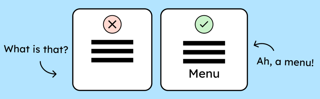
Labeled icons are easier to understand!
To make icons accessible, you need to label them. Not everyone grew up with the internet and understands what an icon means without an explanation. The older generation, in particular, often struggles with this. Where possible, add text to your icons to explain them. For example, label your menu icon with the word “Menu”.
If you want to learn more, this article might be for you: Good UI/UX for older people.
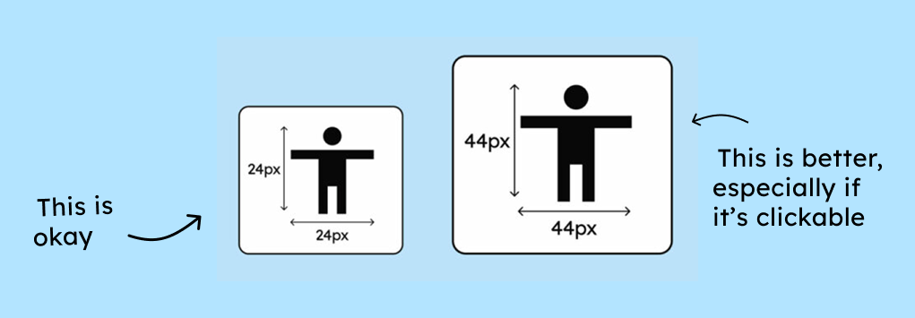
Size does matter!
According to WCAG AA, every control should have a minimum clickable area of 24 × 24 pixels. The clickable area is the area that can be clicked without accidentally clicking an adjacent element that was not intended to be clicked.
In practical terms, this means: An icon can be only 12 × 12 pixels in size, as long as the surrounding clickable area is at least 24 × 24 pixels or there is sufficient distance to other clickable elements so that no clickable areas overlap.
Sounds complicated already? It is a little. That’s why we recommend: simply make your icons at least 24 x 24 pixels; this will save you a lot of headaches. And you’ll ensure that people with tremors or other motor impairments can reliably tap your icons.
The WCAG AAA criterion even specifies that the clickable area should be 44 × 44 pixels. Android and iOS recommendations go even further, suggesting a clickable area of 48 pixels on mobile devices. This clearly demonstrates once again that WCAG accessibility is only a minimum requirement.
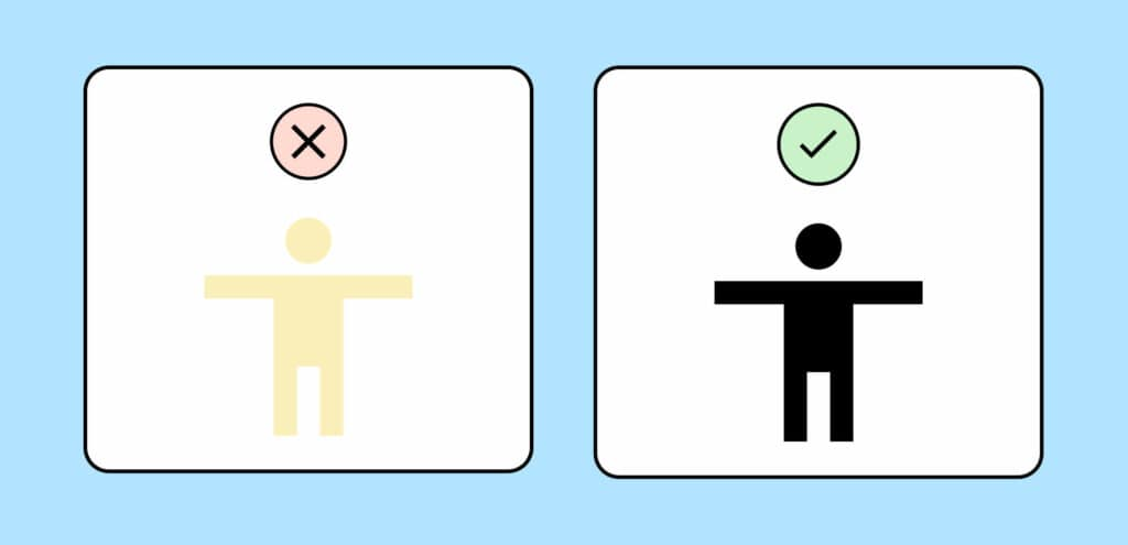
The correct contrast level for accessible icons
Your icons must achieve a certain contrast ratio (3:1). This is mandatory if the icons are used as controls or are important for understanding the content.
You can find more information about the correct contrast ratios for your controls in our article on this topic: Contrast ratios for digital accessibility.
Accessible alt text and link text
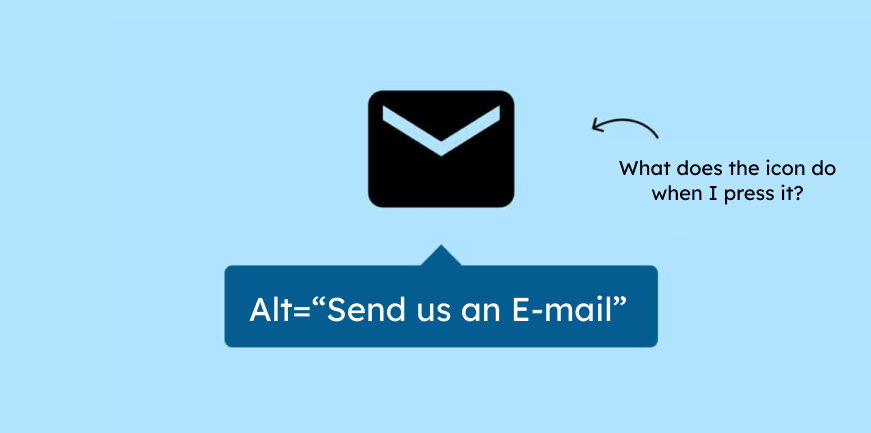
If your icons have a function, you must describe it in the alt text. For example, such a function could be that clicking the icon opens the email program with a new email. By describing the function, screen reader users can understand what happens.
You should always keep in mind that some people don’t see the context. Therefore, they can’t understand purely visual content. A back arrow might seem obvious to you, but if the icon isn’t visible, navigation becomes a challenge. Without additional text, VoiceOver (Apple’s screen reader) would read: “Link. Left arrow.” Alt text allows you to enrich the meaning and, for example, provide information like: “Link. Back to the main menu.” You can learn more about links and how to implement them correctly in our article on accessible link text.
It’s best to document your alt text suggestions along with your design so they don’t get overlooked during development. You can learn more about this in WCAG criterion 1.1.1: Non-text content (especially of controls).
Everything you need to know about digital accessibility as a designer!
- What is the legal situation, and which websites are affected?
- What requirements apply to your designs, and how do you implement them—without missing a thing?
- Do you have to overhaul your entire brand identity and make everything larger now
Through theory and practice, we’ll show you what we’ve taught nearly 1,000 people over the past three years!

The use of icons and pictograms in plain language
Now that we know how to make your icons accessible, I would like to briefly highlight the importance of icons, especially for people with cognitive impairments.
Icons have repeatedly proven incredibly helpful for copywriters and testers of plain language. They simply introduce a second level of understanding. With their help, a concept becomes understandable not only through words but also through a symbol. This duplication of communication seems to have a very positive effect on the comprehension of the content.
If you are interested in learning more: Easy English versus Plain English
Here’s a brief summary of the most important points about accessible icons:
- To make icons understandable, you should label them.
- Icons must be at least 24 by 24 pixels. 44 by 44 pixels is even better.
- Leave enough space between the icons so that you don’t accidentally click the wrong one.
- If your icons are controls, they must have a minimum contrast level (3:1).
- If your icons have a function, you must describe this function in the alt text.
