
A good contrast ratio is particularly important for people with visual impairments. The right contrasts help when someone cannot see colors well or cannot see them at all.
For example, someone with red-green color blindness may have difficulty distinguishing between the colors red and green, or may not be able to distinguish them at all. This can be extremely problematic if you use the colors red and green to convey important information (error messages are the most well-known example).
But choosing red or green can be problematic in other areas as well. Here’s an example we’ve witnessed firsthand through our interactions with public transport. Ten percent of men couldn’t answer the following question!

If you do decide to use red on green, or color on color in general, you should first consider whether the color is purely decorative or conveys important information. Secondly, consider whether you want to use a black outline to increase contrast. You see this quite often on our site. We frequently use black outlines to increase contrast and clearly separate elements.
Without the outline, the figure below, for example, would be almost unrecognizable to people with red-green color blindness because the contrast between red and green is very low.

Everything you need to know about digital accessibility as a designer!
- What is the legal situation, and which websites are affected?
- What requirements apply to your designs, and how do you implement them—without missing a thing?
- Do you have to overhaul your entire brand identity and make everything larger now
Through theory and practice, we’ll show you what we’ve taught nearly 1,000 people over the past three years!

You should adhere to these contrast ratios.
You can easily check the contrast ratio of your colors yourself. Different minimum requirements apply depending on whether it’s text or graphics.
Contrast ratio for texts
WCAG 2.2 AA specifies that normal text must have a contrast ratio of at least 4.5:1. Normal text is text smaller than 18pt (approximately 24px). Larger text, such as headings over 24px, is large enough that a 3:1 contrast ratio is acceptable. This is addressed in success criterion 1.4.3 regarding minimum color contrast.
If possible, follow success criterion 1.4.6 for increased color contrast. Your regular text should have a contrast of 7:1, and large text at least 4.5:1. Success criterion 1.4.6 on increased color contrast.
Large headings may use color combinations that are insufficient for normal text.
Contrast ratio for text on images
Text on images must meet the standard contrast requirements. This can become a problem when text is dynamically placed on images, as in blog articles or product cards.
To maintain high contrast, many people darken their images with an additional color layer, but this doesn’t automatically guarantee good contrast. Therefore, content creators should always check their work in a browser to ensure the content is readable. You can find more information on what content creators should consider when uploading content here.
Contrast ratio for important visual content
Non-textual content, such as diagrams, is often important for understanding. These should have a contrast ratio of at least 3:1.
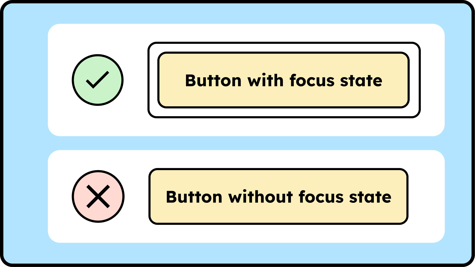
This also applies to the focus frame. Focus frames indicate which button is currently selected. This functionality is particularly important when navigating websites with the keyboard rather than the mouse. If the focus frame’s color doesn’t contrast clearly enough with the button, it’s easy to lose your bearings and forget where you are on the page.
Contrast ratio for logos
Text in a logo doesn’t have to meet any color contrast requirements. Logos that aren’t designed to be accessible indicate that the brand wasn’t developed with accessibility in mind from the outset. This makes it more difficult to create a digital presence that is accessible. Therefore, accessibility should also be part of the branding process.
Everything you need to know about digital accessibility as a designer!
- What is the legal situation, and which websites are affected?
- What requirements apply to your designs, and how do you implement them—without missing a thing?
- Do you have to overhaul your entire brand identity and make everything larger now
Through theory and practice, we’ll show you what we’ve taught nearly 1,000 people over the past three years!
Tools for measuring contrast ratio
There are many tools you can use to measure contrast. Here’s a small selection of tools we like to use.
Browser tools
- APAC: This tool outputs brightness contrast as an Lc value: Lc 90 corresponds to 7:1, Lc 75 to 4.5:1, and Lc 60 to 3:1, as defined by the WCAG standard. Additionally, the tool provides an overview of which font sizes and weights are sufficient in combination.
- WCAG Color Contrast Checker: A Chrome plugin that gives you an overview of the colors used and the contrast ratio. Sometimes the information isn’t 100% accurate, but it gives you a good overview.
- Accessible Palette: Helps you create an accessible color system.
Applications
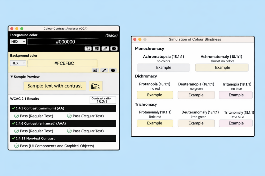
- Color Contrast Analyzer: An application that lets you compare color values anywhere using an eyedropper tool. Advantage: It directly indicates whether the font color combination complies with WCAG 2.1 AA and AAA standards.
- Sim Daltonism: A visual impairment simulator for iOS and Mac.
Conclusion
My personal favorite tool is the Color Contrast Analyzer: It’s self-explanatory, not limited to specific browsers, and can also simulate visual impairments. With it, you can easily and conveniently test whether your content has sufficient contrast.
Furthermore, the current algorithm that determines whether color combinations are sufficient will be replaced by WCAG 3. APAC delivers different results, so the color combinations you currently use may no longer be valid. Until WCAG 3.0 is live, checking with APAC is a valuable supplement, but you must still comply with WCAG requirements.
