Even though the WCAG doesn’t strictly dictate font choices, clever people have figured out that typography plays a massive role in accessibility. Selecting the right font is crucial for people with visual impairments or dyslexia—and honestly, it makes reading a better experience for everyone.
The two dimensions of readability
When we evaluate fonts, we look at two main factors:
- Legibility: How clear and distinguishable are the individual letters and numbers?
- Readability: How fluid and easy is it to read the text as a whole, especially in long paragraphs?
How to pick a legible font
Imagine your vision is blurry, similar to the image below. You might notice that some letters are easier to recognize than others.

This happens because accessible fonts possess specific features that boost character recognition:
- Distinguishability: The characters are unique and don’t look like their neighbors.
- Spacing: There is ample room between characters.
- Openness: The internal spaces (counters) of the letters are wide and open.
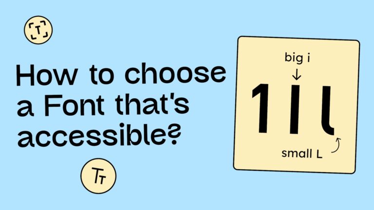
1. Distinguishability
A classic typography problem: The capital I, the lowercase l, and the number 1 often look identical. In many fonts, they are just vertical lines differing slightly in height.
Highly legible fonts solve this with distinct details: serifs on the capital I, a curved “tail” on the lowercase l, or a prominent angled top on the 1. These cues make the characters instantly unmistakable.

2. Spacing between letters
If letters are packed too tightly, they can visually merge. A classic example is r and n. Placed too close, they quickly look like an m. A good font gives the letters enough “breathing room” to ensure clarity.

Openness
Differences between a capital O and the number 0 are often subtle. Accessible fonts might give the zero a slashed counter (a diagonal line through it) or a narrower shape to distinguish it from the rounder O.
We also see issues with the letter C. If the aperture (the opening) is too tight, they can look like an O or a 0 to someone with low vision.

Even letters like e, a, and s can lead to issues. In the comparison below, you can see Arial vs. Atkinson Hyperlegible. Atkinson features significantly wider apertures, making it far easier to decode for people with visual impairments.

Note: Going deeper here would blow the scope of this post. If you want to nerd out on the details, we highly recommend the website legibility.info.
An accessible font: the Atkinson Hyperlegible Next
While several fonts meet these criteria, one deserves a special shout-out: Atkinson Hyperlegible Next.
Developed by the Braille Institute of America, this typeface was built from the ground up specifically for people with visual impairments. Best of all? It’s completely free. You can grab it directly from the Braille Institute’s website or via Google Fonts.

So, should I stop using standard system fonts?
Not at all! While fonts like Helvetica or Arial have some “imposter letters” (like the I/l/1 issue), they are generally familiar, recognizable, and legible enough for most contexts. You should feel free to use standard fonts like:
- Arial
- Helvetica
- Tahoma
- Calibri
- Century Gothic
- Times New Roman
- Georgia
Surprisingly, these classics sometimes perform better in user testing than fonts explicitly marketed as »dyslexia-friendly.«
Arial: the right font for people with dyslexia?
Accessible fonts aren’t just for those with visual impairments; they are a game-changer for people with dyslexia.
The Association for Computing Machinery conducted research to see if fonts marketed specifically for dyslexia actually help. The results were surprising:
- Standard fonts win. Classics like Helvetica, Courier, Arial, and Verdana are generally the best recommendations for readers with dyslexia. Specialized fonts like OpenDyslexic actually performed poorly in the study.
- Style matters. Sans-serif fonts, monospaced fonts (where every character has the same width), and Roman (upright) styles significantly improve reading performance.
- Skip the italics. Italicized text significantly slows down reading speed and should be avoided.
See the full study on the legibility of fonts for people with dyslexia
Variable fonts: The future of customization
Variable fonts allow users to adjust the weight, width, and optical size of a typeface individually. This allows readers to adapt the text to their specific visual perception, which can drastically improve readability.
Meet Lexend
Lexend is a variable font designed specifically to improve reading fluency. While it focuses on distinguishable letterforms, its superpower is its variability.

On the Lexend website, you can test which width and spacing combination works best for your eyes. However, in the real world, variable fonts are rarely implemented fully on websites, likely because ensuring a design doesn’t break across infinite variations is a technical challenge.
How to improve the readability of exts (typesetting)
Moving from font choice to typesetting!
If you paid attention during your typography lectures, this will be old news. But if the allure of student life kept you out of the lecture hall, here are the essential rules for setting legible text (Note: These are best practice recommendations, not strict WCAG requirements.)
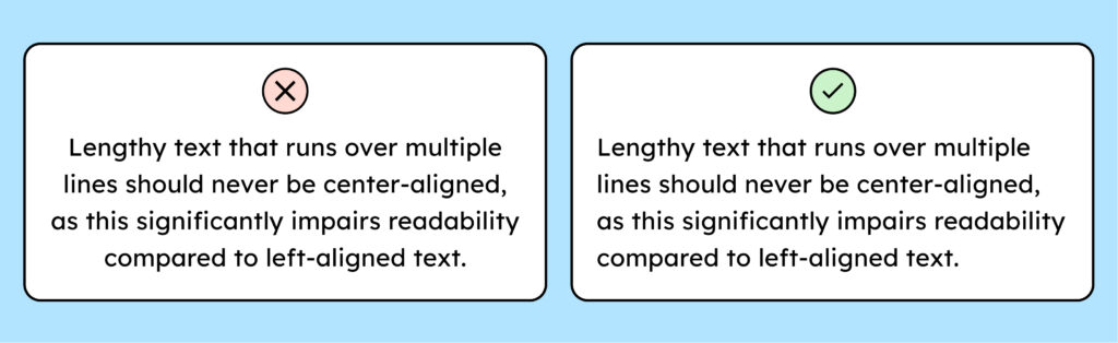
1. Align text to the left
For optimal readability, always align body text to the left. This creates a consistent starting point for the eye, making the »return sweep« to the next line easier.
You don’t have to banish centered text completely, but limit it to headings or short blocks of 2–3 lines max.
2. Avoid using all caps
Stop shouting! Avoid setting body text in ALL CAPS. When text is capitalized, every letter has the same height (a rectangular contour), which makes word recognition much harder for the brain. It increases cognitive load and slows down reading. Plus, it feels aggressive. Save caps for acronyms or very short stylistic accents.

3. Limit the line length
Have you ever had to physically turn your head to read a sentence across a wide monitor? We have. Don’t let text span the full width of a large screen. Instead, cap your line length at approximately 60 characters. This ensures users don’t lose their place when jumping to the next line.

The right font size and line height
Font Size: The web standard used to be 16px. However, as screens get higher resolutions and viewing distances vary, 16px can look tiny. We recommend bumping your body text up to 18px.
Line Height: For body text, aim for a line-height of 150% (1.5). This creates enough white space between lines to prevent them from blurring together. (For large headings, you can tighten this to ~120%).
Power to the user: overriding fonts
Even if a web designer refuses to use an accessible font, users can take matters into their own hands.
Browser extensions allow you to force a website to display text in your preferred font.
For example, there are plugins that swap every font on the web to Comic Sans (which, despite the memes, is actually quite legible for many people!).
Conclusion on accessible fonts
There is no perfect accessible font. The WCAG also doesn’t specify much regarding the use of typography. Nevertheless, there are a few things that have proven helpful for the legibility of fonts and the comprehension of texts.
When choosing a font, you can therefore make sure that:
- The letters are sufficiently distinguishable from each other (example: 1, i, l)
- There is enough white space between the letters
- And the openings of the letters are large enough (example: c, s, a)
And regarding the readability of texts, for better readability, you should:
- Set your texts left-aligned
- Avoid using all caps
- Limit the line length to approximately 60 characters
