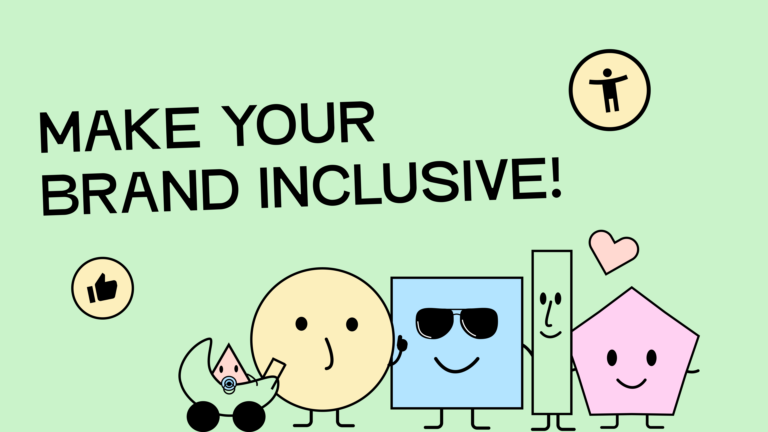
Accessibility and branding: both should ideally be based on values. The core value of accessibility is inclusion. Fortunately, that’s also a pretty valuable value for your brand. By implementing accessibility in your brand, you’ve already created an important foundation for your brand language!
But hold on a minute. I know, I know. Accessible design doesn’t have the best reputation. “Won’t that make my brand boring or unappealing?” you might be wondering. Good news: That’s absolutely not the case.
Give me a few minutes of your time, and you will see: Accessibility is a real asset for your branding, and the two topics go perfectly hand in hand.
1. Redefine your values
A wise man (he’s my boss now, so I have to say this) once told me: “If you know what your values are, then you know what you want.”
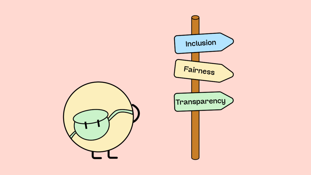
Values serve as a foundation and a guidepost. Once you’ve defined them, you can always refer back to them. And that’s invaluable for a brand. If you define, for example, compassion as a core value, you no longer have to wonder whether you should steal your neighbor’s geraniums. Your values are your rulebook and provide direction for your decisions and behaviors. This makes life much more logical and decisions more tangible. Ideally, you’ve already defined your brand values. If not, now’s a great time! To help you with this, let’s take a closer look at which values are suitable for accessible branding. Let’s go!
Values for inclusive brands
Values are highly individual. You can find inspiration on how to define them here. There is no single, universally applicable value for an accessible brand. You must define them to align with your desired image and brand goals.
Here in this list, you can find inspiration:
- Authenticity
- Social participation
- Inclusion
- Sustainability
- Equality
- Empathy
- Responsibility
- Transparency
- Innovation
- Flexibility
- Growth
- Diversity
- Justice
- Tolerance
- Fairness
- Acceptance
- Openness
- Etc.
2. Focus on inclusion in language and communication.
Your values should also be clearly reflected in your language. An inclusive brand must communicate inclusively. What we communicate externally should be understandable and accessible to everyone and, ideally, appeal to a wide range of people.
Just say it!
To reach everyone, simply express yourself! Good news: The days of trying to impress with jargon and long sentences are over. The more concise you are, the more attention you’ll generate. No matter which target group you want to reach, everyone will thank you if your content is presented simply. You can find tips on how to be as brief and as understandable as possible in our blog article on plain language.
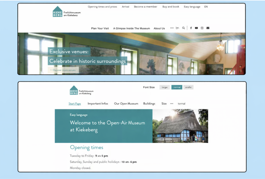
If you want to be as inclusive as possible, offer Plain Language. Plain Language is a language in its own right. You can find out exactly what Plain Language is in this article from the Plain language association international.
There are trained experts who can help you translate your content into Easy Language. According to the Disability Equality Act, public institutions have been required to offer an Easy Language alternative for their websites since 2021.
Here you can see, using the Kiekeberg Museum website as an example, how selecting Plain Language changes the page:
Talk to everyone!
Gender-inclusive language is a controversial topic in the accessibility community, just as it is everywhere. Some find it extremely disruptive, while others consider it indispensable. Unfortunately, we can’t offer a rule that will please everyone. However, we do have a brief overview that will hopefully help you decide for yourself whether or how you want to use gender-inclusive language.
Gender opportunities – An overview:
- Gender-inclusive language using neutral nouns (neutral nouns such as: Users, students, participants)
- Advantages: English already uses gender-neutral nouns, so no grammatical gender needs to be removed.
- Disadvantages: The method is criticized because some neutral nouns can feel overly formal depending on context.
- You can find an article on gender-neutral nouns in the UN Women guidelines.
Better imperfect than not at all!
As you can see, each method has its pros and cons. Ultimately, you have to decide what works for your brand. By attempting to use gender-inclusive language, you’re demonstrating openness in any case. You won’t be able to reach everyone, but you’re making a political statement. Are you afraid of creating barriers with stars or similar symbols, but still want to address everyone? Then you could perhaps add a sentence before your article explaining that you’re addressing everyone, but are using one of the binary methods for simplicity. Or you could explain your gender-inclusive language method upfront. This way, you’ll reach people with cognitive impairments.
I’m sure the gender confusion will eventually settle into a clear rule. Until then, it’s important to keep gathering feedback and, to the best of our knowledge and belief, to involve as many people as possible.
3. Make your design accessible!

An inclusive brand needs an inclusive design – that much is clear. Here’s what you need to pay particular attention to!
1. Color choice
When we talk about colors and accessibility, we’re primarily talking about contrasts. A color doesn’t usually stand alone. On its own, it wouldn’t present a barrier. But when you combine it with another color, several things quickly arise that you need to consider. You can find a detailed article about choosing accessible colors for your brand here on our blog.
Three important tips beforehand:
- Less is more! Define a primary color, a secondary color, and a color for calls to action. You can usually get very far with just a few colors.
- Contrast is key! Pay attention to strong contrasts. The better your content stands out from the others, the easier it is to read. Not only will people with visual impairments thank you for this, but everyone with tired eyes, sunlight on their phone screen, or misplaced glasses will also appreciate it. Our blog article is specifically on contrast ratios.
- Make your content perceptible through two channels! Color isn’t perceptible to everyone. The green button isn’t green to everyone. So, if you want to clarify your content, don’t rely solely on color.
A great tool for checking whether your contrasts are sufficient is the Color Contrast Analyzer, which you can download here.
Everything you need to know about digital accessibility as a designer!
- What is the legal situation, and which websites are affected?
- What requirements apply to your designs, and how do you implement them—without missing a thing?
- Do you have to overhaul your entire brand identity and make everything larger now
Through theory and practice, we’ll show you what we’ve taught nearly 1,000 people over the past three years!

2. Typography
There are also a few things to consider when choosing fonts and their layouts. These days, there are countless fonts available, and we have complete freedom to use them—yay! However, some decorative fonts are very difficult to read, or are simply poorly designed free fonts. Great, so maybe it’s better to limit the selection? You can learn more about this in our article on accessible fonts!

But here are three quick rules to remember immediately:
- Keep it simple! Avoid unnecessarily ornate fonts that sacrifice readability for uniqueness. Some fonts are both striking and easily legible. Use them and focus on making your content stand out.
- Avoid centered text. Our eyes prefer straight lines for orientation. Therefore, left-align your text to maximize readability.
- Be consistent. Define font sizes, heading styles, body text styles, and so on. Your typography should be consistent across your brand. This increases brand recognition and provides the best structure for users.
3. Including pictures
Images are indispensable on the web. For sighted people, they are a valuable complement to textual information. For people who cannot perceive images as such, they present a significant obstacle. But only if they are not properly marked up! Don’t worry, your carefully chosen illustrations don’t have to be abandoned. You simply need to make them perceptible on a second sensor (you remember, we already discussed this with color selection!).
To do this, you need to add alternative text to the images. The process varies slightly depending on the software, platform, or context. Still, it is usually quite similar, either by right-clicking or via a specific window that appears during the upload process.
What you write in the alt text depends on the image content. This decision tree from the Web Accessibility Initiative helps you decide which alt text makes sense.
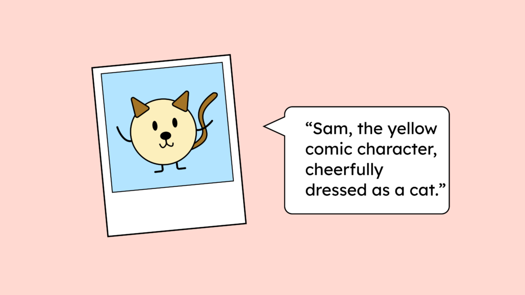
Always question whether purely decorative elements are necessary. If they add value to your website but are irrelevant for visually impaired users, you can leave the alt text blank. This tells assistive technology that the element can be ignored (like dividing lines, which provide visual structure but serve no semantic purpose). Images that convey a mood should have alt text, as this mood is part of your branding. It’s advisable to ensure that the image content itself is inclusive. Isn’t it nice to feel represented? So use photos and illustrations of diverse people to include everyone.
Be careful with icons, as they are technically images as well. Add text or alt text to your icons to make them accessible. You can find more detailed information about accessible icons here on our blog.
Examples of inclusive and accessible brands and websites
To be perfectly honest, it’s incredibly difficult to find best practices for accessible brands. Many brands boast about developing accessible products, but don’t have an accessible website, and vice versa.
Here are a few examples where, as far as we know, work is carried out in a largely barrier-free manner:
Apple
Even though Apple isn’t exactly a prime example of fair trade (which is certainly an important value for inclusive brands), it’s simply at the top in branding. Almost unbeatable in terms of consistency and thoughtfulness, they also offer a wealth of accessibility features in their products, anaccessible online store, and an excellent accessibility manual for developers. You can find Apple’s developer guidelines here. Incidentally, it’s a pretty good cheat sheet for implementing your own branding.
Wise
Wise makes it possible to send money internationally, regardless of the currency. In 2022 – eleven years after its founding – Wise rebranded and documented the process. Here’s a short excerpt of Wise’s new look (opens in a new tab).You can read the complete Wise rebranding process (opens in a new tab) on Medium after registering for free. A very well-presented “making-of,” in our opinion!
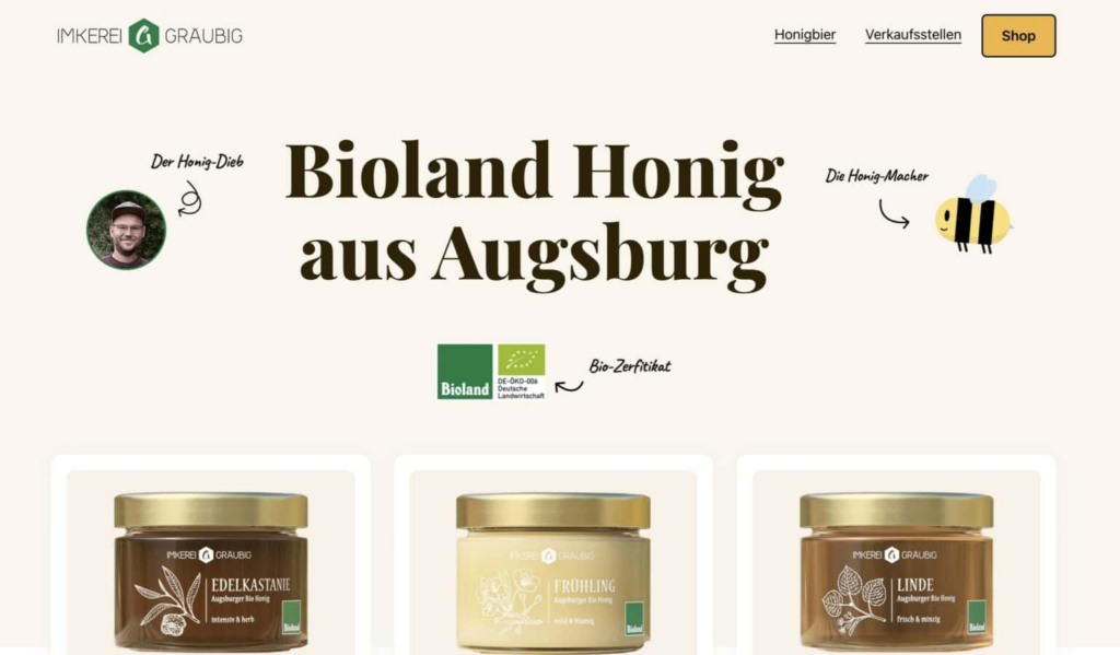
Gräubig Beekeeping
We don’t mean to brag, but: We had a hand in this! Here’s the link to the Gräubig beekeeping shop (German), where even the little bees get their own alt text. (Because, as a blind person informed us, they’re not just decorative, but an integral part of the playful brand!)
Your brand for everyone!
Looking at these brand presentations, we can all hopefully see that inclusive branding is enjoyable. It’s innovative and constantly searching for the best path for everyone. This doesn’t mean constantly reinventing yourself. Rather, it means having a stable foundation that can be continually expanded to open new doors.
If you now feel like making your brand accessible to everyone, keep the following things in mind:
- “Be humble: Recognize what you don’t know and question your assumptions.”
- This excellent Google article on accessible design explains exactly what that means. You’ll never find two users who are the same. Everyone will perceive your brand individually, regardless of whether they have a disability. Inclusive design meets everyone where they are!
- Avoid diversity washing!
- Inclusive design isn’t about self-promotion. We don’t want someone to pat us on the back (okay, we always want that a little, but that’s what Mom’s for). We want to break down barriers and achieve equality.
- You are not a martyr, and disabled people do not need pity!
- Digital accessibility isn’t about pity. People with disabilities want to participate in our digital lives on equal terms. Your brand should empower them to do so!
And then get started! Complete digital accessibility is likely to remain utopian for a long time. That shouldn’t stop us from embarking on the path towards it. Continuous development keeps us agile and our brand successful.
Inclusion is enriching for everyone and always opens up new opportunities. Try the tips above, and if you need more input or someone to guide you, contact us; together, we’ll find a good way forward.
