We’ll start with some good news: Basically, all colors are “neutral” when it comes to digital accessibility. No color is inherently “accessible” or “not accessible.” The crucial factor is usually the contrast ratio. A color reveals its accessibility only in contrast with another color.
Let’s take the color yellow as an example. If you place yellow on white, it’s almost painful to look at. The contrast is far too low, making the yellow difficult to see. However, if you place yellow on black, the contrast is nearly perfect.
A color is therefore only accessible “in contrast to something else.” You must consider colors at least in pairs to determine whether they are accessible together. You can learn more about color contrasts here.
The selection of accessible color combinations
Therefore, before you decide on the main color for your brand or website, consider the overall feel of your presentation.
Basics of color selection: The 60-30-10 rule
To make it easier for people to use color, a rule of thumb has become established: the 60-30-10 rule. This rule states that harmonious color schemes consist of three colors, used in the following proportions: 60% of a neutral or base color, 30% of a secondary color, and 10% of an accent color.
Your base color is usually white/gray or black. The choice of your base color carries considerable weight when it comes to ultimately selecting a “barrier-free” secondary and accent color.
I especially recommend this to non-designers: simply set your text color to the secondary color.
For example, if your background is white and you write black/dark gray/dark blue text on it, this text (in good designs) covers approximately 20–30% of the screen, adding another color (see the image below).
Your final color, the accent color, is your call-to-action or brand color. This color is designed to attract attention and direct the user’s eyes to the important elements. Therefore, you should use this color sparingly and purposefully.
Here’s an example from Shopify’s landing page. 60% is the background (dark green), approximately 30% is the text (white), and then a splash of CTA color (black).

As you can see, even very large companies adhere to this simple design principle.
Everything you need to know about digital accessibility as a designer!
- What is the legal situation, and which websites are affected?
- What requirements apply to your designs, and how do you implement them—without missing a thing?
- Do you have to overhaul your entire brand identity and make everything larger now
Through theory and practice, we’ll show you what we’ve taught nearly 1,000 people over the past three years!

Choosing your base color
The first thing you should do is choose a base color. As mentioned before, this color will usually be either white, gray, or black. If you choose white or gray as your background color, there are, of course, certain colors that are inherently problematic in terms of contrast.
Examples of colors that often cause accessibility problems on white:
- Yellow and orange
- Light blue
- Light green
- Turquoise
- Pastel shades

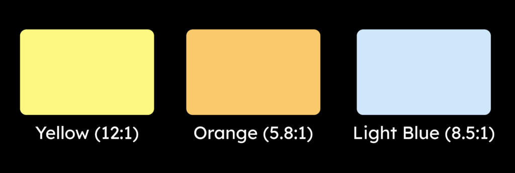
If you decide to use a dark gray or black as the background color, this will, of course, change. Now, some of the colors just mentioned offer almost optimal contrast.
- Yellow on black has a contrast ratio of 12:1.
- Orange on black from 5.8 to 1
- And light blue on black from 8.5 to 1
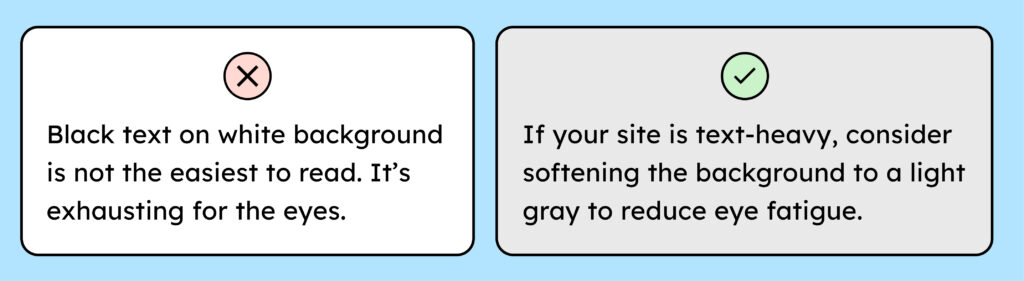
One more tip regarding the use of white: White is extremely bright and can be very tiring for the eyes over time. If you’re designing pages with a lot of text, you should consider giving the background a grayer tone, such as #E9E9E9 or even darker, to reduce eye strain.
Choosing an accessible secondary color:
After you have chosen your base color, ask yourself: Which color provides sufficient contrast against it?
To answer this question correctly, you need to know the following: WCAG AA requires that your text, for font sizes smaller than 24px, must have a contrast ratio of at least 4.5:1. Larger text only needs a minimum contrast ratio of 3:1.

We recommend avoiding placing too much emphasis on the difference between large and small font sizes, as this will only unnecessarily complicate your design system later on. It’s best always to ensure your font has a contrast ratio of at least 4.5:1. This way, you’re always on the safe side.
What does this 3:1 ratio mean?
A valid question. The contrast ratio is simply a measure of contrast. Its precise meaning is math-related stuff that designers prefer not to delve into! Therefore, simply use tools like the Color Contrast Analyzer to check whether you’re achieving 3:1, 4.5:1, etc. If you want to learn more, I recommend the following article: WCAG 2.2 Contrast Algorithm.
Choosing an accessible accent color:
Ultimately, we want to find a good accent color. As described above, a few colors generally cause problems here. However, that doesn’t mean you can’t use these colors; you just need to be careful with them.
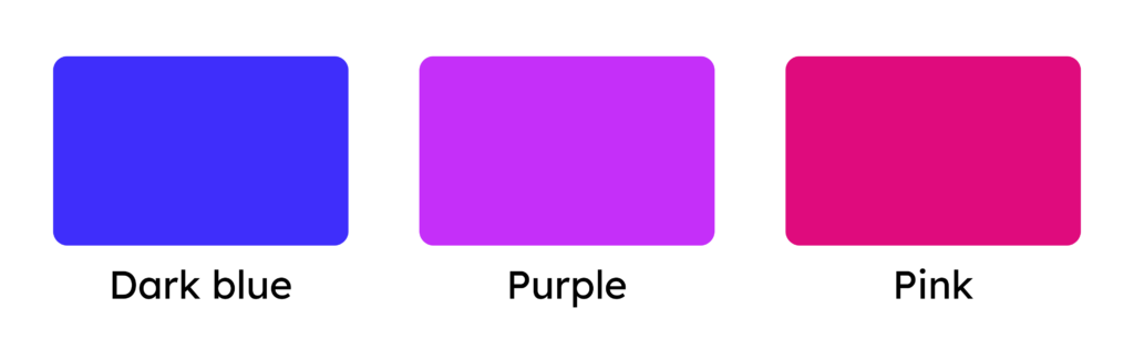
If you want to make your life easier, avoid bright colors like yellow and orange. Instead, choose a rich blue, purple, pink, red, or similar color to eliminate any problems from the start.
However, if it is unavoidable and you choose a light color, then:
- Choose a color with a contrast of at least 3:1 against the background.
- You want to keep your sunny yellow? Then, at least darken the color of your controls (buttons, links) to achieve a 3:1 contrast. While WCAG doesn’t strictly require that your buttons have a 3:1 contrast ratio with the background, if the text already meets that requirement, it would be optimal. More information can be found in WCAG criterion 1.4.11: Non-Text Contrast.
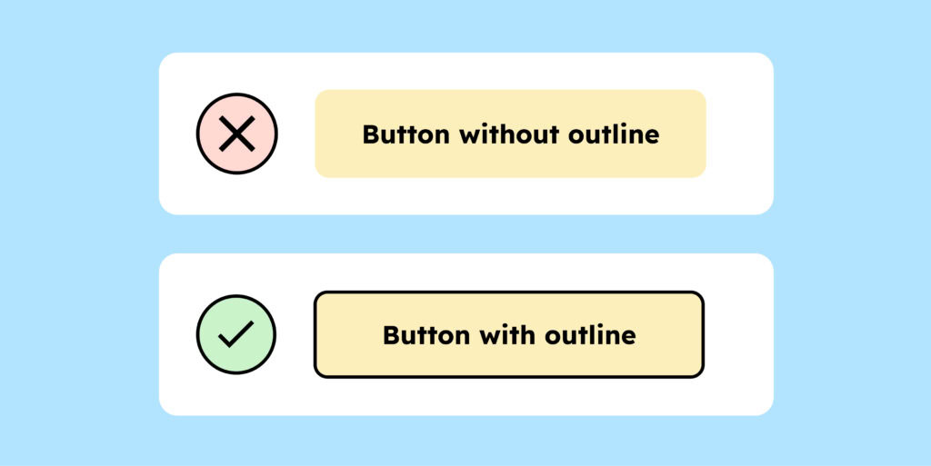
- Tip: If your color is too light, a black border can help. For example, our yellow shade wouldn’t be accessible on a white background. That’s why our buttons have a black outline. The black outline is always clearly visible, ensuring the button stands out sufficiently from the background.
Test and document your accessible color system
One last tricky point when choosing the right color combinations, which we can’t let you leave without mentioning: Contrasts have multiple layers.
- The contrast between text and background must always be correct.
- And if your background is a control element (such as a button or icon), the contrast between the control element and the background must be correct.
Example:
- The text on a button must contrast strongly with the button’s background (min. 4.5:1).
- The button should stand out strongly enough from the background (3:1 ratio).
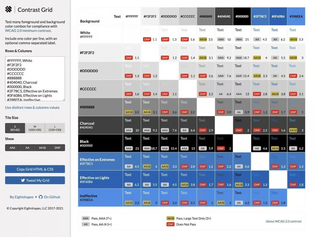
The more colors your design system has, the more easily confusion can arise with different color combinations. Therefore, it’s helpful to document suitable color combinations.
The following tool is very helpful for quickly getting an overview of the WCAG compliance of your color combinations and for documenting them well: the contrast grid tool.
Don’t forget the error messages!
Your design system has (or should have) colors, in addition to the basic colors, that indicate warnings, successes, and errors. These colors are often orange, green, and red. You also need to consider how to use these colors in an accessible way from the outset.
It is particularly common for positive and negative changes to be displayed only in red or green. For example, incorrect entries in a form are often marked in red, while correct entries are marked in green.
This is problematic for two reasons:
- WCAG explicitly states that errors should not only be communicated through color, but also through additional text.
- People with red-green color blindness (10% of all men) cannot understand or distinguish this information.
So, when choosing your color system, don’t forget to consider how you’ll use the colors needed to describe important states. If you opt for red and green, ensure they have sufficient contrast (with the background and the control element). Also, be aware that you’ll likely need to use additional text and/or icons to ensure everyone understands the state.
More information can be found in WCAG criterion 1.4.1: Use of color.
The “best” color palette for color blindness
For anyone still searching for “the ultimate colors” for accessibility, I have something for you! Especially when visualizing data, the use of color is often problematic – particularly for people with color vision deficiencies.
The WCAG even has a specific criterion stating that essential content should not be communicated solely through color.
But even outside WCAG and websites, data frequently needs to be presented visually. Sometimes, due to technical limitations, it may not be possible to distinguish graphs using anything apart from color.
This is especially true in science, where perceiving complex datasets is frequently a barrier for scientists with color vision deficiencies.
While the Viridis color palette doesn’t completely solve the problem, it significantly reduces it. Almost everyone can easily distinguish the colors in this palette – regardless of the type of color vision deficiency.
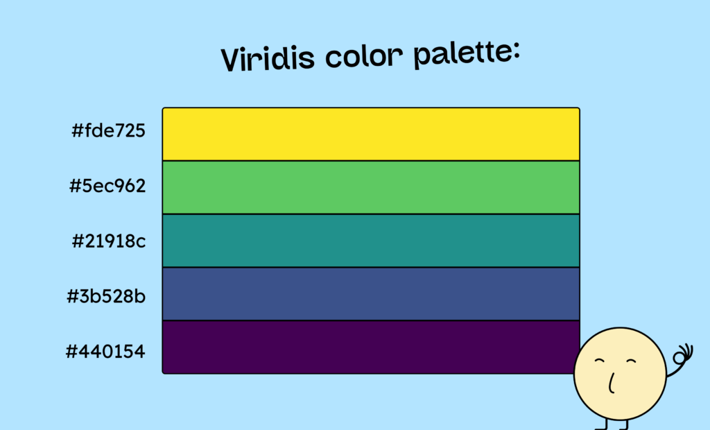
Here is an example of such a palette with the 5 colors yellow (#fde725), green (#5ec962), petrol (#21918c), blue (#3b528b), and violet (#440154)
More information can be found in this detailed article from Nature magazine. And here is a generator for the Viridis color palette.
Conclusion on accessible paints
When it comes to choosing accessible colors, the most important thing to understand is that colors are not inherently accessible or inaccessible. It always depends on the interplay of several colors.
Furthermore, you should always keep in mind that, especially with user interface elements, contrast operates on two levels: the text on the element (e.g., a button) and the element against the background. Both contrasts must be correct for true accessibility.
If you are keen to learn more about accessible design, check out our workshop on the topic: the workshop for designers.
