The inclusive design principles have one goal: to put people at the center of digital product development.
It’s about taking into account the needs of all people, regardless of whether they have permanent, temporary, situational, or changing disabilities – and that will affect us all one day.
These principles offer everyone involved in the design and development of websites and applications – designers, developers, product managers, and idea generators – a comprehensive approach to inclusive design.
Right from the start: These principles are not our idea! You can find the original article in English here: [Link to original article (German)].
Principle 1: Create comparable experiences
Everyone should be able to use your digital product in a way that suits them best, without compromising the quality of the content.
People have different mental or motor abilities and use different approaches and tools to operate or read websites or apps.
The added value, quality, and efficiency of a digital product (such as a website, a PDF, or an app) must be comparable to those of similar products, regardless of use.

Examples of this inclusive design principle:
1. Alternatives for content
For accessibility, it is important to offer alternatives for media, such as alt text for images, transcripts of conversations, audio descriptions, or sign language.
These alternatives must capture the essential information of the original. Alternative texts should therefore be useful and descriptive, and not consist solely of SEO keywords.
2. Customizable features
Subtitles make videos more accessible. If these subtitles can also be customized, for example, in font size, color, and placement, this enables a similarly positive experience.
3. Usability of notifications
Push notifications that appear on the screen require users to see them. Blind users would, in theory, have to actively search for them using the tab key and their screen reader.
To improve push notifications, live regions can be used. These automatically read aloud when something changes at a specific location. Learn more about ARIA Live Regions.
Principle 2: Consider the situation
Ensure a positive experience, regardless of the current situation.
Users of your website or apps come to your website with varying levels of experience or in very different contexts.
Some people are first-time users, while others are experienced users. Some use your digital product at work; others use it on the go and/or under time pressure. All these situations can impact the user experience with your app.
For people who already find interaction difficult, such as people with disabilities, these effects can make use extremely difficult.

Here is a clear graphic from Microsoft showing that there are not only permanent disabilities, but also temporary or situational ones that make it difficult for us to use digital products.
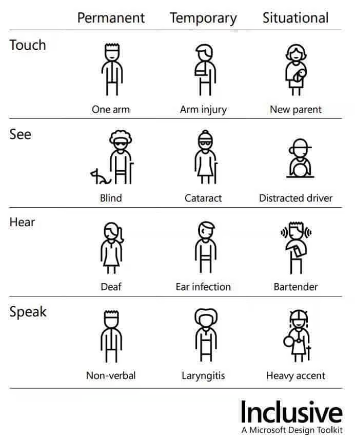
Image description: The image depicts people with various disabilities. They are categorized according to their abilities to touch, see, hear, or speak. They are also divided into permanent, temporary, or situational disabilities.
The first row shows three illustrations of people who have difficulty touching things. The first person is permanently missing an arm, and the second has a temporarily broken arm. The third illustration shows a woman with a baby in her arms, who is limited in her ability to hold the baby.
The second row deals with sight. The first person is permanently blind. The second person has had eye surgery, and the third is situationally distracted while driving.
The third row deals with hearing. The first person is deaf, the second has an ear infection, and the third person has difficulty hearing due to the noise around them.
The last row deals with speech. The first person is mute. The second person has a temporary inflammation, and the last person has a strong accent, which makes them difficult to understand in certain situations.
Examples of this inclusive design principle:
1. Good color contrast
Good color contrast reduces the problem of bright sunlight when viewing the user interface outdoors.
2. Context-sensitive help
Users often need help when they first encounter complex forms. However, this help can become unnecessary or even disruptive as users become more familiar with the form.
Context-sensitive help allows users to decide when to access help and gives them better control over the page.
3. Subtitles for on the go
We’re watching videos on our phones more and more often. We often do this on the tram or in waiting rooms. To avoid drawing attention to ourselves, we often mute the sound. Therefore, your video player should have the sound muted and subtitles enabled by default on smaller screens.
Everything you need to know about digital accessibility as a designer!
- What is the legal situation, and which websites are affected?
- What requirements apply to your designs, and how do you implement them—without missing a thing?
- Do you have to overhaul your entire brand identity and make everything larger now
Through theory and practice, we’ll show you what we’ve taught nearly 1,000 people over the past three years!

Principle 3: Be consistent
Use familiar patterns, best practices, and established conventions to design your digital product.
Use established UI and UX patterns in your design. Examples of such patterns include: The search function is located at the top of the navigation, and links on websites are always underlined.
Users have already become accustomed to these patterns. Through consistency, users quickly learn the meanings and purposes of components, colors, icons, etc.
Communicate and show the same things in the same way, and always offer users the same way to complete the same tasks.
Examples of this inclusive design principle:
1. Consistent design
Use a design system to ensure that you always display buttons, links, headings, etc., the same way.
2. Editorial tea : Standardize all content
Use consistent language across all platforms, including editorial elements that screen reader users can rely on. This includes text alternatives, headings, button labels, and other elements.
Consistency in editorial style is also important; for example, every article should begin with a clearly marked paragraph.
3. Uniform page architecture
Use a consistent page structure for all templates to facilitate scanning and navigation of important content.
Principle 4: Give users control
Ensure that users have full control when using your digital product.
Never suppress or turn off browser or platform settings. This includes presets or adjustments such as font size, zoom, and contrast (including the pre-installed dark mode on PCs).
Also avoid making changes to the status or content of a page that were not initiated by users – unless they have the ability to control these changes .

Examples of this inclusive design principle:
1. Good scrolling behavior
“Infinite scrolling” is a no-go! People using a screen reader can never reach the end of the list. If you want to use it, you can also turn off this feature and use a “Load more” button instead.
2. Stopping animations
Some users get nauseous from animations. If they run automatically, there should be an easy way to stop them with a prominent button.
3. Zooming is possible
Make sure that zooming is not suppressed and the content is not obscured when a user enlarges the screen using zoom or their fingers.
4. Buttons and links have focus states.
Often, for design reasons, the focus indicator for buttons and links is disabled. This can lead users navigating with the keyboard to get lost. Ensure that the focus indicator remains clearly visible to enable accessible navigation.
Principle 5: Offer choices
Offer different ways to complete a task – especially for complex tasks.
People often use different ways to complete a task. By offering alternatives for designing and carrying out tasks, we enable people to choose what is best for them in a given situation.

Examples of this inclusive design principle:
1. Multiple functions
If you use Apple’s Mail app on your phone, you might be familiar with this. To delete an email, you can swipe all the way to the left. This deletes the email. However, while you’re swiping left, a menu also appears. This menu allows you, among other things, to delete the email by tapping a button.
2. Multiple layout variations
For long lists of content, you could offer a grid layout and a list layout. This allows users to decide whether they want to compare a lot of information (list) or whether they are more interested in the details of individual images/products, etc. (grid).
Even people with tremors, who have difficulty pressing small buttons because their hands shake, appreciate a grid display of the content.
3. Accessible alternatives
Offer all users additional display options for complex data, such as additional tables for infographics, to ensure that the information is accessible to everyone.
Principle 6: Prioritize content

Prioritize the most important tasks, functions, and information.
Digital products can be difficult for users to understand if the main functions are obscured.
A website or application can have many features. This can leave users unable to focus on the main task.
Identify the main purpose of the page and then the content and features required to fulfill that purpose.
Examples of this inclusive design principle:
1. Only as much as necessary
Make features or content available gradually and don’t overwhelm users with everything at once. Step-by-step wizards in checkout processes are one example of this.
2. Prioritize tasks
An email application is primarily used for composing and reading emails. The “Compose” button should therefore be prominently placed. The inbox takes precedence over other email lists, such as “Sent” or “Spam”.
Less frequently used features, such as flagging or sorting emails, should appear further down, as they are usually only used after the main task of reading emails has been completed.
3. Prioritize content
On a news page, the headline takes precedence over other content, both visually and in terms of order. Related content, such as similar articles, should follow, while unrelated content is displayed later.
Principle 7: Create more added value
Prioritize implementing features that offer added value to all users.
Features should add value for users by offering efficient, diverse ways to find and interact with content.
Also consider how integrated device features such as voice control, geolocation, camera, and vibration APIs can be used, and how integration with connected devices or a second screen can make the selection easier.

Examples of this inclusive design principle:
1. Integration with connected devices or a second screen
Using voice control to control multimedia, search for content, play music, or watch television offers added value for people who have difficulty using other devices, such as a mouse.
2. Integration with platform APIs
Extend functionality by integrating platform features. The vibration API makes notifications more accessible for the deaf and hard of hearing. In contrast, the geolocation API makes it easier for people with mobility impairments to use location-based services.
3. Facilitation of task completion
Add a “Show password” button to input fields so users can verify they entered the text correctly, or add touch detection for password-protected areas to make them easier to use.
Including design principles as a basis
You now know the basic principles that play a role in designing and developing digital products that offer added value to all users.
An example of an invention that arose from a focus on accessibility is Google’s autocomplete function. It was developed with the idea of saving users a lot of typing, making the search function easier to use for everyone.
By incorporating accessibility into the development process from the very beginning, you can generate entirely new ideas, even with existing products.
So remember,
- To take into account the needs and abilities of different user groups,
- To communicate clearly and understandably,
- To keep the design consistent,
- Giving users control,
- To highlight the most important tasks and information
- And to create additional value by integrating features that improve the user experience.
