
Think of this as a quick, high-level guide that highlights the essentials before you dive into more detailed resources.
Understanding inclusive design principles
The seven fundamental principles of inclusive design serve as guidelines for designers, programmers, and product developers to keep inclusion and accessibility in mind throughout the entire (digital) product development process: These are the inclusive design principles
Once you understand the inclusive design principles, the next step is to understand the explicit design concepts behind accessible design: the design principles behind accessibility.
Accessible Design: The Basics
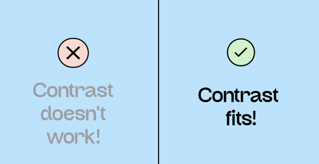
Choose your colors wisely!
One of the first questions many designers ask themselves regarding digital accessibility: How do I choose the right color?
Basically, all colors are initially “neutral” in terms of digital accessibility. No color is inherently “accessible” or “not accessible.” The crucial factor is the contrast ratio. A color only demonstrates its accessibility in contrast to another color. You can learn more about selecting the right colors here: [Link to article on accessible colors].
And if you want to learn more about WCAG and the regulations regarding contrast ratios, then the following article is for you: [Link to article on color contrast ratios].
In short, here’s what you should know about colors:
- The accessibility of a color can only be determined in contrast with another color (yellow on white is not accessible, but yellow on black is).
- Texts should have a contrast ratio of at least 4.5:1.
- Control elements (buttons) should have a contrast ratio of at least 3:1.
- Contrasts often have two levels that need to match: text on the control and control on the background.
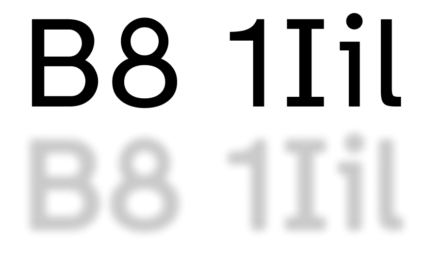
Accessible typography is not a must, but it is helpful!
While choosing an accessible font isn’t mandated by WCAG, it’s still quite important, for example, for people with dyslexia. And there are a significant number of them in Germany – around 7.5 million!
Here’s how to find the right font for your inclusive design: Read the article about accessible typography.
A summary of accessible typography:
- The WCAG standards do not mention the use of accessible fonts, so it is not mandatory.
- Individual letters should be clearly recognizable.
- Choose a typeface where the letters are clearly distinguishable from each other (for example, uppercase I and lowercase i).
- Avoid centering text.
- Sans-serif, monospaced, and Romance typefaces significantly improve reading performance.
- Don’t put long sentences in all caps. (Unless you want to shout at people.)
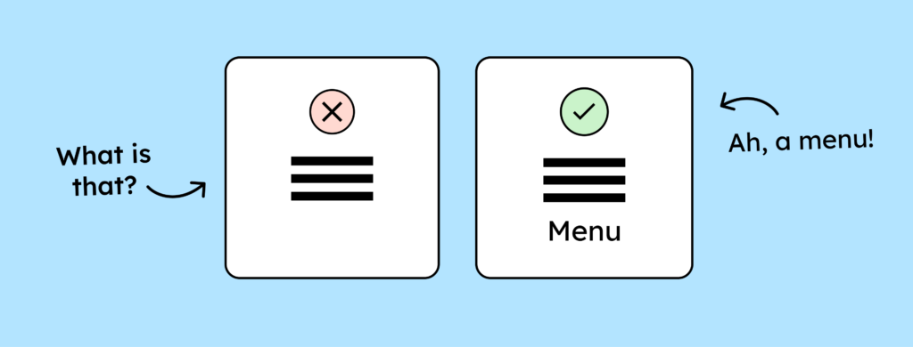
Make your icons accessible
You need to think about even the smallest elements of your website or app from the very beginning – especially if users will be able to interact with them.
To use icons in an accessible way, you should:
- …label your icons.
- … they should be at least 24 by 24 pixels – 44 by 44 pixels is even better.
- … give them a minimum contrast ratio of 3:1.
You can find all the details in this blog article: To the article about accessible icons.
Accessible handling of images
There’s really no such thing as accessibility for images. The most important thing about images is that they have alt text or a description somewhere in the text. For you as a designer, that’s not so relevant.
However, here are some points you might want to take to heart:
- Choose an inclusive visual language (more diversity)
- Avoid placing text on images.
- Do not set images as background images (you cannot add alt text to them).
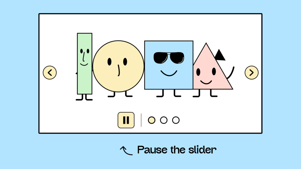
The correct use of animations
A hotly debated topic among designers: How much animation is enough, too much, or too little? Micro-animations in apps, in particular, are becoming increasingly popular. However, animations can pose significant challenges for digital accessibility. They sometimes cause problems with assistive technologies, obscure content, and can even trigger migraines or, in the worst-case scenario, epileptic seizures!
Here’s how to use animations correctly and what WCAG says about it: [Link to article about animations].
Regarding animations, you should remember:
- Your animation must not be longer than 5 seconds.
- No element may flash more than three times per second.
Conclusion on the fundamentals of accessible design
That was an overview of what to pay attention to if you want to consider digital accessibility in your design system from the start.
Once the basics are clear, there are, of course, some more complex questions:
- What do I need to consider when combining accessibility with optimal user guidance?
- Which personas do I actually need to keep in mind?
- How do I document my decisions regarding digital accessibility?
- How do I communicate my decisions to developers?
- etc.
You’ll find all the answers to these questions in our design workshop!
Everything you need to know about digital accessibility as a designer!
- What is the legal situation, and which websites are affected?
- What requirements apply to your designs, and how do you implement them—without missing a thing?
- Do you have to overhaul your entire brand identity and make everything larger now
Through theory and practice, we’ll show you what we’ve taught nearly 1,000 people over the past three years!

You might also be interested in: Accessible website – everything you need to know about it!
