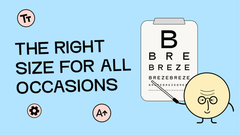
Accessible font: I can make the text as large as I want
The digital accessibility of your website content skyrockets when users can decide for themselves how they want your content displayed. The best part is: you don’t have to do anything other than choose your basic settings wisely. You don’t need overlays or widgets – nothing.
It’s (not) a well-kept secret that modern browsers and operating systems have long allowed us to change font sizes ourselves. So anyone can do it.
Why should the font size be adjustable?
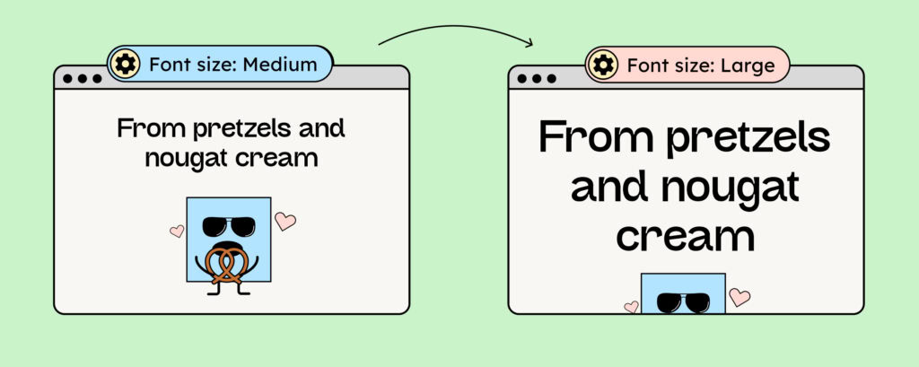
You want – hopefully – as many people as possible to read your texts. By making your text size adjustable, you’re especially helping people with visual impairments to read your texts – and besides that, you’re doing something good for people who simply prefer to read texts in a larger font.
In addition, there are temporary illnesses, such as cataracts, which cloud vision and make reading difficult.

To ensure everyone has the opportunity to enlarge their text, you must pay attention to choosing the correct font unit for your fonts when developing your website.
How do I ensure that users can actually enlarge my texts?
Nothing is simple, which is why there’s more than one answer to this question! There are different techniques for enlarging content in browsers:
- Screen Magnifier
- Browser Zoom
- Adjusting the text size in your browser or operating system
Now comes the catch: Your text can only be enlarged via the settings if you have selected the correct font size.
Font units determine the size of the font displayed in the browser.
True greatness requires the correct unit of writing.
There are static and relative units. The big difference: only relative units scale with your readers’ settings!
Static text units such as pixels and points
A pixel is an absolute unit. If you specify that text is 18 pixels (px) high, user settings will have no effect. The unit is static, meaning the text will remain 18px high forever.
Static units include pixels and points (pt). However, you should avoid using these two units when setting font sizes for websites. Static units ignore the base font size.
For accessible web development, you should use relative units!
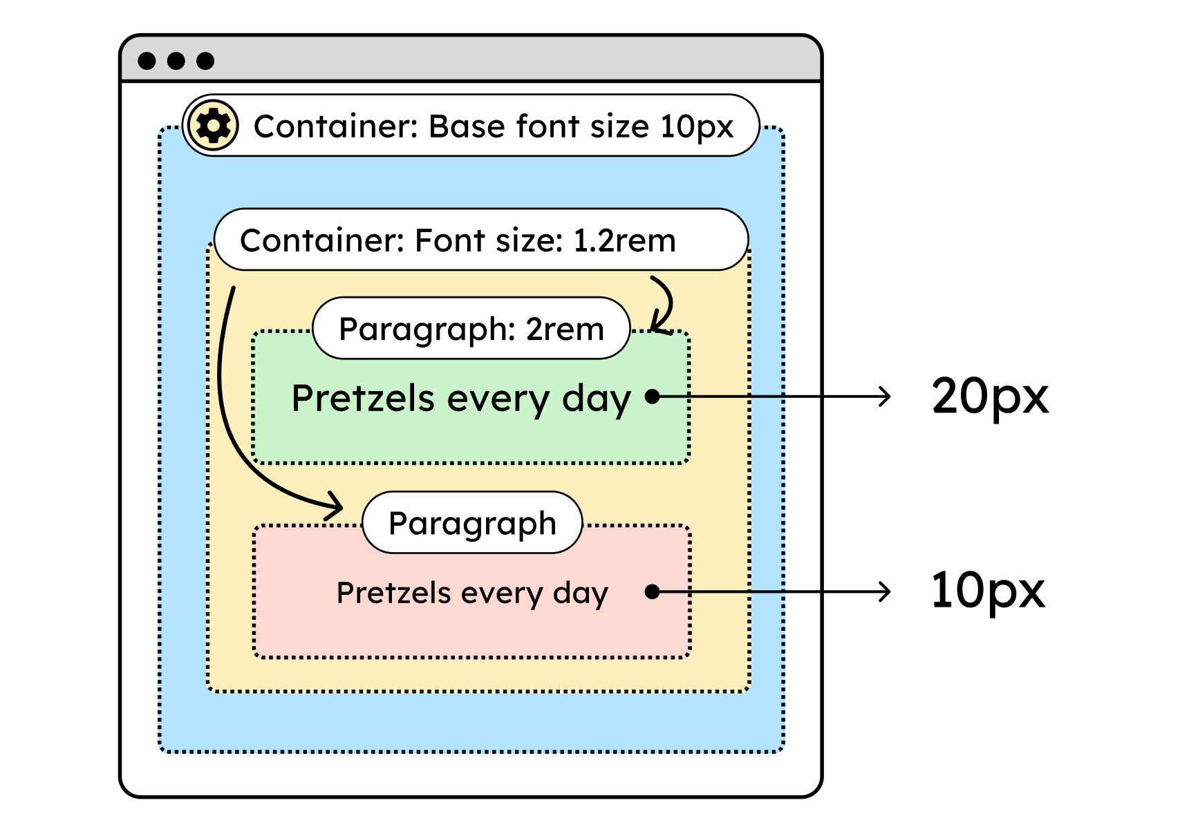
Base font size, relative font units such as em and rem
Your browser assigns a base font size to your website. This is used to calculate the actual font size. Therefore, when using relative units, you’re not specifying the actual font size, but rather how large the font will be relative to this base size.
| Relative Unit | Conversion to Pixels |
|---|---|
| 1em | 16px (Base size of browser setting) |
| 1.5em | 24px |
| 2em | 32px |
The principle is really simple: if users change the base font size, the size of your texts changes, and we are all happy.
Difference between em and rem
Now we want to know how the em and rem units differ: naturally, in the calculation of text size.
When you use em, the text size isn’t calculated directly from the base font size. Instead, each enclosing element is queried for its font size. The text node essentially queries its parent node directly, which in turn checks what its parent node specifies regarding the font size. This process continues until the enclosing node with the base font size is reached.
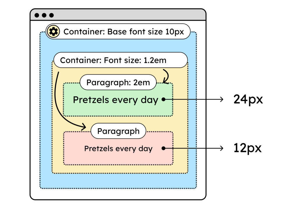
Rem refers directly to the base font size. The nested elements do not affect the actual font size. Therefore, rem is more predictable and makes your life much easier.
How can I test my writing units?
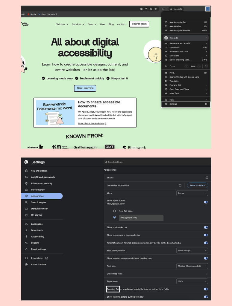
You can adjust the text size in your Chrome browser in three easy steps:
- Click the “Configure and manage Chrome” menu, then select “Settings”. The settings will now open in a new tab.
- In the settings, click the “Appearance” menu item.
- There you’ll find the settings “Font size” and “Adjust fonts”. You can change the text size using both of these options.
If you change the size and your text doesn’t change in appearance, this indicates a problem with the units. You should then check these or pass this information on to the developers you trust.
Warning: Use rem only for font sizes
Now for the tricky part: From now on, you can no longer simply use the rem unit for everything on your site.
As discussed earlier, the rem values scale with the browser’s base font size. This is helpful for typography.
But is this also useful for other things, like spacing? Do I want my margins and padding to increase as the base font size increases? Probably not!
As shown in the following image, the larger the base font size, the greater the spacing around the element. This gives the text less space. This is especially problematic if the text itself also gets larger. So, if everything grows along with the font, there’s even less room for the words.
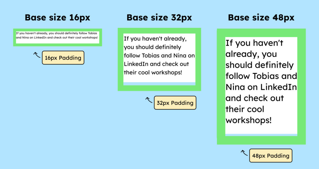
Therefore, you should still use good old pixels for spacing (padding and margin)! This also applies to border widths.
Conclusion: Typeface unit as part of accessible typography
The font unit is just one component that helps make your texts more accessible.
You should also consider choosing the right font: See the article on accessible typography. And to ensure the text is readable, you should pay attention to the correct color contrast: See the article on color contrasts.
You might also be interested in: Understanding accessible PDFs
