Let’s start with the good news: generally speaking, all colors are initially “neutral” regarding digital accessibility.
No single color is inherently accessible or inaccessible. The decisive factor is always the contrast ratio. A color only proves its worth when paired with another.
Take yellow, for example. If you place yellow text on a white background, it’s painful to read; the contrast is too low. However, place that same yellow on a black background, and the contrast is nearly perfect.
Therefore, accessibility isn’t about picking the »right« colors. It’s about picking the right pairs. Here is a step-by-step guide to building a color system that looks great and works for everyone.
The Fundamentals: The 60-30-10 Rule
Before you determine the main color of your brand or website, you should think about the overall look and feel. To ensure harmony and usability, designers rely on the 60-30-10 Rule. A balanced scheme typically breaks down like this:
- 60% Neutral/Base Color: usually white, gray, or black.
- 30% Secondary Color: usually your typography/text color.
- 10% Accent Color: your brand color or Call-to-Action (CTA).
Selecting Your Base Color
First, you will decide on a base color. This color will most often be either White, Gray, or Black. I
If you choose White or light gray, be aware that certain colors will immediately cause contrast issues. You will likely struggle with:
- Yellow and Orange
- Light Blue or Green
- Turquoise
- Pastel shades

If you choose Black or Dark Gray, the game changes. Suddenly, those »difficult« colors like yellow become optimal because they pop against the dark background.
- Contrast yellow and black: 12 to 1
- Contrast orange and black: 5.8 to 1
- Contrast light blue and black: 8.5 to 1

Pro Tip: Pure white has a high radiance that can strain the eyes over long periods. If your site is text-heavy, consider softening the background to a light gray (e.g., #E9E9E9) to reduce eye fatigue.

Selecting an Accessible Secondary Color:
Now, ask yourself, which color has sufficient contrast against my base?
According to WCAG AA standards:
- Small text (under 24px) needs a minimum contrast of 4.5:1.
- Large text (24 px or above) requires a minimum contrast of 3:1.
- Text in bold (18.5 px or above) requires a minimum contrast of 3:1.

Our Recommendation: Don’t overcomplicate your design system. Aim for 4.5:1 everywhere. It keeps your system simple and ensures you are always on the safe side.
Don’t worry about the math. You don’t need to calculate these ratios yourself. Use a free tool like the Colour Contrast Analyzer to instantly check if your pair hits the 4.5:1 or 3:1 target. If you are eager to learn more about it, I recommend the following article: WCAG 2.2 Contrast Algorithm.
I particularly advise for non-designers: simply decide your text color as the secondary color.
Example: Imagine a white background (Base). You place dark gray text on it (Secondary). In a well-designed layout, that text covers about 20–30% of the screen. Finally, you use a splash of color for a button (Accent).
Even major brands like Shopify follow this principle: roughly 60% dark green background, 30% white text, and a 10% dash of black for buttons. It directs the user’s eye exactly where it needs to go without overwhelming them.

Selecting an Accessible Accent Color:
The last color is your CTA or brand color. This is where most accessibility violations happen.
If you want an easy life, avoid light tones like yellow or orange for buttons. Instead, choose a rich blue, purple, pink, or red. These usually pass contrast checks immediately.

You can’t change your brand color?
»But I have to use my brand’s sunny yellow.« If you can’t change the bright brand color, you have two options to make them (more) accessible:
Add a border: If your yellow button vanishes against a white background, add a black border (outline). This ensures the interactive element is clearly distinguishable from the layout.
Darken the text/icon inside the button: The button’s background color does not strictly require high contrast against the surrounding background. It’s sufficient if the text inside the button contrasts properly with the button color itself. However, you must be careful. To ensure that users in all contexts distinguish this from normal text, you should use additional visual cues—such as bolding or underlining—to clearly indicate that the element is interactive.
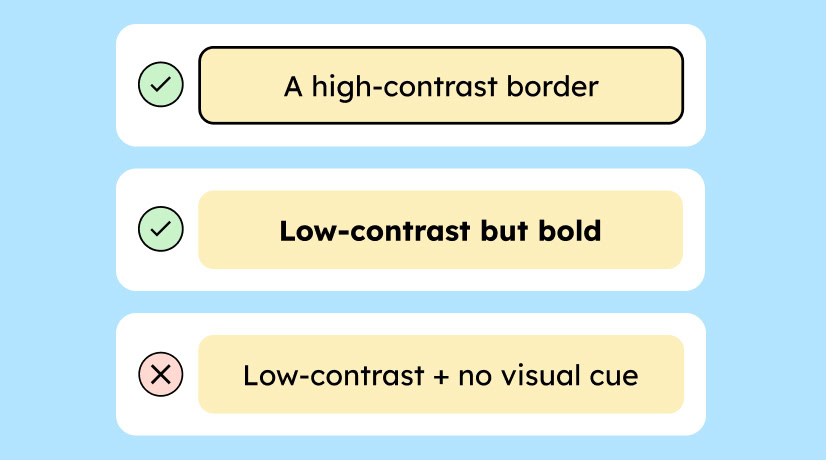
The same principle applies to icons. It is sufficient if only the icon’s color has enough contrast against the background. However, we still recommend that the icon color and the button color both have sufficient contrast.
Learn more about the WCAG requirements for contrast of controls.
Test and Document Your Accessible Color System
One last tricky point when selecting the right color combinations, without which we can’t let you go: Contrasts have multiple levels.
- The contrast of text on background must always be correct.
- And if your background is a control element (like a button or icon), the contrast of the control element to the background must be correct.
Example:
- The text on a button must stand out sufficiently from the button’s background (min. 4.5:1).
- The button should stand out sufficiently from the overall background (3:1).
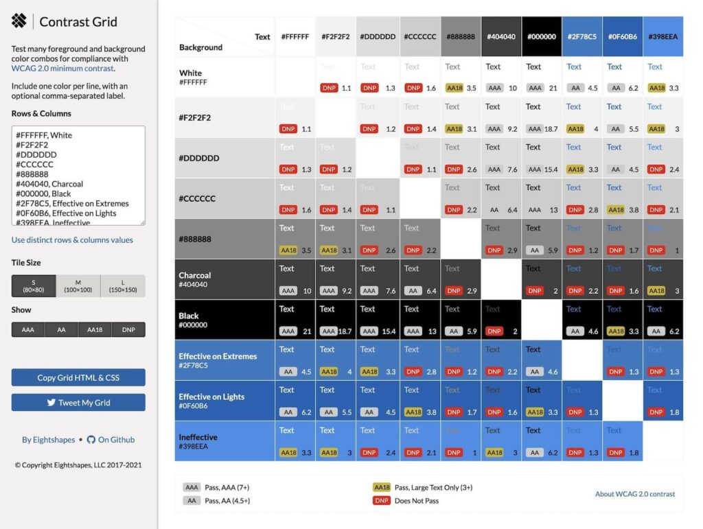
The more colors your design system has, the faster confusion can arise with different color combinations. That is why it is helpful to document suitable color combinations.
The following tool is very helpful for getting a quick overview of the WCAG conformity of your color combinations and documenting them well: Contrast Grid Tool.
The “Best” Color Palette for Color Blindness
Data visualization is notoriously difficult for accessibility. If you are designing charts or scientific graphs, standard palettes often fail people with color vision deficiencies.
While no palette is perfect, the Viridis Palette is widely considered the gold standard for accessibility. Its colors are distinct enough that almost everyone can distinguish them, regardless of color blindness type.
The Viridis Palette:
- Violet:
#440154 - Yellow:
#fde725 - Green:
#5ec962 - Teal:
#21918c - Blue:
#3b528b

More on this in this detailed article from Nature Magazine. And here is a generator for the Viridis color palette.
Conclusion on Accessible Colors
Choosing accessible colors isn’t about restricting your creativity; it’s about understanding relationships.
Remember:
- Colors are defined by what they sit next to.
- Check contrast for both text-on-button AND button-on-background.
- Never rely on color alone to convey a message.
Want to dive deeper? If you are ready to master inclusive UI, check out our full workshop: Accessibility for Designers.
