
The importance of good UI/UX design for older people
We all get older (hopefully!), and unfortunately, our physical and mental abilities decline somewhat with age. These potential limitations must be considered in design decisions if you want your design to appeal to everyone today. A well-thought-out UI/UX design addresses the needs of the older target group so that they, too, can use websites and apps to their fullest potential.
Beyond the self-determination we (re)give to older people, social inclusion also plays a major role here. Digital technologies offer numerous opportunities for communication, access to information, and participation in social life.
Seniors who may live in remote areas or have limited physical mobility can still participate in social interaction and be part of society through user-friendly apps, websites, and other digital platforms designed for them.
6 Challenges in UI/UX Design for Older People
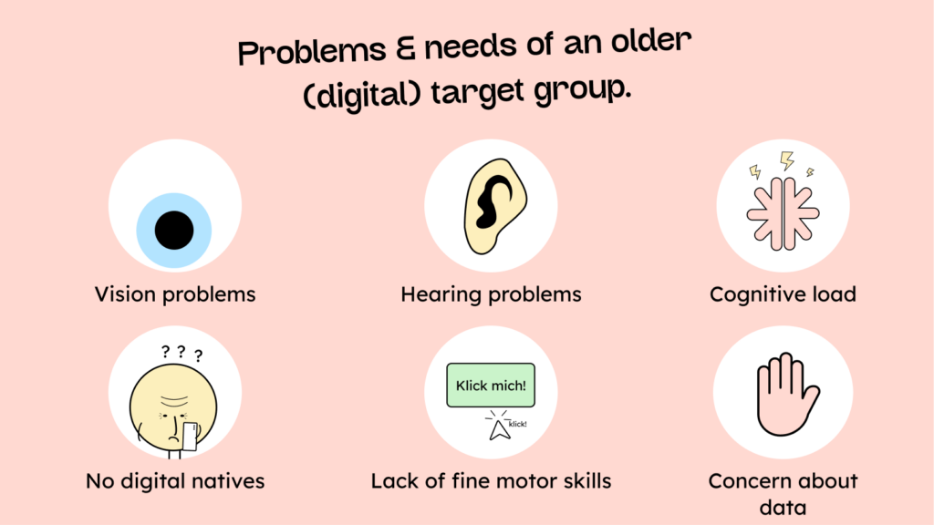
1. Vision problems:
Eyesight often deteriorates with age. Small font sizes and low contrast between text and background can significantly impair readability.
2. Hearing problems:
Just like eyesight, hearing also deteriorates in many people with age. There should always be an alternative to any form of audio on a website or in an app.
3. Coping with cognitive load:
Older people are often more easily overwhelmed cognitively. Long forms, cumbersome search processes, or unclear instructions can lead them to forget what they are supposed to do or simply give up more quickly.
4. No digital natives:
It may be hard to imagine, but not all of us grew up with the internet. Older people often still have reservations about new technologies and don’t intuitively understand what certain things mean. Icons without labels, pop-ups, or animations can be confusing. A simple and clear design is therefore advisable to keep the user experience understandable.
Uncertainty often plays a role here as well. Older users frequently need reassurance that what they have just done was correct, or that what they are about to do is correct!
5. Impaired fine motor skills:
Older people may have difficulty precisely clicking or tapping on small buttons or links. This can be due to conditions such as tremors (severe shaking) or multiple sclerosis, but can also be a general decline in motor skills that comes with age.
6. Concerns about personal data:
Unlike younger people, many older people remain very concerned about the security of their data, fearing that something “criminal” might be done with it.
Therefore, there should always be an explanation of why certain data is needed and what happens to it, including how long it will be stored.
The 5 most important principles for creating better UI/UX design for older people
Now that we know the problems the older generation often faces when using websites and software, the question is how best to overcome them.
1. Make it big and “loud”:
The first principle, especially to counteract the declining eyesight and fine motor skills of older people, is to make things bigger.
This principle can be implemented in practice in various ways:
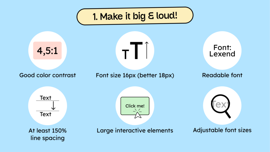
a) Ensure sufficient color contrast:
An appropriate color contrast between text and background is more pleasant for the eyes, improves readability, and makes it easier for older people to recognize elements.
b) Choose an easy-to-read font:
Easy-to-read typeface not only supports the eyes but also improves comprehension. According to a study, the “Lexend” typeface significantly improves word reading accuracy compared to Times New Roman. Further information can be found on the website: lexend.com.
c) Make the text large enough:
Text should be at least 16 pixels high to be easily readable. We actually recommend 18 pixels. Smaller text, such as icon labels, should be at least 12 pixels (14 pixels is better).
d) Increase the line spacing:
Sufficient line spacing between lines of text makes it easier for older people to read and follow the content on the screen. We recommend a 150% line spacing for body text. This can vary for headings. The rule of thumb is: the larger the font, the less line spacing is needed.
e) Use large controls:
Larger controls are easier to tap, especially on smartphones, and significantly facilitate interaction for people with limited fine motor skills or tremors.
f) Make font sizes adjustable:
It’s also worth noting that fonts can now be adjusted in width. So-called variable fonts are becoming increasingly popular, and their use on the web will continue to grow. On the Lexend website, you’ll find an overview of what variable fonts can do and why simply adjusting the font width isn’t enough to ensure an optimal reading experience for everyone.
Ideally, users should be able to adjust the font size themselves. This can be achieved, among other things, through the Zoom function. However, it’s important to ensure that no text disappears or is obscured when users zoom in.
Everything you need to know about digital accessibility as a designer!
- What is the legal situation, and which websites are affected?
- What requirements apply to your designs, and how do you implement them—without missing a thing?
- Do you have to overhaul your entire brand identity and make everything larger now
Through theory and practice, we’ll show you what we’ve taught nearly 1,000 people over the past three years!

2. Communicate clearly and simply
Having seen how important the size of elements on your website is for older people, today we’ll discuss how to adapt our (visual) communication so that everyone understands what they are seeing.
In particular, the problems that older people did not grow up with the digital world and can become cognitively overwhelmed more quickly play a significant role here.

a) Use simple or plain language:
Clear language and simple wording improve the user experience for everyone. There is a difference between plain language and easy-to-read language (German). Plain language is specifically designed to help people with cognitive impairments understand texts.
Plain language means simply trying to express things clearly. This includes avoiding jargon and technical terms. It’s much better to use everyday expressions, short words, and vivid language to be understood.
b) Label your icons:
Instead of relying solely on symbols, icons should have descriptions. As mentioned earlier, older users are often less familiar with symbols than younger people who grew up in the digital world and are therefore more frequently confused by icons.
c) Reduce animations:
Animations should be used sparingly. They can be more confusing than helpful and can even trigger migraines in some users. Step 9.2.2.2 of the BITV test also states that distracting, flashing, or moving elements should be avoided. If used, they should either be limited to 5 seconds or be switchable off.
d) Provide supporting help texts:
Help texts are quite helpful for filling out a form correctly or, for example, for understanding what happens to personal data after submitting a form.
For example, it’s very useful to specify the number of characters allowed in a password field. It’s frustrating to create a password, only to find out it’s too short or invalid.
e) Focus clearly on the main content:
This is about clearly guiding your website visitors. Regardless of age, every person who comes to your website should immediately understand what is important and what is not.
It helps reduce the number of elements and create a visual hierarchy by using different font sizes or by neatly placing elements. This guides the eye almost automatically.
f) Provide alternative media options:
Images need alternative text, videos need subtitles, and audio files should have the spoken word available as text. Therefore, there should always be at least two ways to consume the medium to ensure that people with hearing or vision impairments can also access this information.
3. Keep tasks simple and understandable.
Of course, users also need to interact with our site, for example, by filling out forms or going through processes like checkout. UI/UX designers face two main problems in these activities.
Problem 1: Short attention span.
TikTok not only (provenly) lowers IQ, but also shortens our attention span. This is why a short, simple operation for your digital product is generally very helpful.
Problem 2: Small “cognitive memory.”
Younger people are also affected by this problem, but not as severely as older people; they are increasingly less able to cope with “cognitive load.” This means they forget things quickly or are more easily overwhelmed by too many instructions/steps.
Here are 5 tips on how to solve these problems through good UI/UX:
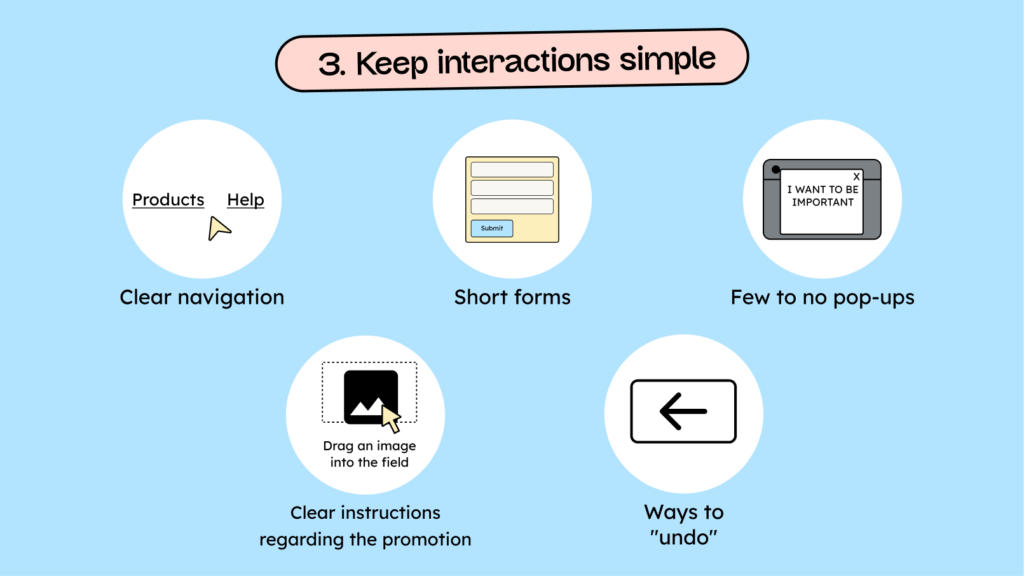
a) Create a clear navigation:
There are hundreds of things to say about navigation. Here, we’ll focus on one fundamental principle: “Hick’s Law” states that the time required to make a decision increases with the number of options. Clear navigation reduces decision time and makes orientation easier.
b) Keep the forms short:
Forms should, first and foremost, be limited to the essentials: the more information we ask for, the less likely it is that someone will fill them out.
If you absolutely must use longer forms, they should be divided into sections or individual steps. This requires clear headings and labels to facilitate navigation.
c) Use few to no pop-ups:
Minimize the use of pop-up windows. They can be extremely disruptive and take your attention completely out of context. This can be particularly irritating or confusing for older users. Pop-ups are also a nightmare for people who use screen readers. Often, they can’t close them, or they simply appear and are read aloud by the screen reader without any contact, which is extremely confusing.
d) Give clear instructions on what needs to be done:
Display clear, context-related guidance when users need to perform actions that might not be immediately obvious. For example: “Click here to change your settings.”
e) Allow actions to be “undone”:
Anyone who has ever tried to help their mom use her smartphone has probably heard the following: “I’m afraid of breaking something.”
Therefore, Simple ways to undo or correct actions give older users a sense of control and reduce their fear of making mistakes.
4 – Give constant feedback
Ever clicked a button and nothing happened?
At least you thought nothing was happening. So you clicked another 27 times before you were finally redirected or received a message that something had worked?
While you were setting a new world record for clicks, the website was “working.” You just didn’t notice because the site didn’t tell you what it was doing.
Feedback is one of the most important aspects of designing good user interactions and is helpful for all users. However, the older generation is particularly afraid of “doing something wrong.” Therefore, clear instructions before an action and direct feedback afterward are even more important to them.

a) Show meaningful error messages:
Error messages should be one thing above all: helpful. Instead of displaying “Server error 743”, they should provide specific information about the error and how to resolve it.
Examples: “The email address has fewer than 8 characters. Please enter a valid email address.” or: “The uploaded image is the wrong size. Please upload an image with at least 1080 × 1080 pixels.”
b) Show visible progress indicators:
Progress indicators are helpful for long forms and complex (ordering) processes.
Have you ever been unsure during a checkout process exactly when the payment will go through and whether you can confirm it beforehand?
Just a few days ago, one of my customers bought a flight to Japan for €1200 because of this uncertainty, at the wrong time of day!
c) Give active elements a clear focus state:
Active elements, such as links or buttons, require a clear focus and active state. This helps users better understand where they are or what they have selected.
The focus state is shockingly often neglected. It’s especially important for people who use the keyboard to navigate your website. If you’ve ever tried to navigate a website without a focus state using the Tab key, you know how lost you can feel on the internet.
d) Have important actions confirmed:
Use confirmation dialogs to prevent accidental changes or deletions.
This point is particularly important to alleviate the older generation’s fear that they are “deleting” something, for example, the internet.
Any action with dramatic consequences requires confirmation before it is completed.
e) Give yourself a chance to recover:
For long and complex interactions, it’s helpful to be able to save progress. This way, you don’t have to start all over again if you leave the page or close it accidentally.
Sometimes it’s also helpful to review previous versions of your input or restore specific parts. (More so for apps than for websites)
5 – Strengthen trust
Users are happy to give you their data – if you’ve built up enough trust!
The older generation, in particular, is very skeptical about their data. The idea that someone might take their information and misuse it is deeply ingrained in their minds. They are much more cautious about handing over their data in exchange for free Wi-Fi or a free coffee. They need a bit more trust in you or your company before giving out their email address or phone number.
How do you build this trust?

a) Keep the UI uniform and consistent:
The more consistent and uniform your design is, the more professional your website and your brand will appear: quality creates trust.
Furthermore, users generally find their way around much better and have a more positive customer experience when things like buttons, forms, navigation, etc., always look the same.
b) Make contact options easily accessible:
Don’t hide your phone number and email address in the legal notice.
Make it easy for your website visitors to contact you as quickly as possible. Providing contact options builds trust because it shows that real people are behind your business. Search engines also view quick contact options as a positive sign that you are a genuine, trustworthy company.
c) Ensure security and data protection:
Clearly and explicitly explain why you need certain data from your customers, what the data will be used for, and how long you will store it—the more transparent your “why,” the more likely people are to give you their data.
UI/UX design for older people: Conclusion
Please share ideas about what you can adjust on your website or in your app to improve the UI/UX design for older people. But as you may have noticed, many of these things don’t just benefit the older generation; they make things better for everyone.
Through targeted adjustments and empathy, you can create a seamless digital experience and enhance the positive perception of your digital presence, driving more traffic, sales, and customers.
