As a content creator, you’re pretty busy! You write texts, produce videos and audio recordings, search for images, and so on. A good marketing funnel these days requires a lot to entertain people and also to communicate important information about products and services to customers.
However, when creating this content, quite a few things can go wrong regarding digital accessibility. To make your life at least a little easier, this article gives you an overview of what you need to focus on to implement digital accessibility, at least on a website.
You can learn more about other content formats in the following articles, among others:
- To the article about accessible PDFs
- To the article about accessible presentations
- To the article about an accessible marketing funnel
How to keep website content accessible in the long term
A word of caution: You might not be entirely sure how to implement some of the points we’re presenting here. The lines between “this is the responsibility of design/development or editorial” can sometimes be blurry when it comes to digital accessibility. Depending on your content management system and your HTML knowledge, some points will be easier or more difficult to implement. (If you get stuck at any point, feel free to contact us anytime. Just send us an email.)
We compiled the following list based on our experience. It covers many tasks that are typically part of an editor’s responsibilities. However, this may not apply to everyone.
1. Use meaningful HTML titles
The first quick win: Make sure every subpage of your website has a meaningful title. The About page should be called “About Us,” the Contact page should be called “Contact,” the Service page should be called “Our Services,” and so on. This helps, for example, someone who relies on a screen reader to immediately see where they are as they navigate their tabs.
Depending on your system, the process for setting the title may vary slightly. However, most common systems, such as WordPress, automatically use the title you’ve chosen for the page/blog post as the page title. Normally, you don’t need to do this separately.
If, for some crazy reason, you’re writing your page yourself using HTML, you’ll need to give the page a title. It will look something like this: “<title>Cool Page</title>”.

2. Name links correctly
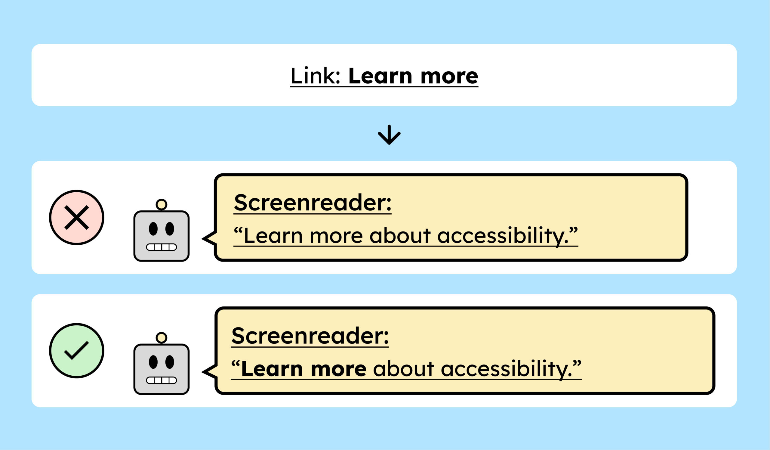
All your links, as well as links in texts, should make it clear to me as quickly and clearly as possible where they will take me, without me having to read or see the surrounding context.
This is essential for people who are blind, among others, who use the tab key to navigate a page or a list of links on a website. If your link is simply labeled “click here” or “learn more,” it’s unfortunately not very helpful without context. This is especially true if there are 15 links with the same name.
So instead of calling your link “Click here to learn more”, you should be more specific: “Click here for more information about the Accessibility Strengthening Act” or simply: “More about the Accessibility Strengthening Act.”
Regardless of digital accessibility, countless conversion rate experiments have also shown that links and buttons that clearly state what will happen after they are pressed convert better.
A second important point regarding links is to understand that a screen reader reads each letter individually.
When you insert a URL into text, a screen reader reads it aloud like this: “HTTPS colon slash slash…”. This is not only extremely annoying, but also because not all companies and URLs have descriptive names. A URL alone doesn’t provide any information, and I might not know what the linked page is or what it does. Therefore, you should always hide URLs behind descriptive words.
Finally, it should be noted that it is also difficult for people using voice control to access these links. They would have to say: “HTTPS colon…” to select the link by voice.
3. Pay attention to the correct heading structure
Time for a metaphor: You can think of the content of your website or blog post as a small book. It has a title, chapters, subchapters, and so on.
To help the reader of a book find their way around more easily, the chapters in a book are very clearly structured and also visually distinguished from subchapters, for example, often by larger typography.
You should think of it the same way when it comes to your page’s content.
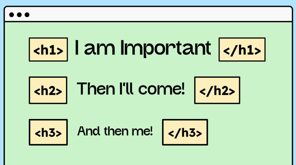
To implement this concept on a website, you can also use special title tags to structure your content. These range from H1 to H6.
Let’s take this article as an example:
Title:
“Digital Accessibility for Content Creators – An Overview.”
This is the H1 heading. It only appears once per subpage.
(A book also only has one title.)
The following is an H2 heading:
“How to keep websites accessible in the long term.”
An H2 heading is like a chapter and can appear multiple times.
In this case, our chapter is divided into 14 subchapters, starting with:
“1. Setting meaningful HTML titles.”
These are now H3S.
After the chapter is completed, the next one starts again with an H2.
And so forth.
Often, you won’t need much more than H3S or, at most, H4S. So you don’t have to use all the headings (H1-H6); they just need to be in the correct order.
You can find more information about good HTML structure in this article: [link to article about correct HTML structure].
A well-structured HTML code is also necessary to make your article readable by search engines. The better structured your HTML is, the more search engines will like you.
4. Highlight texts in other languages
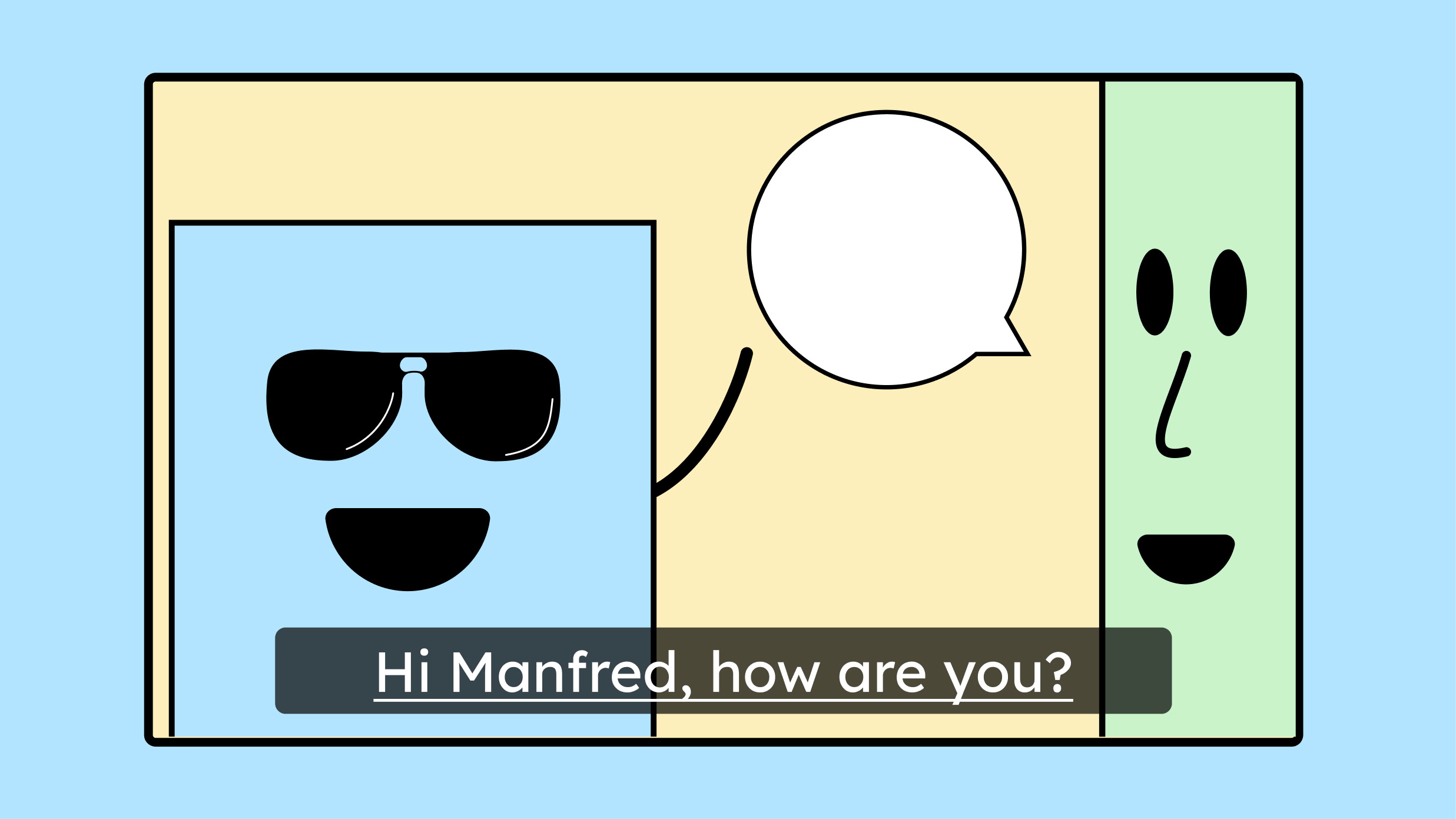
As the world becomes more global, more and more foreign words are being integrated into our language.
The problem with terms in other languages: A screen reader doesn’t know that you’ve suddenly changed languages. You have to give it a hint. You do this by setting a language tag in the HTML using the lang attribute. It looks like this:
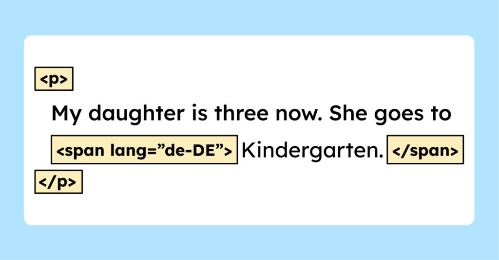
The language tag “de-DE” tells the screen reader to pronounce the word in German. You can easily implement this in WordPress by editing the text’s HTML and inserting the span with the lang attribute, as shown in the image above.
Everything you need to know about creating accessible content!
- What types of content actually need to be accessible: social media, websites, newsletters?
- What requirements apply to content, and how do you implement them—without missing anything?
- How do you integrate accessibility into your daily workflow without it becoming a major extra burden?
Through theory and practice, we’ll show you what we’ve taught participants—from Aktion Mensch to Deutsche Bahn—over the past three years!

5. Beware of tables
Tables are a rather complex topic. The HTML semantics of tables must be correct so that they can be read properly by screen readers. If you don’t really know how to ensure this, I would advise against using tables.
A detailed discussion of tables is beyond the scope of this article. If you’d like to delve deeper into the topic, you can start here: Tips for accessible tables in WordPress
6. Add alt text to images
I know the topic of alt text is tiresome. But it still needs to be mentioned, especially since most people either don’t use it or do it incorrectly. So, to reiterate: Images need descriptive alternative text so that screen readers can read them aloud.
Some people cannot see your pictures, so to give them an idea of what they say, you have to describe them.
In the following excellent article, people with visual impairments were asked what alt texts should look like to provide the most added value: “Article about the perfect alt text.”
There are also a few nuances regarding alternative text. For example, decorative elements don’t require alt text, and complex graphics often need more than simple alternative text. I won’t go into detail about these here, though. You can learn more in our course or in an upcoming article!
7. Using icons correctly
You need to think about even the smallest elements from the very beginning, especially if users will be interacting with them.
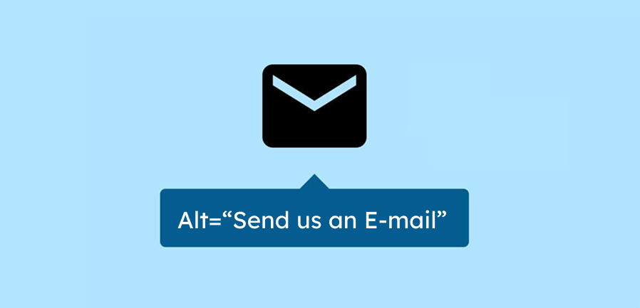
Much of what concerns icons is more relevant for designers. Their role is primarily to ensure that the contrast levels and icon sizes are correct. For content creators, the main concern is that these icons also need alternative text.
If your icons have a function, you must describe this function in the alt text. For example, such a function could be that clicking the icon opens the email program. By describing the function, screen reader users can understand what happens.
You should always keep in mind that some people don’t see the context. Therefore, they can’t understand purely visual content. A back arrow might seem obvious to you, but if the icon isn’t visible, navigation becomes a challenge. Without additional text, VoiceOver (Apple’s screen reader) would read: “Link. Left arrow.” With alt text, you can enrich the meaning and, for example, provide information like: “Link. Return to the main menu.”
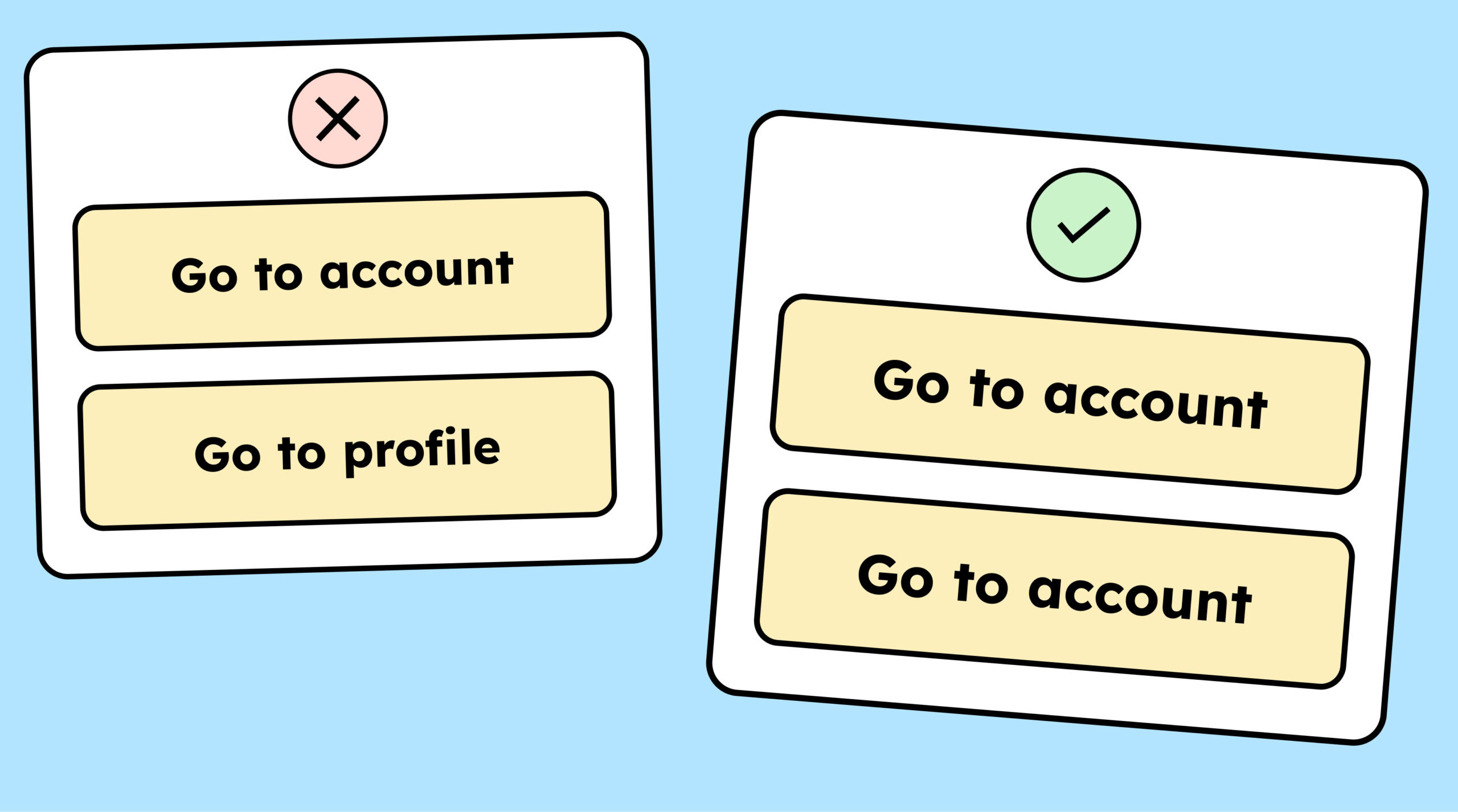
8. Consistency in the texts
The labels for your navigation elements, buttons, form fields, and so on should always be the same.
If the button for the account area is labeled “to the account area”, it should always be labeled that, not sometimes “Konto” and sometimes “Account”.
The more consistent you are with your choice of words, the easier it is for users to find their way around.
9. Use the correct ARIA labels
If you’ve never heard of ARIA labels, they’re attributes in HTML used to describe certain things more precisely.
For example,
You have a link with the description “To the workshop for content creators .” The link includes an icon indicating it will open in a new tab. However, screen reader users don’t see this icon. It might be helpful for them if you explicitly state in the link that it opens in a new tab. But you want this text to be visible only to screen readers. For this, you can use an ARIA label. This allows you to describe the link more clearly, but only for users of assistive technologies. In the ARIA label, you could write, for example: “To the workshop for content creators. Link opens in a new tab.”
This is a very simple example of using ARIA labels, but an important one. Especially because it’s easy to make a big mistake here: not naming the ARIA labels the same as the link itself. A mistake that the author of this article might have made at the beginning of his accessibility journey… cough.
When you add an ARIA label to a link or button, the text must match the button’s text exactly.
- Example button text: “Click here to access the workshop”
- Example ARIA label: “If you click here, then…”
In this example, the visible button text and the ARIA label start with different words. This is a problem because voice control systems respond to the ARIA label rather than the visible text. If someone tries to select the button using voice control, it won’t work because they can’t guess the text in the (hidden) ARIA label. They only see what’s on the button itself.
10. Add captions to videos
Your videos need captions. That’s all there is to it! No matter what kind of video it is or who it’s for. These days, captions are always helpful.
11. Provide audio descriptions for videos
If your videos contain information that is important to the plot but not explicitly spoken, they need an audio description.
Audio description makes your video accessible to people who are blind. In an audio description, a voice describes what is shown on screen. This can include important information about the plot, individual characters, or the entire scene. On-screen text is also read aloud.
Audio description is required to achieve WCAG level AA.
12. Provide alternative text for videos
To achieve WCAG Level A, a video does not need audio description, but a full-text alternative is required so I can have the content read aloud to me.
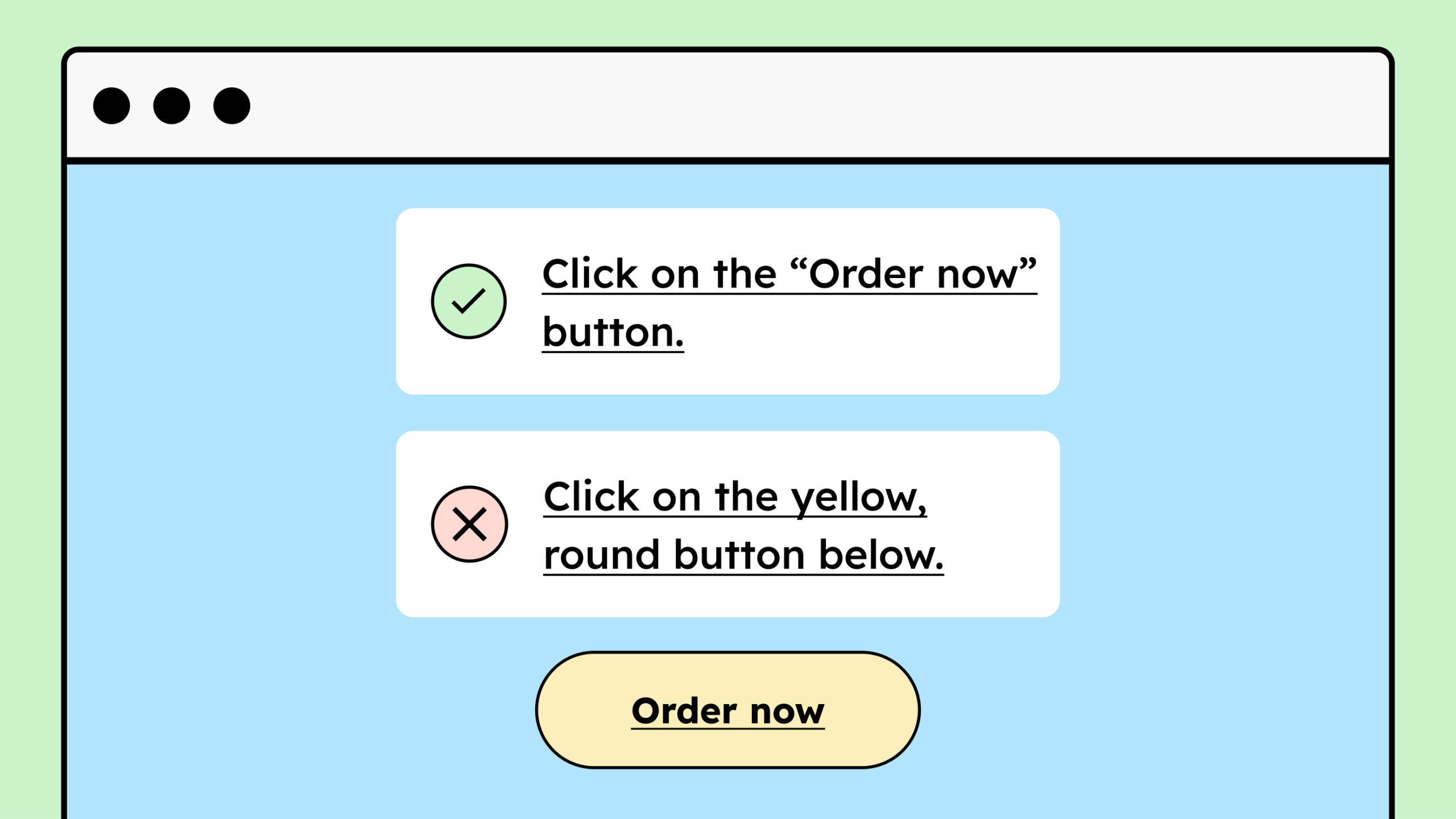
13. Do not describe elements exclusively “sensorily”.
When describing another element in a text, avoid saying things like “to the right of the text” or “the yellow button.” Not everyone understands these “sensory features.” A person who is blind wouldn’t know where “bottom right” is and wouldn’t be able to see the “yellow button.”
If you want to describe something, use headings, link text, or other labels for the element. This way, I can also navigate to the yellow button using assistive technologies if I know that the text on the button says “To the Workshop”.
14. Create an accessibility statement
Finally, you should document everything you have done and are doing regarding digital accessibility in an accessibility statement. While this isn’t mandatory for companies, it’s extremely helpful nonetheless. Such a statement demonstrates your commitment to the topic and allows people with disabilities to contact you if they encounter any problems. You can learn more in our dedicated blog article on this topic. [Link to the article about the accessibility statement]
Overview of WCAG criteria for content creators
The following link provides a concise summary of the WCAG criteria relevant to content creators (Overview of WCAG criteria).
You can always refer back to it if you can’t quite remember something from this text!
Conclusion on digital accessibility for content creators
Hopefully, you now have an overview of what you need to consider as a content creator to make and keep website content accessible. If you’d like to delve deeper into this topic, why not check out our workshops? The first five participants always receive a 10% discount: To the workshop for content creators.
