

Note 1: Size Matters!
Let’s start with the basics: Your controls (buttons, icons, inputs) need to be the right size. On touchscreen devices like tablets and smartphones, your controls should be at least 24×24 pixels (WCAG Level AA) – even better, 44×44 pixels (Level AAA). (See the WCAG minimum size criteria)

People with conditions like tremors need larger elements so they can actually tap things in your app with their fingers! If you’ve ever tried to tap tiny icon buttons in an app, you know how frustrating that can be—especially when they’re too close together. If you don’t know what I’m talking about, I recommend trying out Lichess.org (play chess) on your phone. (Sorry, Lichess!)
Why I consider this point particularly important: As a designer, I know that designers like to save space. Your professors probably instilled the concept of “white space” deep in your subconscious. Design needs plenty of room to breathe! And since content creators usually don’t adhere to this with their texts (yes, you’re the bad guys!), we have to deal with the consequences and shrink our elements.
I hope that accessibility now gives you another argument to tell copywriters that their texts need to be shorter because your controls take up space!
Note 2: Stick to Native Elements
As a designer specializing in digital accessibility, you have a lot of power! And with great power comes great responsibility, Peter.
As a designer, you decide which UI components to choose. And depending on which ones you choose, you can cause developers a lot of joy or a lot of frustration.
If you choose a component like a dropdown menu and want to style it in a fancy way, your developer might no longer be able to use native HTML for it. This means they have to “build” the components themselves. That costs a lot of time and money – especially since it’s extremely prone to accessibility bugs.
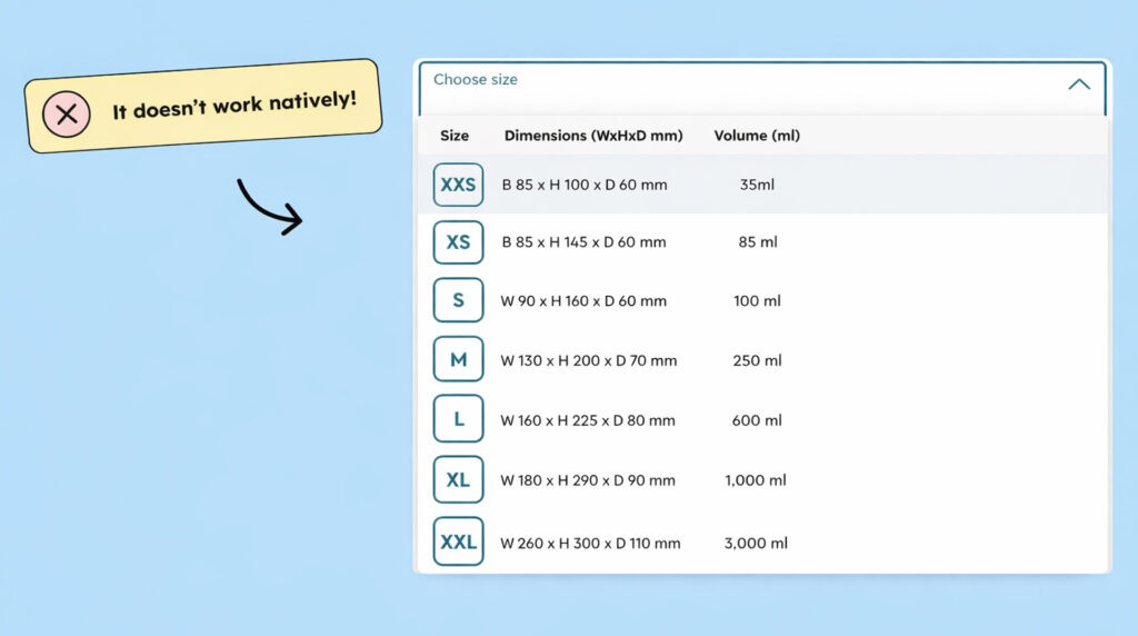
If you’re looking for an overview of problematic UI components that you might want to avoid when designing, I have to plug our online course here shamelessly: Buy our online course for designers, it’s great! [Link to the online course for designers]
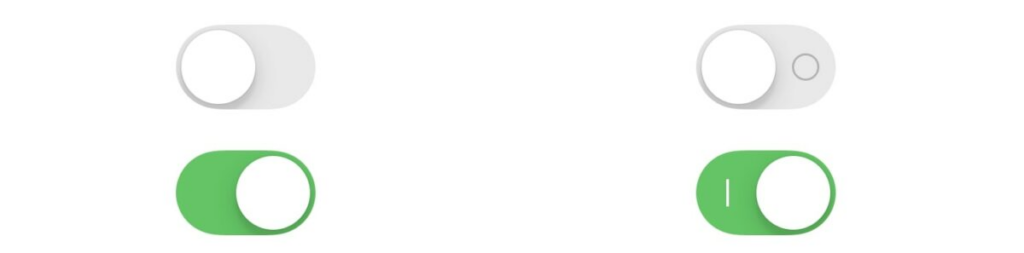
Native HTML elements are naturally not found in apps. However, there are native iOS or Android components that you can or should use. Apple, for example, explicitly recommends using the native Toggle component.
Excerpt from Apple’s accessibility page: Use the native SwiftUI toggle switch component. The native component indicates its state through the button’s position and fill color. However, some people find it helpful to have an additional label clarifying whether a switch is on or off. If you use the native iOS toggle, on/off icons will automatically appear if users have enabled on/off labels in their accessibility settings.
Note 3: Use animations sparingly
Some people get dizzy or nauseous from animations! Therefore, you should avoid animations unless they are essential for the user experience. And even if you believe they are essential, your app should still function without them.
Apple offers an option in its accessibility settings to “Reduce animations .” These settings should disable or significantly reduce animations in your app. Therefore, there must be no animations conveying essential information. If such animations exist, a non-animated alternative should be provided to convey the same information.
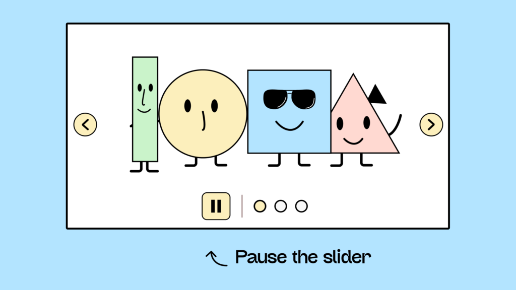
Furthermore, WCAG requires that there be a way to pause animations that last longer than 5 seconds. Therefore, a pause button must be provided. (This also applies to sliders that move automatically.)
Regarding animations, it’s important to be careful when using moving or flashing elements. I know flashing things are great for grabbing attention, but in the worst-case scenario, these effects can even trigger epileptic seizures. If you want to see this in action, the following website is a must-see: [Link to website with lots of flashing (Warning!)]
Everything you need to know about digital accessibility as a designer!
- What is the legal situation, and which websites are affected?
- What requirements apply to your designs, and how do you implement them—without missing a thing?
- Do you have to overhaul your entire brand identity and make everything larger now
Through theory and practice, we’ll show you what we’ve taught nearly 1,000 people over the past three years!

Note 4: Not everyone has hands!
Well, this had to be said sometime: Some people operate a mobile phone without hands! Okay, that doesn’t necessarily mean they don’t have hands. There might be other reasons why they operate a phone with just a wink, switches, or sip-and-puff technology. Nevertheless, ultimately, it means that there are people who don’t use their fingers to operate a mobile device. Therefore, these people can’t perform gestures. They can’t pinch, swipe, or shake their phone.
If your app has features that can only be triggered by swiping left and right (for example, in dating apps), then you have an accessibility problem. That’s why dating apps have now introduced the option to click a button in addition to swiping.
So every time you, as a (product) designer, come up with a cool way to do something with the hands in your app, you also need to think of a clickable alternative.
Conclusion on accessible app design
Unlike development, designing accessible mobile applications isn’t dramatically different. There are a few things you need to consider, which you hopefully know by now. Otherwise, you should adhere to the same standards that generally apply to accessible web design.
If you haven’t really dealt with this topic before, I recommend this article: The design principles behind accessibility
