
We start from scratch and demonstrate how a form should be structured and designed to be as accessible as possible. We base our approach on the WCAG 2.1 AA guidelines and provide practical tips that consider both legal requirements and user-friendliness.
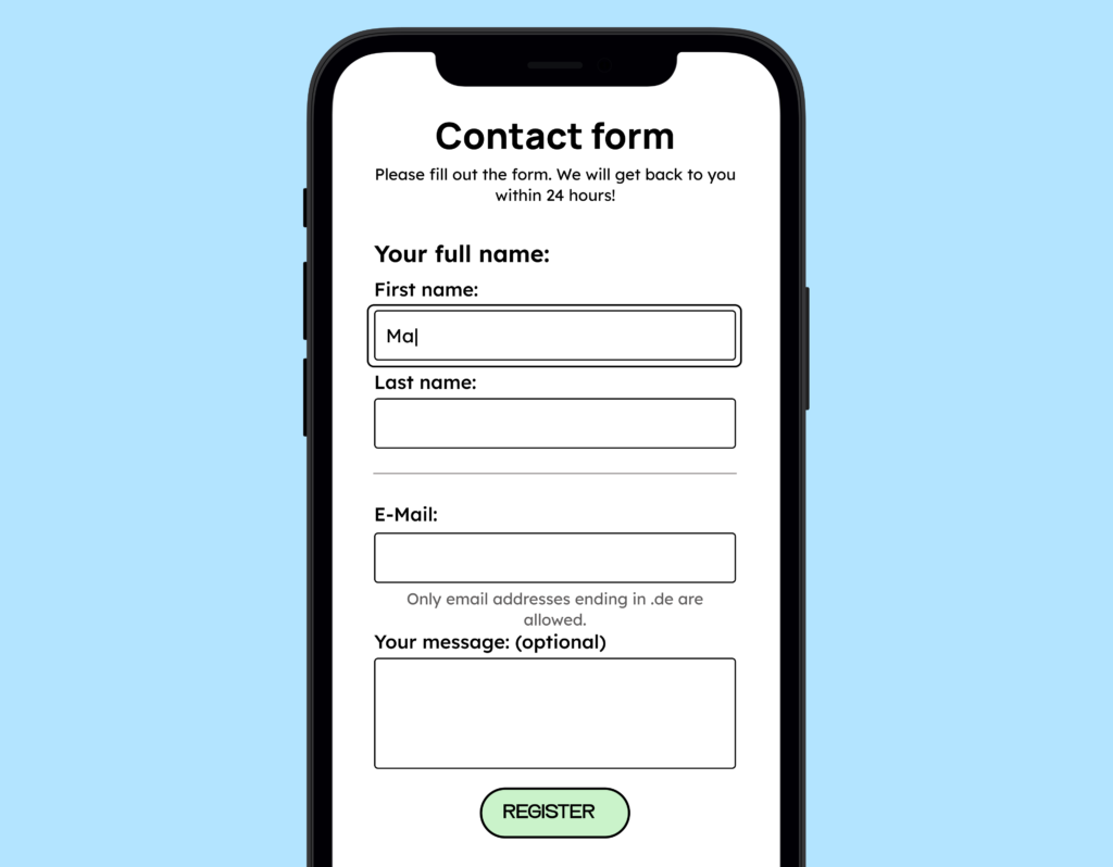
We’ll take this inaccessible contact form as our starting point and work our way forward step by step.

Step 1: Make input fields visible and describe them
WCAG criterion 3.3.2: Label or instructions require that input fields have visible labels. Visible labels help users better understand what input is expected of them, thus helping them avoid errors.
Every form field therefore needs a visible label, ideally using a <label>. This also applies to checkboxes, radio groups, and custom-built components such as range sliders.
Is a placeholder sufficient for this?
In our initial example, only placeholders are used in the input. But is that enough? In short: No. Placeholders alone are not sufficient as labels.
What is problematic about placeholders?
- Insufficient contrast: Placeholders are often too pale and do not meet the minimum contrast requirements for text.
- Disappearance while typing: As soon as you start typing, the placeholder disappears, and the label is missing. Screen readers like VoiceOver will no longer read your placeholder aloud, but will only read the input itself.
- Causing confusion: Some users think the placeholder is already a pre-filled value and do not change it.
You won’t find this topic directly addressed in WCAG criterion 3.3.2 labels or instructions, but there’s now a dedicated “Failure” on the WCAG GitHub repository, which will soon be officially added. See the Git discussion.
The labeling must be meaningful.
Now that we have a visible label, we must ensure that it is also meaningful, as required by WCAG criterion 2.4.6: Headings and Labels (German).
A form field for first names should therefore also be labelled “First Name”. For groups (such as checkboxes or radio buttons), additional parent labels can be helpful.
Then, the HTML should include fieldset and a legend tag that adequately describe the purpose of the input group.
Example: Two checkboxes for “Email” and “SMS”. The overarching label <legend>How would you like to be notified?</legend> clarifies the context.
This is what our form looks like after we added meaningful labels to the input fields:

Step 2: Clearly highlight mandatory fields
After labeling our input fields, we also want to indicate which fields are mandatory.
Good UX avoids letting users make a mistake only to tell them that they’ve made one. We want to prevent potential sources of error from the outset. To do this, we need to indicate which fields are mandatory clearly.
Often, the popular asterisk (*) isn’t enough. Users frequently overlook it, and screen readers often read it as “asterisk”. Honestly, did you know what an asterisk is? It’s therefore better to clearly indicate in the input field labels which fields are required and which are not.
This means that we can specify, for example, the following as a label: First name (required field).
In our example, this looks like this:

However, this approach is somewhat counterproductive. As a UX professional, Adam Silver so aptly put it in his blog post:
“Well-designed forms generally avoid optional fields. This means that optional fields should be rare. And since the purpose of highlighting a field like ‘required’ is to draw attention to what is different, it’s better to mark optional fields.”
Therefore, it is better to add ‘optional’ as a label for an input field. This way we can create minimal distraction and maximum clarity.
Therefore, we will also reverse the approach and only label the optional fields. If you want to go a step further, you can add the following note to your form: “Fields for voluntary information are marked ‘optional’. All other fields are mandatory and must be completed. “

If you only want to mark the required fields with asterisks (*), that’s not forbidden in itself. However, the meaning must then be explained (ideally right at the beginning of the form).
Step 3: Provide instructions for filling in the input fields.
It’s extremely annoying when you fill out a form and only find out afterwards what you should have paid attention to. We all know this from password fields that only tell us afterwards that the password must be at least 8 characters long or must contain a special character.
As mentioned above, we want to avoid such errors in advance. Therefore, we should inform users what input we expect before they fill it out. According to WCAG criterion 3.3.2: Labels or Instructions, it is also mandatory to guide when an input requires a specific format.
Adding a note to our contact form wouldn’t really make sense anywhere. However, we came up with something to illustrate the point:

A little tip for the developers among you:
Additional information should appear directly above and next to the input field. If it appears visually or programmatically below the field, it must aria-describedby be linked to the corresponding field. This ensures that screen readers read the information aloud before input is entered.
Everything you need to know about digital accessibility as a designer!
- What is the legal situation, and which websites are affected?
- What requirements apply to your designs, and how do you implement them—without missing a thing?
- Do you have to overhaul your entire brand identity and make everything larger now
Through theory and practice, we’ll show you what we’ve taught nearly 1,000 people over the past three years!

Step 4: Group inputs that logically belong together
It is often helpful to group related input fields. This makes the form appear to consist of several smaller sections, making it easier to quickly grasp the content.
In our case, the form is very straightforward, so this step isn’t necessary. However, we’ve grouped the first and last names for illustrative purposes.

Another tip for the developers:
If input fields are visually grouped, this grouping should also be recognizable in the code. This ensures that the visual relationship matches the semantic structure. If the corresponding label is missing, this is an error according to WCAG criterion 1.3.1: Info and Relationships.
Step 5: Show your current location
Now we want to show users where they are in the form clearly. An obvious focus state makes it clear which form field is currently active.
Anyone who’s ever filled out a form using the keyboard without focus knows how lost you can feel. (If you’ve never had this experience, try going through a few contact forms on websites using the Tab key.)
There is also a WCAG criterion for this: 2.4.7: Focus visible. This criterion states that all controls must have a visible focus state.
Such a focus state can look very different. Focus states can be:
- Underlining
- Bold text
- Color change of the element (as long as the contrast of the color from the focused to the unfocused state is greater than 3:1)
- The blinking line appears after clicking in an input field.
- Focus frame
We recommend using a focus frame. This is consistent across all elements and easily recognizable. More information can be found in Sara Soueidan’s blog post on focus indicators.
In our example here, we used a focus frame:
Step 6: Explain what happens to the data
One point that has become increasingly important in recent years is building trust. Everyone wants to sell something online. And unfortunately, some of these sellers have malicious intentions!
Therefore, it is becoming increasingly common practice to tell users what happens to their data: what the data is used for. Why do I have to provide my phone number? This is independent of the data protection notices, which are usually mandatory anyway.
A brief description of what happens to the data, or generally what happens after the form is submitted, can work wonders. Besides improving clarity, it also increases form submissions. Here, too, it’s crucial to ensure that this information is accessible to assistive technologies.
Step 7: Designing multistep forms
Long forms are easier to manage when divided into several smaller sections. This makes them clearer, less daunting, and easier for users to process step by step.
Dividing forms into smaller sections is particularly helpful for users with higher cognitive demands or less computer experience. People with ADHD also benefit from this, as large tasks can quickly become overwhelming.
For multi-step forms, the first step should explain how many steps follow. Each subsequent step should provide an update on progress.
There are three common ways to display progress in a form:
- Heading: The simplest option is to include the progress in the heading. For example, you can simply add this in parentheses after a heading: Contact form (Step 1 of 2).
- Progress bar: A slightly more sophisticated option is using a progress bar. This can be very useful when there is no clearly defined number of steps. For example, if users can skip steps while entering data.
- Step-by-step indicator: If a form has a known number of steps to complete, a step-by-step indicator can be helpful. Clearly indicate the current and completed steps through text formatting and an additional icon. Furthermore, it’s helpful to be able to return to completed steps via a link to review them.

Regardless of which option you choose, progress must be clearly visible to all users. To achieve this, use not only colors but also textual cues such as “Step 2 of 5” or visual markers that clearly indicate the current step. This way, even people with impaired color vision or cognitive limitations can easily track progress.
Step 8: Give the user feedback
Even though we have done our best to make our accessible contact form as easy to understand as possible, users will still often make incorrect entries.
Therefore, our next task is to ensure that we accurately display and describe any errors that occur. We want to empower users to resolve the problems themselves so that they can still submit the form!
Negative feedback:
What happens when users make a mistake? We absolutely have to let them know! How do we let them know? Through error messages!
Your error message should be clear, understandable, and clearly displayed directly next to the relevant field. It can be part of the label or placed below the form field. You should not only identify it by color but also clearly explain what needs to be corrected (WCAG criterion 3.3.1: Error detection).

Positive feedback:
Positive feedback is just as important! We should also inform users when they have filled out a form correctly and submitted it successfully. Then they can rest easy knowing that everything worked out.
In our case, we make the form disappear and display a success message.

Your accessible form
These 8 steps will equip you with the tools to create an accessible contact form. You now know how to label input fields clearly, mark required fields and instructions, logically structure groups, and guide users safely through multi-step forms.
