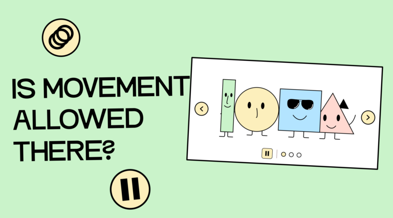
First, a little theory about WCAG! That’s what you’ve been waiting for, right? WCAG has three criteria that apply to the use of animations:
- Criterion 2.2.2: Pause, stop, hide stipulates: If something on the page moves automatically and lasts longer than 5 seconds, there must be a way to pause, stop, or hide the movement.
- Criterion 2.3.1: Limit of three flashes or less stipulates that a website must not contain any content that flashes more than three times per second.
- Criterion 1.4.2: Audio control stipulates that if sound is played automatically and lasts longer than 3 seconds, there must be a way to pause, stop, or adjust the sound (independently of the system volume).
If you are interested in the WCAG, you can either click the links to the respective WCAG documents or view our prepared summary of the individual criteria: Overview of the WCAG criteria.
To give you a better idea of which common animations can be problematic, I have compiled a few examples.
The use of videos on your site
Yes, all those background videos that are often used in website hero pages can be problematic. If these videos are longer than 5 seconds, there needs to be a button somewhere to pause them.
If the video also plays sound, this must be pauseable or adjustable from 3 seconds onwards.
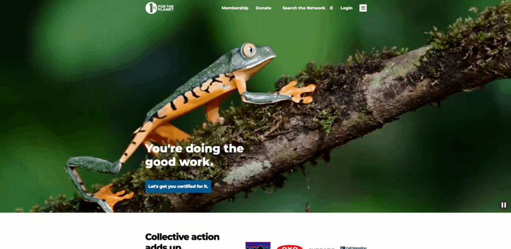
The website “One Percent for the Planet,” for example, uses a video in the header (without sound) and has included a stop button. Visit the 1% for the Planet website.
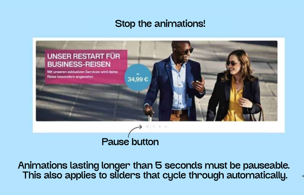
The problem of slider accessibility
The 5-second rule also applies to automatically running sliders. Therefore, there must be a way to stop them.
Eurowings has a nice example of a pauseable slider on their website. Here’s the link to the Eurowings page (German).
The stylish, flowing fonts
You’re probably familiar with text that scrolls continuously across the screen. This animation should also be pauseable. We found an example of this on the awwwards.com website.

Headlines that write themselves
You’re probably familiar with this, too: Cool headlines that “write themselves” letter by letter or replace entire words.
These things are a nightmare for screen reader users. Sometimes the word isn’t read at all, it’s repeated, it’s cut off mid-sentence, it’s spelled out, and so on. The problems with them are numerous.
Everything you need to know about digital accessibility as a designer!
- What is the legal situation, and which websites are affected?
- What requirements apply to your designs, and how do you implement them—without missing a thing?
- Do you have to overhaul your entire brand identity and make everything larger now
Through theory and practice, we’ll show you what we’ve taught nearly 1,000 people over the past three years!

Please refrain from using flickering!
Flickering occurs when the blinking frequency is 3 or more flashes per second. This applies not only to blinking elements, but also to GIFs in presentations or on websites.
One example is an old Pokémon episode in which a very rapid, lightning-like flash from red to blue occurred during a battle scene. After it aired in Japan, around 700 people had to be hospitalized due to epileptic seizures. As a result, the episode was banned and never aired in the US or Europe.
Regarding flickering, there’s a special rule that an element may flash more than three times per second if it’s small enough and the only element in the visible area. However, even then, it may not flash for longer than 5 seconds. You can find the exact size calculation in the following WCAG technique: Keep the blinking area small enough. But before you spend too much time worrying about it, just forget about it and make your life easier!

The beloved parallax effect
Effects like parallax scrolling can look cool, but unfortunately, they cause nausea in many people. Objects moving across the screen at different speeds create a sense of depth. This affects visual perception and can cause nausea in some viewers, particularly those with balance disorders.
If you can’t do without parallax effects in your applications, ensure they can be disabled. Developers you trust can use a media query to animate elements on websites with varying degrees of intensity or to stop the animations completely.
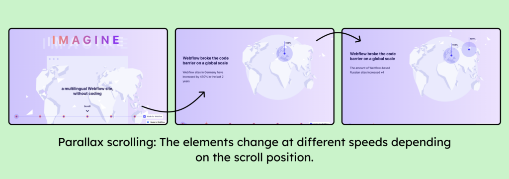
You can find a live example of the parallax effect on Weglot’s website.
Automatic animations – allowed in exceptional cases
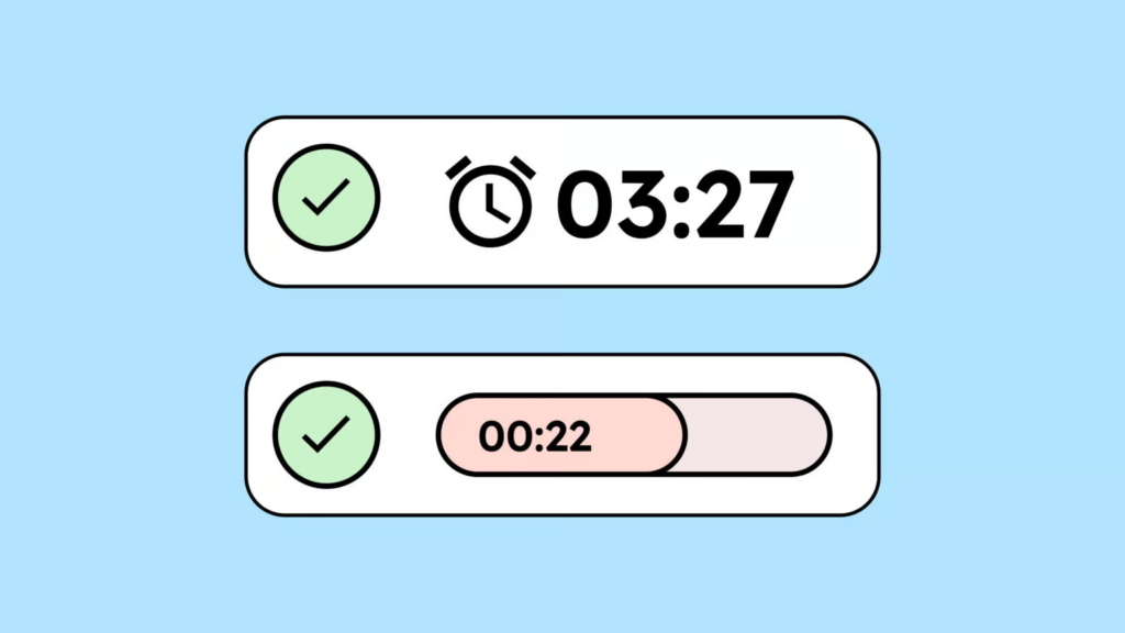
As is often the case, there are exceptions to the WCAG guidelines. Automatic animations are usually problematic for accessibility because they can be distracting or disruptive. But sometimes they are essential.
For example, an animation in online banking might show how much time is left when there’s a time limit. Or loading animations might indicate that something is currently loading. In such cases, automatic animations are permitted and even essential because they provide important information and help users better understand the page.
Conclusion on the use of animations
Even though it might sound different at first, as a designer, you actually have quite a lot of freedom when it comes to animation. Especially the popular micro-animations for element interactions are no problem at all.
The only thing you need to keep an eye on is that your animations are no longer than 5 seconds (and 3 seconds with sound), or you’ll need to include a nice little pause button.
