WCAG 3.2.4: Consistent Identification
Back to all WCAG criteriaOVERVIEW
What's it about?
Recurring components on different pages must be named consistently so users can more easily recognize familiar functions.
The visual appearance should also remain consistent. For example, a heart icon used for Wishlist in one place must not suddenly be used for Like somewhere else.
How to
Depending on your situation, you can implement one of the following options to meet the criterion. For a deeper dive, please refer to the linked WCAG techniques.
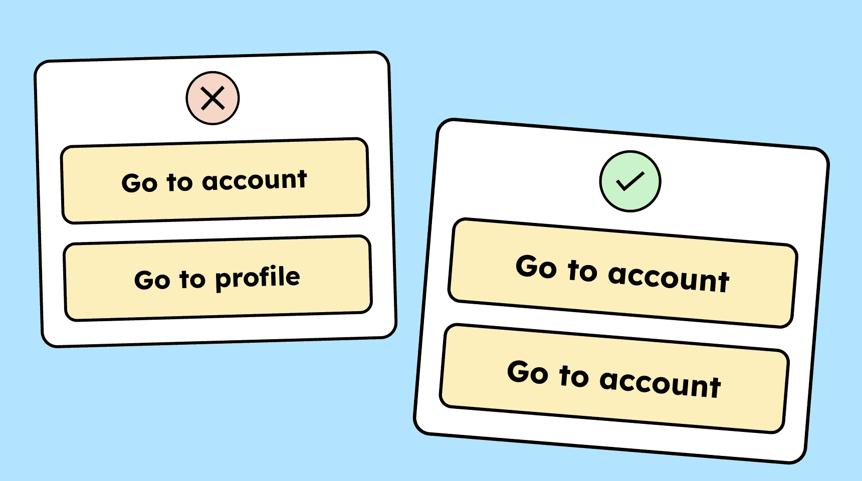
Consistent naming
If a button has the same function on multiple pages, it should also have the same name everywhere. To access the account, for example, the button should not be labeled “Go to account” on one page and “Go to profile” on another.


Create accessible designs?
Our workshop for designers!
Learn everything you need to know as a designer to create accessible design systems for digital products and entire brands.
Learn accessibility with us?
Looking to implement WCAG best practices in your design, development, or content workflow? Book a workshop for your team or contact us directly to learn more.