WCAG 2.4.7: Focus Visible
Back to all WCAG criteriaOVERVIEW
What's it about?
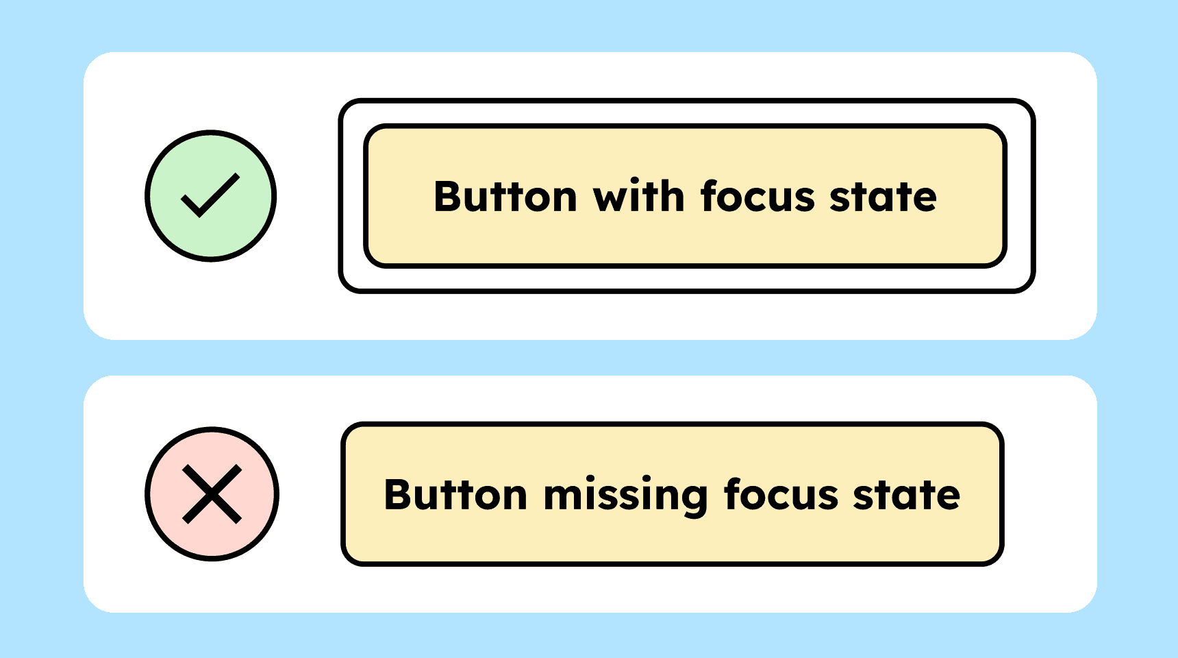
Interactive elements (buttons, links, etc.) need a focus state. It must always be visible which element on the page currently has keyboard focus.
How to
Depending on your situation, you can implement one of the following options to meet the criterion. For a deeper dive, please refer to the linked WCAG techniques.
Visible focus indicator
All interactive elements such as buttons, links, or form fields must have a visible keyboard focus. The focus indicator or highlight should remain visible for as long as the element is focused, with no time limit.
Possible focus highlights include:
-
Underlining
-
Bold styling
-
Color change (as long as the contrast between the focused and unfocused state is greater than 3:1)
-
The blinking caret when clicking into an input field
-
A focus outline
We recommend using a focus outline. It is consistent across all elements and easy to recognize. More about this can be found in Sara Soueidan’s blog post on focus indicators.

-

Overriding the browser’s focus indicator
Pay attention to the default focus indicators provided by browsers or operating systems: these sometimes do not meet contrast requirements.
Even though many browsers now use a double focus outline, the contrast against certain colored backgrounds is not high enough (3:1). This is because browsers sometimes use colors like blue or pink for the focus outline.
If the contrast is too low, you must provide your own focus indicator that meets the contrast requirements.

Accessible development?
Our workshop for developers!
Learn everything you need to know in our workshop to build accessible websites!

Learn accessibility with us?
Looking to implement WCAG best practices in your design, development, or content workflow? Book a workshop for your team or contact us directly to learn more.