WCAG 3.2.6: Consistent Help
Back to all WCAG criteriaOVERVIEW
What's it about?
Help options on the site should be easy to find and always placed in the same location.
Examples of help include:
-
contact information in the footer
-
a chatbot
-
a contact form
-
a button to call or send an email
How to
Depending on your situation, you can implement one of the following options to meet the criterion. For a deeper dive, please refer to the linked WCAG techniques.
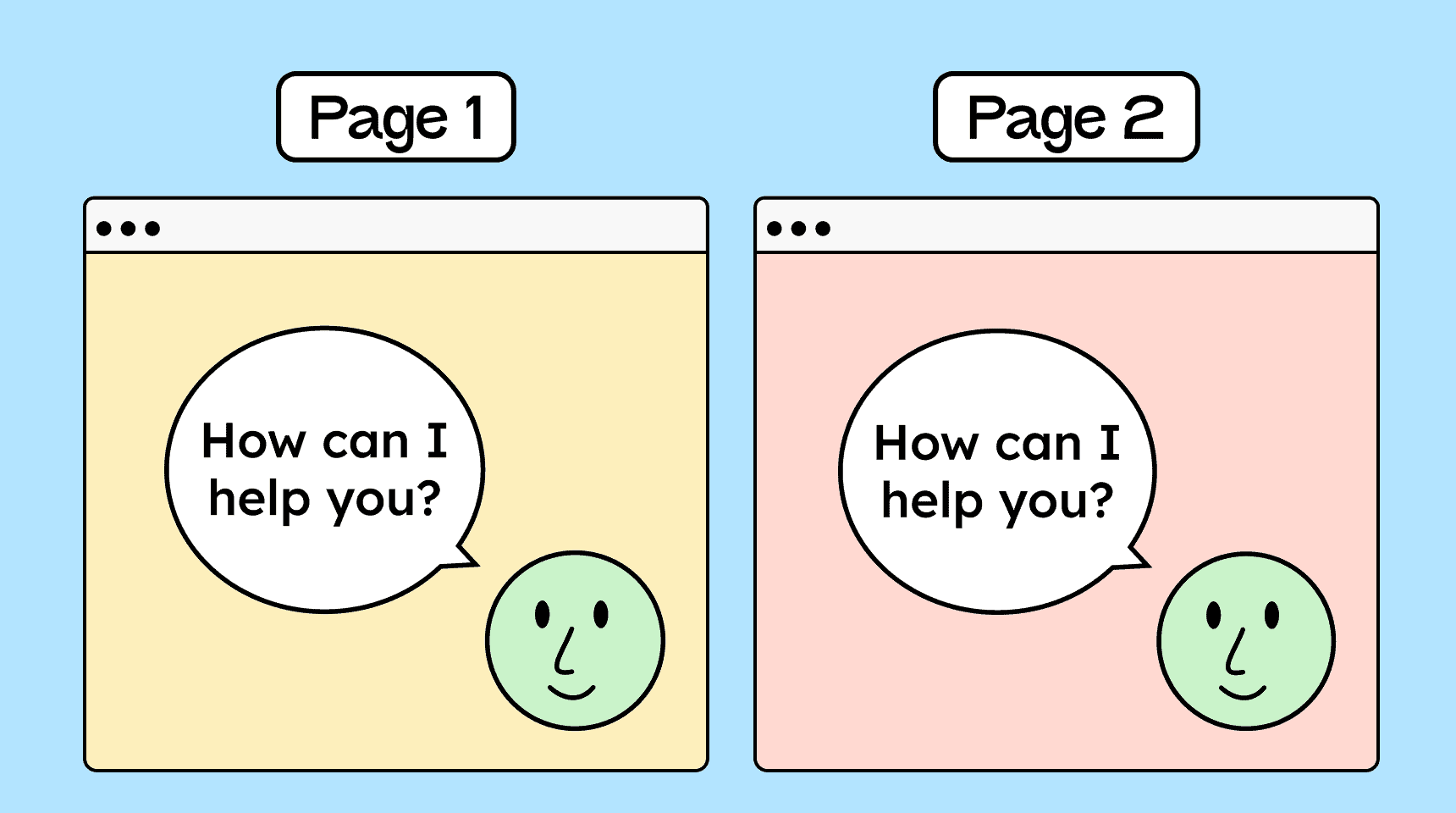
Help in the same place
The easiest way to meet this criterion is to include a link to the contact page in the header or footer. This link should appear in the same place on every subpage. By clicking the link, users are taken to a page with contact information.


Notes
Exception: Help in responsive views (desktop/mobile)
The position of the help element must remain the same within a given view. On different views, such as desktop and mobile, it may be placed differently.

Hint: More than one help option
If the site provides multiple help options, then at least one of them must always be found in the same location.

Hint: Help is not mandatory
The criterion does not require that help be provided, only that if help is available, it must always appear in the same place.

Create accessible designs?
Our workshop for designers!
Learn everything you need to know as a designer to create accessible design systems for digital products and entire brands.
Learn accessibility with us?
Looking to implement WCAG best practices in your design, development, or content workflow? Book a workshop for your team or contact us directly to learn more.