WCAG 2.5.8: Target Size (Minimum)
Back to all WCAG criteriaOVERVIEW
What's it about?
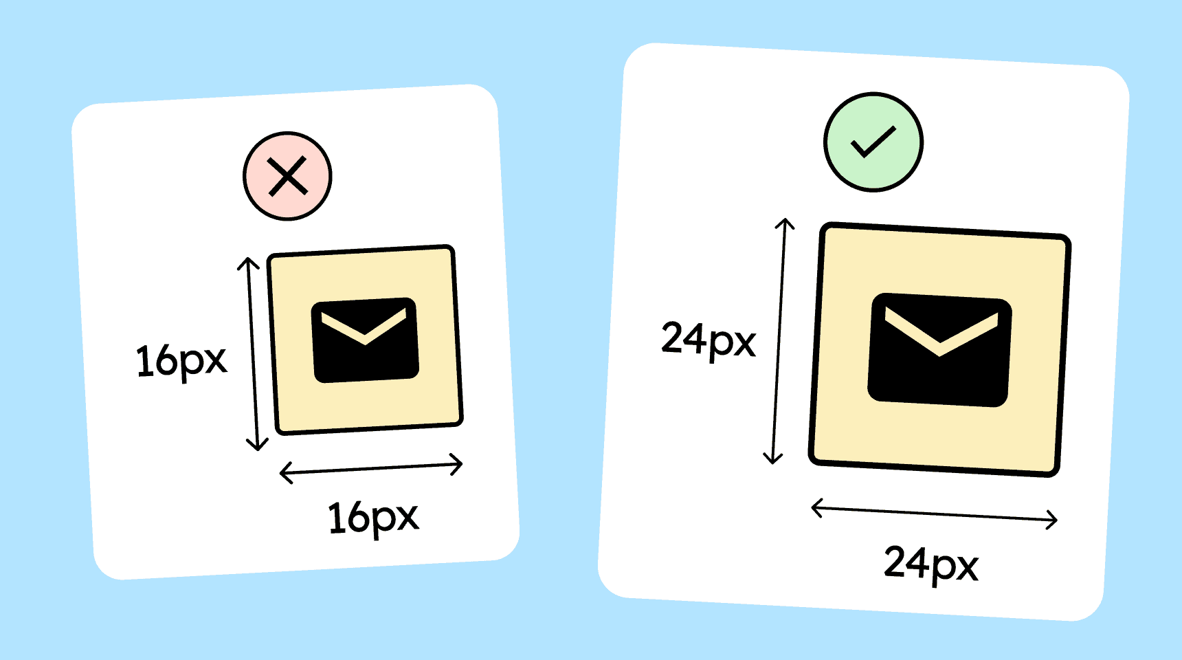
Interactive elements such as buttons, links, icons, or other clickable areas must be at least 24 × 24 CSS pixels in size, or their hit areas must not overlap with those of other elements.
How to
Depending on your situation, you can implement one of the following options to meet the criterion. For a deeper dive, please refer to the linked WCAG techniques.
The clickable area is at least 24 × 24 pixels
Interactive elements should have a clickable or tappable area of at least 24 × 24 CSS pixels.
For clickable icons, the icon itself may be smaller (e.g., 18 × 18 pixels), as long as the invisible hit area is at least 24 × 24 pixels.
Recommendation: Wherever possible, significantly larger hit areas should be used. Apple and Android themselves recommend 44 px and 48 px respectively as the smallest practical sizes for mobile.


Spacing to adjacent controls
A control may be smaller than 24 × 24 pixels as long as there is no overlap with other interactive hit areas within a 24-pixel radius. This is to prevent users from accidentally hitting the wrong target.

Notes
Exception: An alternative of the required size is available
A control does not need to meet the minimum size requirements if there is a second control elsewhere on the page that performs the same function and does meet the minimum requirements.

Exception: Inline links in body text
Links inside paragraphs are exempt from this criterion because the height of the links often depends on the height of the surrounding body text.

Exception: Element provided by the user agent (browser/OS)
Elements that come from the browser itself are also exempt, because you have very little influence over them.
A good example is the native HTML date picker, which often has tiny buttons. (Admittedly, it also has an accessible alternative through the input field, which is large enough!)

Create accessible designs?
Our workshop for designers!
Learn everything you need to know as a designer to create accessible design systems for digital products and entire brands.
Learn accessibility with us?
Looking to implement WCAG best practices in your design, development, or content workflow? Book a workshop for your team or contact us directly to learn more.